Like clothing fashions, website trends can web and flow through the years with many elements enduring from year to year.
What we’ve noticed over the last few years is while there is consistency to those trends, code developments have pushed those trends to new heights – like the death of Flash in favour of animation through real video and clever JavaScript and CSS styling. Here’s our 6 website trend picks for 2018…
1. Responsive Design
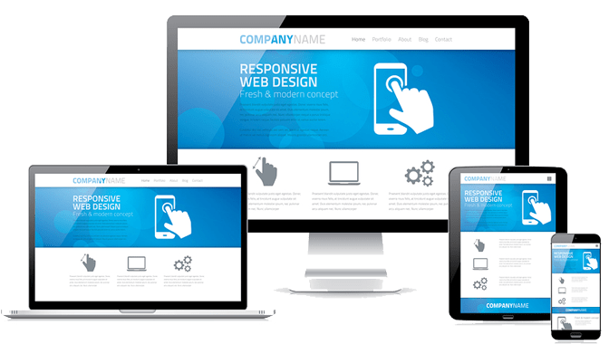
Responsive Design is a layout approach taken to ensure a website is user-friendly on a mobile device (smartphone or tablet). Its nothing new but its taking a higher priority in web design and code. Perhaps its taking on even more significance lately as clients understand the importance and allow for the extra budget required to do it better!

With website browsing on a mobile device, overtaking desktop browsing on many websites we shouldn’t be building any website that isn’t designed and coded to resize and conform to mobile browsing requirements. This is particularly true for B2C websites, requiring interaction with customers through contact forms, phone numbers, store locations and of course, online shopping. We’re seeing our NZ finance industry clients with 55% of their visitors coming from Smart Phones where they not only gather comparison information but also are happy to complete lengthy multi-page loan applications. In many cases the mobile phone isn’t just an alternative browser, it’s the households only browser.
Full Responsive Design is not just about changing a 3-column layout to one or increasing font sizes; its about considering the users requirements when they visit your website from a mobile device. These considerations include:
- They want to find the store nearest them – activate GPS location services on your site, show the nearest store first and make it easy to drive to you using Google Maps.
- If there’s a good chance they’ll want to contact you, have your phone number in a sticky menu that is constantly visible on a landing page and its coded to easily call you.
- Forget the waffle on a mobile – remove unnecessary info for a mobile device and get to your key Calls-to-Action quicker.
- Update your forms on a mobile device so they’re easy to navigate for chubby fingers.
- Form field validation alerts must to be easy to follow and fields arranged so they are easy to navigate to and update.
- Reduce questions to only those absolutely required. Do you really need to ask “how did you hear about us”?
And now that Google sees mobile-friendliness as a critical ranking factor, you’d must have a Responsive Design compliant website to ensure you are not losing customers to your competitors. Note that the battle for ranking well with google on mobile is only a reflection of what your mobile users are wanting – they’ll immediately bounce from your website, and not be happy with their search result, if they don’t encounter a pleasant user experience.
2. Gamification
You’ve optimised for search engines and analytics but are you influencing and optimising how your users engage with your site? “Gamification” is the process of adding game-like dynamics to sites and services – It’s a powerful tactic for influencing and motivating your website visitors.
It works because it makes the routine, more engaging and encourages and challenges consumers to complete our desired actions. Gamification can encourage people to perform tasks that they normally consider boring, such as completing a contact form, shopping, filling out a survey or exploring product features.
The NZ Army have run some highly engaging forms of gamification on their website, whereby prospects could adjust key controls to successfully land a Hercules or select the right strategies to find the missing people. As NZ Army demonstrated, its important to match the ‘gaming’ to your product otherwise it will have little relevance.Gamification on a website doesn’t have to go to the extremes of developing a ‘game’; it can be as simple as animating switches within a contact form, or animating a success graph at the end of a form completion almost as a reward. Earning rewards or points through a process or through repeated purchases online is essentially another successful form of gamification.
If within a serious business context, gamification can turn the mundane into an engaging and rewarding experience.
We’ve used Gamification to help MyFinance customers realise their dream car…

Bellroy are masters at using gamification to explain he benefits of their slim wallets…

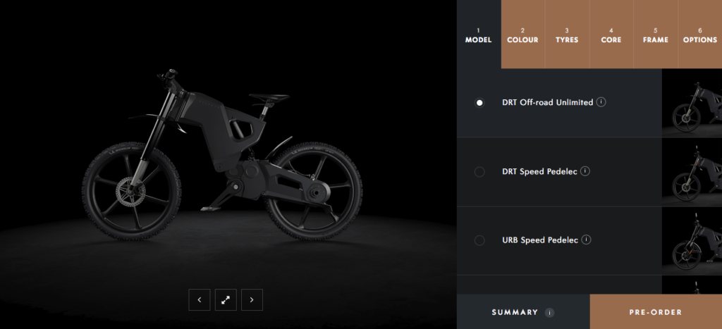
And there are growing list of websites that offer personailsed products built for a users exact requirements. Trefecta e-bike is a great example of this and their Configurator is also another clever type of gamification…

3. The Internet of Things
The Internet of Things (IoT) is the network of physical objects accessed through the Internet, without the intervention of people. These objects contain embedded technology to interact with internal states or the external environment. In other words, when objects can sense and communicate, it changes how and where decisions are made, and who makes them. Its also called M2M – Machine to Machine!

Perhaps the ultimate in the Internet of Things is SKYNET from the Terminator movies where the internet and machines where so much in control they took over!
The IoT is connecting more and more places – such as manufacturing floors, energy grids, healthcare facilities, and transportation systems – to the Internet. When an object can represent itself digitally, it can be controlled from anywhere. This connectivity means more data, gathered from more places, with more ways to increase efficiency and improve safety and security.
Nest is a great example of a clever thermostat that turns up the heat at home when your phone’s GPS tells it that you have just left the office. Its their version of the Internet of Things and they call it “works with Nest”…

4. Video Content
By 2017, video will account for 69% of all consumer internet traffic, according to Cisco. Video-on-demand traffic alone will have almost trebled.
Given the time and devices, most of us would rather watch content rather than read it. Video can deliver a story with more emotion and cut-through than words or still images can alone. It’s a medium we have always gravitated to through movies, news channels and TV programmes. And now the landscape gives us streaming movies, TV on demand and reliable band-widths to provide video on our own websites if we care to produce it.
Consider silent background video within your home page cover area to draw prospects into your uniqueness. Use it to tell your story more distinctly than your competitors, or deliver a short video to make the complex product features seem simple and irresistible.
Perhaps the number one reason for using video in your content marketing or on your website is that it converts more customers. Recent research shows that 71% of marketers say video conversion rates outperform other marketing content – so catch up jump on your competitors!
Local bar, Orleans in Britomart, Auckland delivers their desirable ambiance in their website’s cover video…

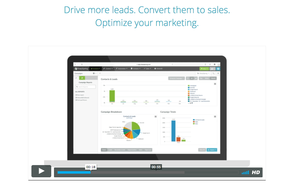
SharpSpring distinctly explains how their Marketing Automation software could work for you. (Talk to Grand about the many benefits of SharpSpring and Marketing Automation techniques)

5. Your Value Proposition
For Grand, the Value Proposition is one of the most important elements of a website! It’s why intelligent code, great design or clever UX on their own doesn’t produce a website that gets results. Conversion and sales come from customers buying into your story and wanting what your product more than your competitors.
We have a mantra at Grand – “Narrow the focus to build the brand”. It’s all about building a reputation around one thing; the one thing that sets you about from the competition and forms the key reason why a customer would choose you.
The value proposition is the single, overarching statement that highlights the desirable and exclusive elements of your offering in a succinct, memorable and visitor-centric way.
Too often we come across websites where the client has taken great care to mention every conceivable product feature without really explaining the principle benefit(s) for the customer, in the customer’s terms. When a website talks from the customer’s viewpoint it can start resonating with the customer’s needs – they’ll get you straight away. You won’t have buried your uniqueness in technical jargon; you will have talked in a customer-centric manner and you’re more likely to get chosen over your competitors.
So, on quick inspection, does your website answer these fundamental questions:
- Why should I choose you?
- What’s in it for me?
- Why should I give you my email address?
- Why should I give you my hard-earned money?
- It’s OK for me to buy this because….
- Have you explained to your customer, from their viewpoint, what is positively different about your brand?
The ingredients of a good value proposition:
- You just get it within 5 seconds – its concise and easily understood.
- It describes exactly what you get from using that product or service.
- It tells us how it is positively different from competitors
- It avoids superlatives, hype and jargon.
If your website doesn’t succinctly convey your Value Proposition, then you are missing out on one the key website trends of 2017 – a website that engages with its prospects and customers. Here are some good examples of websites that deliver their compelling Value Proposition within the cover section of the home page…
Tile – with the promise that you’ll even lose less time searching

Curtain Clinic – not just about cleaning; they’ll bringing back the freshness to your curtains.

Grand Creative – while our business descriptor is “The Digital Marketing Agency”, what we more often promise to our customers is that our unique processes will “get more business for your business”.
6. Call to Action
Having effective call-to-actions is essential part of any website. Literally every website page should have an objective it wants users to complete whether it is making a phone call, filling a contact form, completing an application downloading an eBook or signing up to a newsletter.
In direct mail, we’d have to tell people to “mail the enclosed card.” In digital marketing, we usually ask for a click. Regardless of the medium there are 3 essential elements of a call-to-action:
- Reduce the risk with a no-obligation assertion. Offer a free trial or a sample of what you are selling. This gives people the confidence to take the next step.
- Create a sense of urgency. Ask for a response right now. Don’t give users the option to wonder off and look somewhere else never to return.
- State the action – tell users exactly what you want them to do next.
Here’s a tip: When deciding on the ideal button copy, just complete the sentence, “I want to __________ “. It makes for an unambiguous direction.
Here’s some call-to-action examples that deliver all 3 elements…
MANPACKS
- Manpacks reduces risk by explaining “1000’s of men have already signed up”.
- The button copy tells us what is happening next – we’re building a manpack!

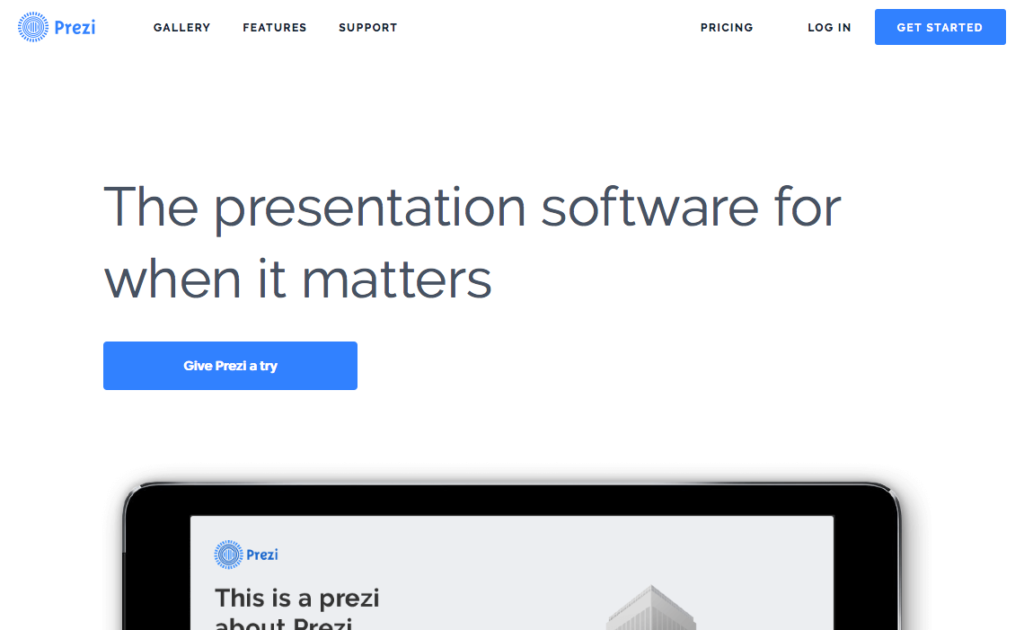
PREZI
- The casual copy “Give Prezi a try” implies an easy road into trialing Prezi for free.

Key Takeaways
So, like clothing fashion there is always something new for web designers and developers to focus on or experiment with. Our list for this year is a mix of recent years’ trends but they all have the underlying objective of optimising conversion and improving clicks, leads and sales from a business’ website. Check your website and see how it is utilising these elements:
- Responsive Website Design
- Gamification
- The Internet of Things
- Video Content
- Your Value Proposition
- Call to Action

