

What happens if you’re trying to sell your car, but you’ve left it dirty – people may view it but you’re not going to get any offers. That’s exactly why you need a polished homepage design for your website.
You never get a second chance to make a first impression.
You need to present the best possible homepage design for your specific audience and ensure you’re presenting your products or services to their best by highlighting their unique qualities and benefits.
Undoubtedly, your website homepage is the most critical page on your website.
Sure, you might have special landing pages funnelling leads from your Google Ad campaigns, and lead capture pages pushing for conversions, or ecommerce product pages that garner a direct sale, but your homepage is most often where it all starts.
Your homepage is most likely to be the first page that your website visitors will see when they land on your website.
It’s the first impression prospects will have of your business – it’s the greeting at the door that welcomes visitors in or scares them away!
So, let’s explore some of the most important aspects of the perfect website homepage…
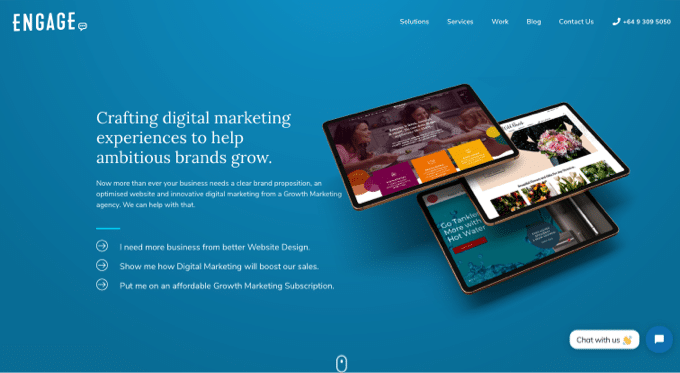
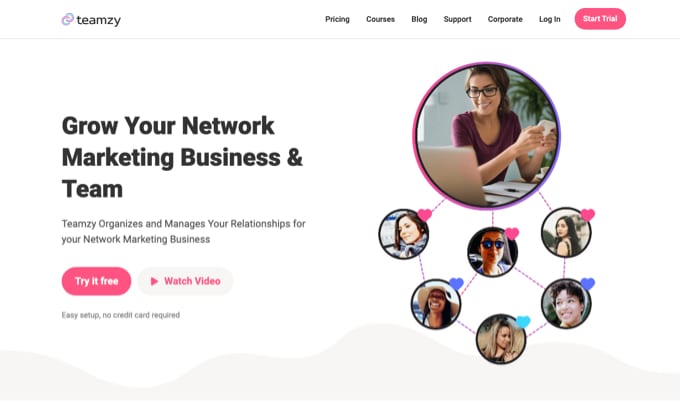
A compelling headline that talks directly to the customer
On the homepage the headline is a summation of your value proposition – it should distinctly express what this website and business can uniquely offer the visitor – that is, “what’s in it for me”.
Like a newspaper, we’ll certainly read the headlines – if something takes our interest we’ll read further.
If the article introduction resonates with us, we’ll keep reading – perhaps just skimming the sub-headings, images and bullet points, to the point that we’ve formed an opinion or have decided to take an action.
In short, presenting a compelling headline front and centre on your website homepage is the most important element you can create when designing your page. It’s the element we give the most attention in our website design and development process.
If you can’t describe your business to your visitors in that one sentence and if it doesn’t connect with their issues, then you’re not going to convert website traffic into sales.
Keep in mind these questions when creating your homepage headline:
- Who are you? (What is your company, product, or service about?)
- What do you do? (What does your company, product, or service actually do for its users?)
- How are you better than your competitors? (How does your company, product, or service uniquely solve a problem or fulfil a need in a way that’s better than the other options available?)

Help your audience understand exactly what you do
If you managed to get your visitors through your door with a compelling headline, now you can tell them a little more about how you can solve their problem.
Its great idea to be upfront with what you do at this point – prospects want confirmation they have come to the right place – so, tell them…
- We offer same day delivery of flower bouquets in the Auckland area.
- We supply and install European sourced tiles for commercial projects.
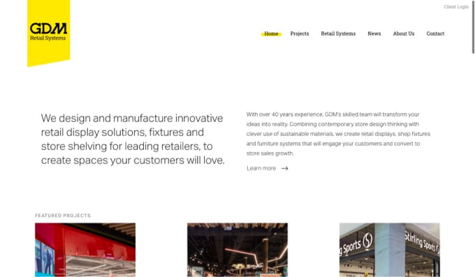
- We provide retail display systems for multi-store retailers.

Deliver concise and unique benefits
Our mantra at Engage is “Go beyond what you sell and focus on why it matters”(to your audience).
But so many brands use their website platform to talk about themselves.
No doubt your background and story is important to you – just make it relevant to the prospect.
The only reason you should mention that you’ve been in business since 1998, is if you back that up that your experience has developed a high quality product that will last for years.
Focus on what your research says is most important to your customer – they are most interested in what’s in it for THEM.
Prospects want to know about the benefits of buying from you, versus your competitors, because that’s what will compel them to make an enquiry or purchase.
So you need to explicitly state the factors that will compel them to buy from you rather than the other 4 websites they have up on their browser?
If they’re in research mode they want to see that your solution ticks all the boxes and more.
So place your key product or service benefits upfront on the home page and encourage prospects to read more.
On the home page, use support copy or emphasis copy to briefly explain how prospects will benefit from your product or service. If relevant, quantify the benefit with real numbers and state the timeframe that the benefit will be delivered in.
- Using our Growthology Engine we’ll increase your leads by 20% within 3 months.
- Buy with confidence – 30 day money-back guarantee
The difference between features and benefits
- Features are facts about products or services; they add credibility and substance to your sales pitch.
- Benefits give customers a reason to buy because they explain how your product or service improves their lives.
- To translate features into benefits, answer the question “So what?”
The benefits are the primary reason a prospect will buy your product. When it comes to purchasing, people are self-centred – they want things that solve their problems.
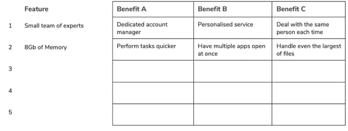
The Features-Benefits Matrix
Get your thoughts together by mapping out a Features Benefits Matrix – it will help crystallise how features of your product or service can match the benefits you can deliver your customers.
Provide a prompt for visitors to engage with you
Most of the visitors to your website won’t be ready to buy from you, just yet.
Your goal is to get them to engage with you and then hopefully convert in the near future.
We don’t necessarily purchase the first shirt we see at the first store we visit, and we certainly don’t buy a new vehicle on the first visit to a car yard.
And so it is with a website visit – we’re not necessarily going to buy the first $100 headphones we find and we’re certainly going to research the hell out of $1000 tablet purchase.
We need to give visitors the necessary incentive, information, or time to make their commitment.
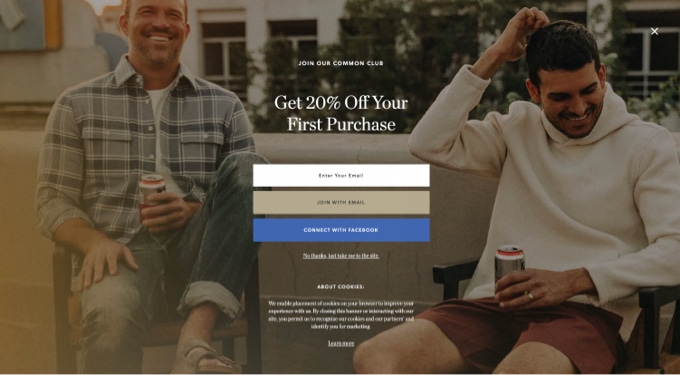
Providing an incentive is an obvious approach for an ecommerce store, where we’ll regularly see coupon offers delivered through homepage pop ups. Take 10% off your first purchase with this coupon code. Subscribe and get 15% off your first order.
If you’re an app or software provider, a free trial or demo is a great way to reduce the barriers to purchasing – including a lack of experience with your solution or the trust that your app will deliver as promised.
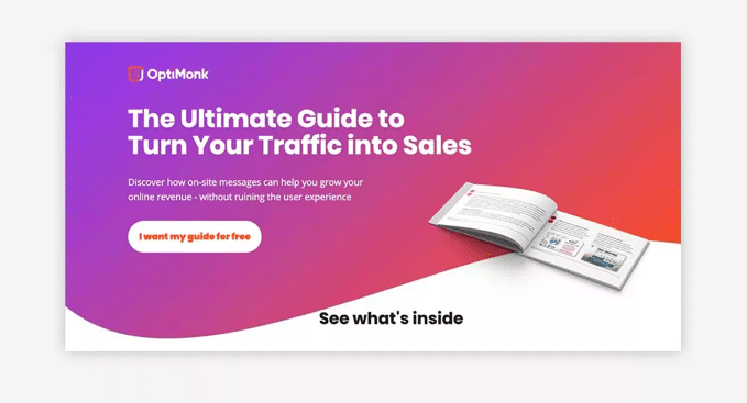
If you’re a B2B business, and prospects simply need to get to know you better, then offer a high-value content offer (HVCO) that exchanges their email for your valuable content like a how-to guide, a clever cheat sheet or access to instructional videos.
The objective for most of these offers is gaining an email address, whereby you’ll have permission to engage with that prospect on a regular basis until you’ve given them the confidence to buy from you, or they’re simply ready to make the leap and call you, book a meeting, visit your store, ask for a quote or make a purchase online.
Include prominent Calls-to-Action
The goal of your homepage is to compel visitors to dig deeper into your website and move them through your sales funnel – from awareness of your business, to interest and on to a purchase decision.
On your homepage, you’re not likely to know the visitors intention – are they just researching, have they just discovered you, or are they ready to make a purchase, call you or request a quote, right now?
Include two or three calls-to-action (CTA) above the fold of your homepage to encourage a deep dive into your website or to take action of some sort.
However, don’t confuse customers with too many opposing options.
Make sure you use a call-to-action title that makes sense and conveys value. A CTA like “Subscribe Now” is OK but how about “Subscribe Now & Get Free eBook” – now I’m interested.
Here’s a tip: Your CTA is where you want your visitors to focus their attention. It’s an invitation: Here’s what to do next. Create better CTA titles by completing the sentence, “I want to _______“.
Help prospects engage with your business by figuring out where to take them on the next step.
Make your website homepage work brilliantly on mobile
For most of our clients, even if they are B2B, their mobile traffic accounts for 60% of website traffic (and climbing). You’ll be surprised what consumers are getting done on their mobile phones even if they have an accessible desktop alternative.
So, no matter your business, your website homepage must work on mobile.
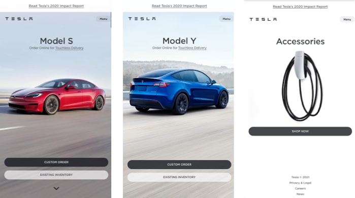
We’re typically building with Responsive Design – that is, we’ll use a framework like bootstrap to quickly build fluid web pages with a set of common HTML and CSS components that adapt the same content for both a desktop and mobile screen.
In fact, many of our websites take a “Mobile First” philosophy where we design layout for mobile first and consider desktop second.
We’re usually laying mobile content to one or two columns wide, which means that any one time the user is viewing just one or two pieces of information.
We need to cleverly use the scrolling and horizontal flicking effects on mobile.
And we should consider the auto population of forms, address finders and clickable phone numbers – all to make the mobile experience of your homepage an effortless one.
We’ll declutter screens using hamburger menus – those 3 stacked lines. And design special flyout menus to help users navigate a website.
And adding sticky call-to-action buttons is a great way to make our important actions always present on a user’s screen.
Test alternative homepage designs
In an ideal world we should be continually testing and retesting ideas and content on our homepage.
An improved homepage has the ability to reduce bounce rate (the percentage of visitors who don’t go further) and more importantly, double your conversions.
Even a 5% lift in conversions could mean a significant return on investment from A/B testing copy, images and call-to-action options.
A/B testing, sometimes also referred to as split testing, is a way to compare elements on a page against each other to determine which performs better in terms of page views, time on page, conversions, bounce rate, etc.
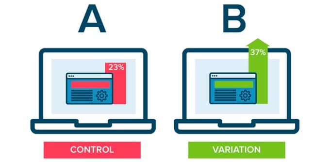
There are numerous free and paid tools that help us do this, like Google Optimize – so if you’re unsure which headline works best, test it.
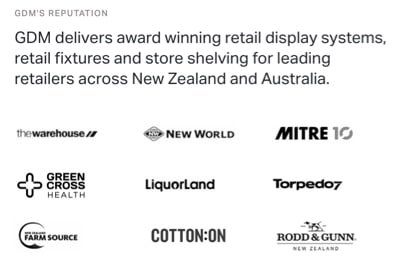
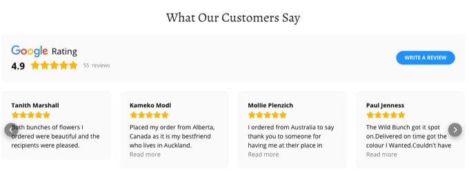
Include Social Proof and Trustmarks on your homepage
Whether we’re purchasing a T-shirt, a dental exam, a furniture removal service, or a complex retail shelving system we want to know that we can trust the company that we’re go to purchase from or consult with.
Of course, the level of trust required will depend on the quantity of money we’re about to part with.
That trust might come from dealing with a well-known local retailers or a highly credible international brands – so showing the logos of current customers that you deal with, may instil confidence in potential customers.
Memberships and accreditations are another way to demonstrate your expertise in certain fields

Embedding your ratings and reviews with trusted aggregators like Google Reviews or Trustpilot is another way to display your creditability.
Takeaways
The homepage of your website is the window to your business.
It’s fundamental that the homepage communicates the right impression otherwise prospects will bounce and venture no further into your website.
The perfect homepage website design needs to include these key elements if it to perfectly present your brand and encourage visitors to find out more or buy from you:
- A compelling headline that conveys your unique value proposition.
- Copy that explains to your audience exactly what you do so that they get you.
- An outline of your brand’s benefits – what’s in it for a customer.
- Reasons for your prospects to engage with you.
- Direct and prominent calls-to-action – to direct prospects to trial, view more or buy.
- Your website homepage must work brilliantly on mobile – because 60% or more of your users will be using their mobile to browse your homepage.
- An ability to test alternative homepage designs to optimise conversion with the best layout as proven by your website visitors.
- Inclusion of social proof and trustmarks to provide more reason for prospects to buy from you.
Make a great start to redeveloping your homepage by downloading our website project planner.
Contact us today on 09 309 5050 or email phil@engagedigital.co.nz if you would like to discuss the redevelopment of your homepage into a conversion machine!
