If you’re not presenting the most attractive and compelling ecommerce website design to your target audience then you’re definitely leaving money on the table.
The creative appeal of an ecommerce website plays a big part in engaging customers, ensuring trust and increasing the appeal and perceived value of your products.
The relationship of design with the function focus of most ecommerce sites will ensure one a site stands out from the many homogenous sites around it.
Given my line of work, I’m constantly bookmarking and cataloguing websites that catch my eye for numerous reasons. Here’s some of the reasons the following websites made my ever-growing ecommerce wunderlist:
Online Store Familiarity
I expect a catalogue of products laid out in a familiar grid. I expect identifiable Add to Cart buttons and common experience through the shopping process. Anything less could confuse, reduce trust or increase the time it takes to get through the checkout. If you are brave you could break this rule but I for one expect a certain design familiarity to an ecommerce store.
Easily understood navigation
Good navigation helps new shoppers find what they’re looking for without hassle. If you have broad market, not all accustomed with a fly-out sidebar menu, the stick to the path well-trodden.
Design Shouldn’t Overpower the Products
The focus of an ecommerce site should be on the products that are available for purchase. There are always exceptions to the rule but ensure the product remains the hero.
Ease of Checkout
Good design can make the checkout process fluid, guiding the shopper through often complicated hoops. If the checkout process involves too many steps or is confusing, shoppers will wind up abandoning their cart with items left unpurchased.
Compatibility with All Devices
Not-so-small screens with improving resolutions is fuelling the unrelenting rise of mobile phone use for ecommerce purchasers. It’s vital that our store designs consider the requirements of mobile-only shoppers and the design elements they’d find helpful – special navigation flyouts, horizontal scrolling of products, sticky View Cart buttons.
Use of Clear, Beautiful Images
Product images should be the heroes on any ecommerce store. Quality luscious photos should focus on aspiration use of products, product details and benefits. Just think when you’ve visited a store with small low-quality flat images – it certainly can easily turn you away.
Bellroy

DSTLD design and produce luxury denim clothes and accessories. They’re on my design radar because the industrial design layout matches this brand’s essence. Photography is aspiration and on brand but direct and detailed when it needs to be. Despite the minimalist style ecommerce items are where anyone would expect them to be.
Huckberry
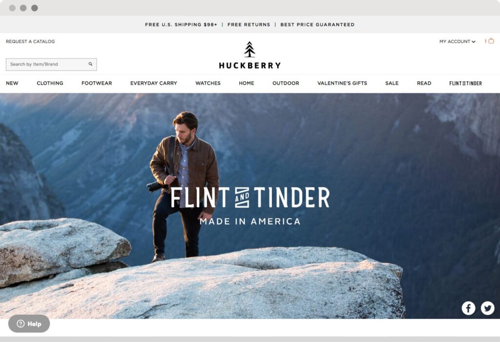
Huckberry say that their emails will be the most awaited in your inbox and they’re not wrong – they’re interesting, full of rich photography and content – particularly if you like the outdoors. And their ecommerce website design continues to deliver on that promise with wicked product photography. Note how you need to login in to view – with this site I haven’t hesitated.
Holssen
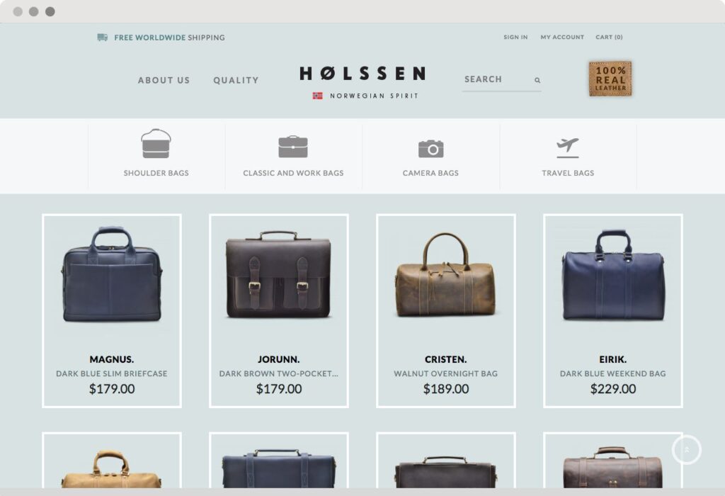
Sometimes we get carried away with our positioning tactics! The brief says the home page must include a lavish cover image, copy that conveys our proposition, links to blog articles and videos, trustmarks and testimonials, social media feeds to facebook and Instagram. Holssen said stuff it; let’s just show our amazing products.
53
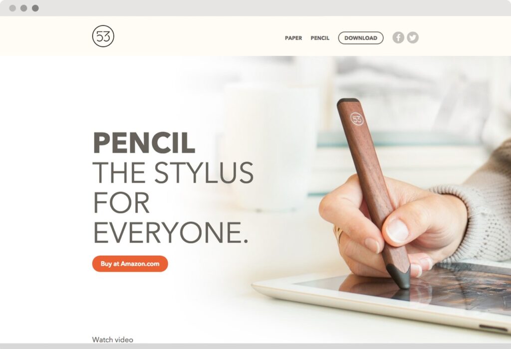
While not strictly an eCommerce website, FiftyThree made it to my shortlist because it’s definitely selling something. That something is creativity, style and technology all wrapped in to their product called Pencil. This landing page is as creative as the product and is loaded with well-designed benefits, imagery and animations.
Allbirds

I’m a sucker for great positioning and the ‘world’s most comfortable shoe’ sounds like a proposition that should resonate with a big market. This site uses typography, images and quirky illustrations to tell why you need a pair. Allbirds tell their story well and provide plenty of calls-to-action to get your buy in.
Like all great Small Business Website Design Companies we’re building propositions like this into the mantel of the websites we create. If your customers don’t understand what you do and why you’re different then they’ll go elsewhere.
Beardbrand
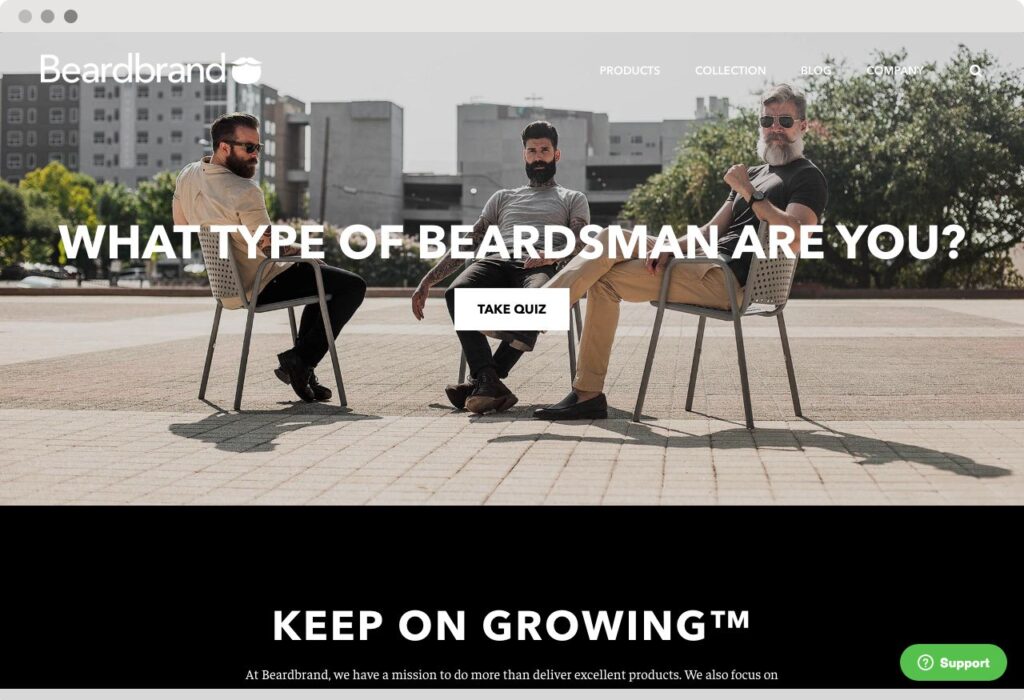
Always been a fan of Beardbrand’s website design. It’s one site where bearded models aren’t just there for the hipster factor. Their eCommerce site feels like a knowledgeable and helpful friend and they happen to sell stuff.
Flambette
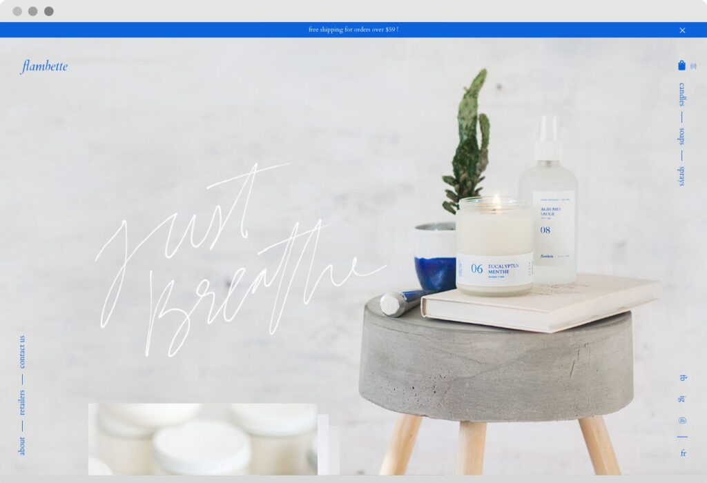
Most of the eCommerce sites I’ve listed so far are conventional in their layout. To prove that I’m not confined to normal, meet Flambette. Note the vertical menus placed to the sides, animated copy and images on scroll. Animated product images intrigue the user and the designers have even considered page load animated icons.
Paolita
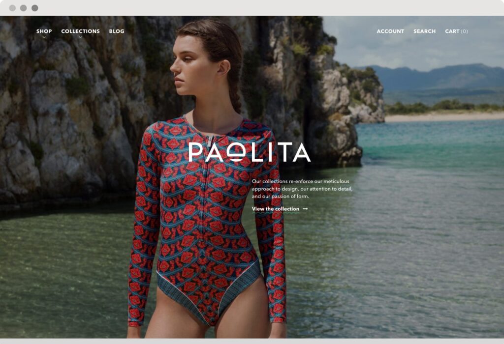
Many clothing sites could make it to a list of creative eCommerce design and there is a similarity with many of the great ones. Paolita finds inspiration for their fashion designs from many cultures; European, North African, Mexico. Its demonstrated from white collections through to heavy patterned and coloured collections. I love the fresh nature of their design layout and the subtle animations on display of copy and product images.
Ethel’s Baking

If you’ve got this far with my list, you’ll appreciate I lean towards minimalist design and familiar shopping aesthetics. Ethel’s Baking is here to break that mould. While built in BigCommerce it manages to redefine this ecommerce SaaS system with it’s own highly tailored design.
Grovemade

This site might have made it here because of my interests in anything Mac and handmade. But boy, what a great example of those two interests in one product. Grovemade presents their fantastic range of products with soft grey backgrounds and minimalist navigation. Nothing gets in the way of exploring their products and putting them in your cart.
Takeaways
In putting together this short collection of ecommerce website I’ve learnt that my design preferences are as much about current creativity as they are about practicality and familiarity from a visitor’s viewpoint.
Sure, I came across far more intense designs but for me I found those sites over styled, not clear about what they were selling or simply too awkward to navigate.
To me, good ecommerce design isn’t about austere model shots but about integrating on-brand imagery with a seemingly simple ecommerce shopping experience for your particular target market.

