When it comes to building a website, the options can feel endless. In the past few years, we’ve seen an explosion in new design software and a surge of fresh ideas from the world of digital marketing. The result? A whole new generation of website builders that make it simpler than ever to create your own site.

These programs are not just for those with no technical know-how—they’re ideal for anyone who wants to build their first site or refresh an old one without hiring an expert designer. WordPress itself is an excellent example of how these builders can be used to create beautiful sites quickly and easily. With more than 60,000 plugins available and more than 200 themes on offer, there’s always something that will fit any taste or project. Here’s everything you need to know about using these tools as a WordPress site builder

What is a WordPress Website Builder?

Website builders, such as WordPress and Wix, are programs that can be used to create a website without requiring any technical know-how. These programs make it easy for anyone with a creative idea to create a site in a matter of minutes. In many cases, these websites can look more polished than those built by professional designers.

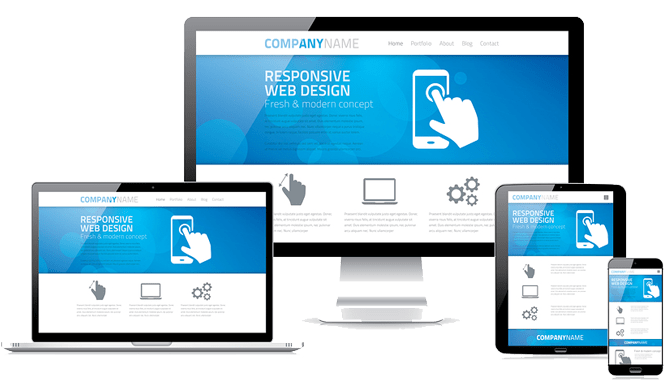
Many of the best website builders use HTML5 and CSS3. This is why you’ll find that they have an attractive interface and intuitive functionality—the design will stay modern even after years of updates. Website builders like these also allow you to quickly customize your site’s appearance with different fonts, colors, layouts, images, and other features all without having to learn code or hire someone who has knowledge in web design fields like graphic design or web development.

What’s the difference between a WordPress Website Builder?

A website builder is software that helps you design and build your website. There are a number of different programs out there, but WordPress is one of the most well-known options. A WordPress site builder integrates with WordPress to make designing a site effortless. It allows you to edit the theme of your site, add media, and manage pages on your site without needing to learn any coding skills or worry about hosting or domain names. It’s in this way that it can be used as a WordPress website builder.

You can also use these tools as a developer by using their program as a tool to create sites for clients or other projects that don’t require complex design solutions. You simply use the tools within the program you choose while working with client-provided files and save them on your computer when they’re ready for publishing. 

As an example of how websites created with these tools function without any coding experience, consider Tumblr. By using Tumblr’s website builder, building your own blog has never been easier. With easy drag-and-drop interface, you have access to all the features that make Tumblr so popular—as well as some custom ones just for those who create their own blogs.

Why Use a WordPress Website Builder?

If you’ve been wanting to build your own website, but don’t want to take the time and money out of your budget for a professional web design service, a WordPress website builder can be a great option for you.

WordPress is an open-source content management system that’s been in use since 2003. It was originally designed as a blogging platform, but has grown quickly over the past decade and has become one of the most popular platforms on the internet.

With WordPress, anyone with some technical knowledge can learn how to create a professional-looking site at their own pace. Just by following a few tutorials, you could have your dream website up and running in no time! This means that if you have any ideas or simply want to refresh an existing site with new content—professional grade websites are accessible to all.

When it comes to building a website with WordPress, there are many options available. But the most important thing is understanding just what exactly makes this system so useful in creating great websites—it’s what sets it apart from other options like Squarespace or Weebly. The power of WordPress is its flexibility; with so many plugins and themes available, it’s possible for users to customize their sites into whatever they want them to be.

From design to delivery with WordPress website builders

When using a website builder, you will be able to spend more time on the creative process and less time worrying about technicalities. The design software will often take care of the coding for you, which frees up your time to focus on aspects like content and design.

You’ll also be able to easily update your site in the future. You won’t need to hire an expert designer or developer or worry about learning HTML and CSS—with a website builder, all the updates are done for you with just a few clicks. This makes it much easier for new changes to be made without having to pay someone else.

Finally, when using a website builder, there is no limit to what you can build. There are hundreds of ready-made themes that are available as well as thousands of plugins that offer innovative features and functions. This means that there is something available for any project idea you come up with without needing to start from scratch every time.

Pros of Using a WordPress Website Builder

The beauty of a WordPress website builder is that it’s not just for beginners. If you already know how to use WordPress, then you can use one of these tools to design your site quickly and easily. They also make it easy for those who don’t have any technical backgrounds to build a professional-looking site. For example, if you want to create an Instagram feed for your newsletter, there are web builders available that can be used in minutes to create beautiful galleries.

Another big benefit is the ability to create stunning websites without having to hire a designer or worry about the tech yourself. This allows you to focus on what matters most: your business’s mission and what makes your company unique. The builders also allow a whole new generation of entrepreneurs and small businesses the opportunity to create an online presence without breaking the bank or even hiring an expert designer.

Cons of Using a WordPress Website Builder

Using a WordPress website builder is not for everyone. It’s worth considering that you might have to give up some of the freedom and control that comes with creating a site from scratch. You might not even be able to totally customize the site without hiring designers or developers, which will make it harder for your business if you plan on selling products. If you choose to build your site using a WordPress website builder, you might find yourself with a basic site that doesn’t do much more than show off your content. 

If you decide to create your own site from scratch, use these tips to improve the user experience:

  • Spending a little more upfront on design will help ensure your site looks professional and has a higher chance of converting visitors into customers. 
  • Choose a unique name for your company and make sure it’s spelled right! (Note from Dan: Check spelling… seriously?)
  • Find people in the marketplace who can help you build out features that are unique to your business needs.

Final Words: Should You Use a WordPress Website Builder?

The answer to this question largely depends on the project you’re working on. For example, a website builder might be overkill if you want to build a fairly simple website with minimal customization and a basic layout. However, suppose you’re looking for something more in-depth and customizable with features like e-commerce, content management system (CMS), or mobile optimization. In that case, a WordPress website builder can help streamline the process and save money on design fees.

And by using WordPress as your site builder, you don’t have to worry about getting locked into any particular program. The WordPress software is open source and available to use for free. You also get access to thousands of other developers who are constantly adding new plugins that can help your site grow to meet your needs!

We’ve all made this mistake, right?

We send all traffic from social media or paid ads to our home page.

Home pages are usually not great at getting visitors to complete a certain action quickly.

Sure your home page might sum up what you’re all about but it’s often the most generic page of your entire site.

They’re built with multiple offers and features to provide a generic starting point for new users.

If you’re going to engage the right targeted customer with highly relevant content, then then you need to write and build effective landing pages.

Not only will you optimise conversions but you’ll also substantially reduce lead generation costs.

In this article we’re going to:

  • Explain the essential components of a high-converting landing page
  • Introduce the Problem/Solution/Benefit Formula
  • List the Five Proven Conversion Boosting Headline Formulas
  • Provide copy direction for an effective landing page
  • And provide our infographic for the Anatomy of a High Converting Landing Page

What is a Landing Page?

A landing page is a page on your website designed to convert visitors into leads. It will focus on encouraging a certain targeted audience to complete a desired action. The page will usually have a short form that allows you to capture a prospects information in exchange for an offer of value.

Anatomy High Converting Landing Page Infographic

Components of an Effective Landing Page

1. Compelling Headline

Perhaps the most important element on the page, the headline has to command the visitor’s attention. It immediately tells the visitor they are at the right place AND what’s in it for them.

It will most likely resonate the Value Proposition for your brand or for this particular aspect of your business. It has to be benefit driven and compelling!

Is this a landing page from a Google Ads campaign? Consider a headline that closely matches your advert proposition. It makes the page more relevant for the visitor and increases your Quality Score with Google.

2. Problem-solving Support Copy

You’ve captured your prospect’s attention with the headline, now confirm that your offer matches the visitor’s needs in a sentence or two. What is your promise to prospects?

3. Strong Call-to-Action

It’s crucial that we clarify what we want a prospect to do next by stating a clear Call-to-Action (CTA).  This is often achieved by applying button copy that completes the sentence, “I want to __________”. 

Use strong contrasts in colour to make your CTA buttons or links stand out. Red or orange buttons are often used to catch the visitors’ eye.

4. Reinforcement Statements

We use Reinforcement Statements to reinforce a proposition or highlight an offer. They are usually a short sentence displayed at a large point size. And often followed by a CTA or a Solution Grid. 

5. Concise Solution Grids

Our Solution Grid is a design layout defining the key features or benefits in a concise manner. That is, what are our solutions to the prospects’ main problems?

Use images or icons to convey the topic, short sub-headlines to punch the benefit and concise body copy to explain further.

A Solution Grid might come as a short row of 3 items or a longer grid of 6, 8 or more points. We might also use a Solution Grid to outline Next-Steps or How-to lists.

6. Detailed Support Information

When we want to explain sub-topics in a little more detail, we’ll often use yin-yang sections – so called as we’ll often alternate content from left of page to right of page for a friendly design flow. Each section will include a combination of a sub-heading, support body copy, relevant image/icon and an optional CTA.

7. Succinct Bullet Points

Bullet points make it easy for a prospect to grasp the essence of your offer by keeping things short. Speak to their prospect’s pain points and how your offer solves them.       

8. Striking Hero Images

Great images are as important as compelling headlines. Be sure to include relevant and engaging images to draw the prospect further in. Video is a particularly strong and engaging method to tell your story.

9. Lead Capturing Opt-in Form

Given the purpose of a landing page is to capture leads then the opt-in form is crucial. It needs to encapsulate the information we want from a prospect to complete a goal (download an eBook, sign-up to a newsletter, complete an application, or add to shopping cart).

Offering a lead magnet (e.g. eBook) at this sales stage might help us start a conversation and enable us to nurture that prospect further with personalised email.

An opt-in form may be repeated 2 or more times throughout a long landing page. Only collect the information you really need.

10. Social Proof

Prospects may not take your word for it, but they will listen to other customers. Include relevant testimonials, reviews and/or case study excerpts on the landing page. These could link to more detailed reviews but be mindful of whether tempting the visitor to another page is a good idea for this specific landing page.

11. Mobile Friendly

It almost goes without saying but your landing page has to incorporate responsive design – it has to be easy to interrupt and use on all devices.

Other Page Design Options

Remove Navigation

If you’ve led a prospect to this page from online promotion and with a direct call to action in mind, then remove distractions and any chance of them wandering elsewhere by removing website navigation.

Social Sharing Icons

Include social sharing icons so prospects can share the landing page with others across their social platforms or bookmark it for themselves to reference later.

Testing & Optimising

Use A/B Tests to optimise a landing page for conversion over time. Test substantial design alternatives and/or subtle changes in headlines, copy, images and CTAs to see what resonates most with prospects.

Page URL

It’s not only useful for the visitor but also good for google rankings, that your page url is descriptive and contains your focus keywords. http://acme.com/great-landing-page

SEO Meta Tags

Always include a short Page Title in your meta tags for the landing page. The Page Title should include your focus keywords and again concisely explain what the page is about or what’s in it for the prospect. This is what they will see as the heading in a google organic search result, so make sure it’s also compelling not just a list of disjointed words. 

Links to Other Pages

Lots of links on a home page make sense to encourage a prospect to navigate to the most relevant pages for them. On a specific landing page though, keep links just to relevant support pages so as not to distract the prospect from your intended CTA.

Live Chat Support

One of the strongest conversion tools that you can get for your online shop is Live Chat software that allows you to chat with your online visitors. Even if you make your landing page close to perfect, there will always be visitors with unanswered questions. Of course, you cannot answer all potential questions on your page, that would destroy its clearness. That’s where live chat comes in. 

Formatting

For clarity and an easy user experience your page structure needs to follow the styling that has been have established for the website.

Heading styles, body copy, emphasis copy, call out grids with icons, quotes and CTA buttons should all follow a pattern that the visitor becomes familiar with so that all your content is structured and easily skim-read or followed word for word.

While some detail can be left to the design team, within your content brief identify all key styles:

  • H1 (only one per page), H2, H3 .. H6
  • Body Copy, Bullet Points, Numbered Lists, Emphasis copy etc
  • Hyperlinked copy, Buttons

Choosing Hero Images

Great landing pages have great images. It’s that simple. As mentioned above, the image you choose should help boost the overall message of your campaign. It should help to illustrate exactly what it is you’re offering and shouldn’t be too abstract or arbitrary (no matter how good they look).

Here’s a 7-step framework for judging hero images, and it goes like this:

  1. Keyword Relevance (does the image complement the targeted keywords?)
  2. Purpose Clarity (does the image help clarify the message of the site?)
  3. Design Support (does the image support and enhance seamless flow of page design leading to the CTA?)
  4. Authenticity (does the image represent your brand in a credible way?)
  5. Added Value (does the image add value? Improve relevance? Demonstrate benefits?)
  6. Desired Emotion (does the image portray desired emotions that trigger action?)
  7. Customer “Hero” (does the featured image depict the customer as the “hero” once equipped with this solution

Follow the Problem/Solution/Benefit Formula

  • Establish a problem. What’s a common issue your audience has? Identify it and agitate it!
  • Present a solution. Next, state why your product or service as the best solution to their problem. Ensure that your solution covers every detail of their problem.
  • Show a benefit. Now, you can show your prospect how much better life can be when their problem is solved.

Copy Direction for an Effective Landing Page

Step 1: Identify the Audience

The first step to creating landing page copy is to identify who you are targeting.

Step 2: Choose the Desired Action

Now that we know our intended audience, it’s important to identify the exact action we want them to take.

Your landing page should NOT be a brochure. It should NOT be informational.

The entire point of a landing page is to generate action.

Step 3: Identify the Core Problem

Once you’ve determined your targeted audience segment and desired action, your next step is to identify the key problems facing this segment that might be solved by your product/service.

Copy should use this central theme in the Value Proposition and as a filter for the rest of our copy.

Step 4: Write the Value Proposition

Now that we’ve identified the core problem for our target audience, it’s time to write our Value Proposition.

This is your business’ chance to demonstrate the value you bring to the table, IN THE CONTEXT of your audience’s needs.

Don’t talk about you.

Talk about the customer.

Step 5. Provide the Support to your Solution

After the heading and cover section, I recommend creating a “Solution Support” section.

This could involve a “Solution Grid” of 3, 4, 6 or more support summaries or you can follow up with an in-depth paragraph that explains exactly who you are, what you’re offering, and why visitors simply HAVE to get it.

Step 6: Write the How

Moving forward along our landing page, it’s time to talk a bit about HOW we can fulfil our promises to our customers.

Never lead with the “how”.

People don’t care about how until they resonate with you on “why”.

But once we’ve resonated with them at a core level and promised a central benefit that solves their problems, it’s important to touch on how we plan to deliver.

The “how” section of your landing page is all about finishing out the narrative that you are the answer to their problem.

You have the most freedom to get a bit off-track in this area but try to bring everything back to that central problem in a way that drives visitors toward the targeted action.

Step 7: Include the Social Proof

Your landing page is a narrative.

It presents a story that says YOU are the answer to your audience’s most pressing problems.

One of the easiest ways to evidence this story is social proof.

Anyone can make claims, but if you can show people that you’ve already solved these problems for others, they are far more likely to buy into the narrative.

Step 8: Write the Final CTA

By now, you’ve written the copy for your entire landing page.

It’s time to tell them to take that desired action.

They are interested.

They read your entire pitch.

Tell visitors precisely what you want them to do.

Takeaways

There you have it, numerous low-effort/ high-impact components to a landing page that could have lasting dividends to your business. 

It’s time to explore how you can start using these essential lessons to build your effective landing pages.

Start by implementing each of these components, and you’ll be well on your way to engaging your visitors and converting them into customers. 

Remember, consumer psychology can sometimes be surprising, the only way we can be confident that we’ve achieved our best page is by continuing to test. It’s always better to experiment with different versions of your pages to see which works best for your market — optimisation should become a routine at your company.


Like clothing fashions, website trends can web and flow through the years with many elements enduring from year to year. 

What we’ve noticed over the last few years is while there is consistency to those trends, code developments have pushed those trends to new heights – like the death of Flash in favour of animation through real video and clever JavaScript and CSS styling. Here’s our 6 website trend picks for 2018…

1. Responsive Design

Responsive Design is a layout approach taken to ensure a website is user-friendly on a mobile device (smartphone or tablet). Its nothing new but its taking a higher priority in web design and code. Perhaps its taking on even more significance lately as clients understand the importance and allow for the extra budget required to do it better!


With website browsing on a mobile device, overtaking desktop browsing on many websites we shouldn’t be building any website that isn’t designed and coded to resize and conform to mobile browsing requirements. This is particularly true for B2C websites, requiring interaction with customers through contact forms, phone numbers, store locations and of course, online shopping. We’re seeing our NZ finance industry clients with 55% of their visitors coming from Smart Phones where they not only gather comparison information but also are happy to complete lengthy multi-page loan applications. In many cases the mobile phone isn’t just an alternative browser, it’s the households only browser.

Full Responsive Design is not just about changing a 3-column layout to one or increasing font sizes; its about considering the users requirements when they visit your website from a mobile device. These considerations include:

  • They want to find the store nearest them – activate GPS location services on your site, show the nearest store first and make it easy to drive to you using Google Maps.
  • If there’s a good chance they’ll want to contact you, have your phone number in a sticky menu that is constantly visible on a landing page and its coded to easily call you.
  • Forget the waffle on a mobile – remove unnecessary info for a mobile device and get to your key Calls-to-Action quicker.
  • Update your forms on a mobile device so they’re easy to navigate for chubby fingers.
  • Form field validation alerts must to be easy to follow and fields arranged so they are easy to navigate to and update.
  • Reduce questions to only those absolutely required. Do you really need to ask “how did you hear about us”?

And now that Google sees mobile-friendliness as a critical ranking factor, you’d must have a Responsive Design compliant website to ensure you are not losing customers to your competitors. Note that the battle for ranking well with google on mobile is only a reflection of what your mobile users are wanting – they’ll immediately bounce from your website, and not be happy with their search result, if they don’t encounter a pleasant user experience.

2. Gamification

You’ve optimised for search engines and analytics but are you influencing and optimising how your users engage with your site? “Gamification” is the process of adding game-like dynamics to sites and services – It’s a powerful tactic for influencing and motivating your website visitors.

It works because it makes the routine, more engaging and encourages and challenges consumers to complete our desired actions. Gamification can encourage people to perform tasks that they normally consider boring, such as completing a contact form, shopping, filling out a survey or exploring product features.

The NZ Army have run some highly engaging forms of gamification on their website, whereby prospects could adjust key controls to successfully land a Hercules or select the right strategies to find the missing people. As NZ Army demonstrated, its important to match the ‘gaming’ to your product otherwise it will have little relevance.Gamification on a website doesn’t have to go to the extremes of developing a ‘game’; it can be as simple as animating switches within a contact form, or animating a success graph at the end of a form completion almost as a reward. Earning rewards or points through a process or through repeated purchases online is essentially another successful form of gamification.

If within a serious business context, gamification can turn the mundane into an engaging and rewarding experience.

We’ve used Gamification to help MyFinance customers realise their dream car…

Bellroy are masters at using gamification to explain he benefits of their slim wallets…

And there are growing list of websites that offer personailsed products built for a users exact requirements. Trefecta e-bike is a great example of this and their Configurator is also another clever type of gamification

3. The Internet of Things

The Internet of Things (IoT) is the network of physical objects accessed through the Internet, without the intervention of people. These objects contain embedded technology to interact with internal states or the external environment. In other words, when objects can sense and communicate, it changes how and where decisions are made, and who makes them. Its also called M2M – Machine to Machine!

Perhaps the ultimate in the Internet of Things is SKYNET from the Terminator movies where the internet and machines where so much in control they took over!

The IoT is connecting more and more places – such as manufacturing floors, energy grids, healthcare facilities, and transportation systems – to the Internet. When an object can represent itself digitally, it can be controlled from anywhere. This connectivity means more data, gathered from more places, with more ways to increase efficiency and improve safety and security.

Nest is a great example of a clever thermostat that turns up the heat at home when your phone’s GPS tells it that you have just left the office. Its their version of the Internet of Things and they call it “works with Nest”…

4. Video Content

By 2017, video will account for 69% of all consumer internet traffic, according to Cisco. Video-on-demand traffic alone will have almost trebled.

Given the time and devices, most of us would rather watch content rather than read it. Video can deliver a story with more emotion and cut-through than words or still images can alone. It’s a medium we have always gravitated to through movies, news channels and TV programmes. And now the landscape gives us streaming movies, TV on demand and reliable band-widths to provide video on our own websites if we care to produce it.

Consider silent background video within your home page cover area to draw prospects into your uniqueness. Use it to tell your story more distinctly than your competitors, or deliver a short video to make the complex product features seem simple and irresistible. 

Perhaps the number one reason for using video in your content marketing or on your website is that it converts more customers. Recent research shows that 71% of marketers say video conversion rates outperform other marketing content – so catch up jump on your competitors! 

Local bar, Orleans in Britomart, Auckland delivers their desirable ambiance in their website’s cover video…

Video brand proposition at Orleans Bar, Auckland

SharpSpring distinctly explains how their Marketing Automation software could work for you. (Talk to Grand about the many benefits of SharpSpring and Marketing Automation techniques)

5. Your Value Proposition

For Grand, the Value Proposition is one of the most important elements of a website! It’s why intelligent code, great design or clever UX on their own doesn’t produce a website that gets results. Conversion and sales come from customers buying into your story and wanting what your product more than your competitors.

We have a mantra at Grand – “Narrow the focus to build the brand”. It’s all about building a reputation around one thing; the one thing that sets you about from the competition and forms the key reason why a customer would choose you.

The value proposition is the single, overarching statement that highlights the desirable and exclusive elements of your offering in a succinct, memorable and visitor-centric way.

Too often we come across websites where the client has taken great care to mention every conceivable product feature without really explaining the principle benefit(s) for the customer, in the customer’s terms. When a website talks from the customer’s viewpoint it can start resonating with the customer’s needs – they’ll get you straight away. You won’t have buried your uniqueness in technical jargon; you will have talked in a customer-centric manner and you’re more likely to get chosen over your competitors.

So, on quick inspection, does your website answer these fundamental questions:

  • Why should I choose you?
  • What’s in it for me?
  • Why should I give you my email address?
  • Why should I give you my hard-earned money?
  • It’s OK for me to buy this because….
  • Have you explained to your customer, from their viewpoint, what is positively different about your brand?

The ingredients of a good value proposition:

  1. You just get it within 5 seconds – its concise and easily understood.
  2. It describes exactly what you get from using that product or service.
  3. It tells us how it is positively different from competitors
  4. It avoids superlatives, hype and jargon.

If your website doesn’t succinctly convey your Value Proposition, then you are missing out on one the key website trends of 2017 – a website that engages with its prospects and customers. Here are some good examples of websites that deliver their compelling Value Proposition within the cover section of the home page…

Tile – with the promise that you’ll even lose less time searching

Curtain Clinic – not just about cleaning; they’ll bringing back the freshness to your curtains.

Grand Creative – while our business descriptor is “The Digital Marketing Agency”, what we more often promise to our customers is that our unique processes will “get more business for your business”.

6. Call to Action

Having effective call-to-actions is essential part of any website. Literally every website page should have an objective it wants users to complete whether it is making a phone call, filling a contact form, completing an application downloading an eBook or signing up to a newsletter.

In direct mail, we’d have to tell people to “mail the enclosed card.” In digital marketing, we usually ask for a click. Regardless of the medium there are 3 essential elements of a call-to-action:

  • Reduce the risk with a no-obligation assertion. Offer a free trial or a sample of what you are selling. This gives people the confidence to take the next step.
  • Create a sense of urgency. Ask for a response right now. Don’t give users the option to wonder off and look somewhere else never to return.
  • State the action – tell users exactly what you want them to do next.

Here’s a tip: When deciding on the ideal button copy, just complete the sentence, “I want to __________ “. It makes for an unambiguous direction.

Here’s some call-to-action examples that deliver all 3 elements…

MANPACKS 
  • Manpacks reduces risk by explaining “1000’s of men have already signed up”.
  • The button copy tells us what is happening next – we’re building a manpack!
PREZI 
  • The casual copy “Give Prezi a try” implies an easy road into trialing Prezi for free.

Key Takeaways

So, like clothing fashion there is always something new for web designers and developers to focus on or experiment with. Our list for this year is a mix of recent years’ trends but they all have the underlying objective of optimising conversion and improving clicks, leads and sales from a business’ website. Check your website and see how it is utilising these elements:

  1. Responsive Website Design
  2. Gamification
  3. The Internet of Things
  4. Video Content
  5. Your Value Proposition
  6. Call to Action

If you want to optimise your website’s return-on-investment, provide the best experience for your customers and maximise lead generation, then your website needs to be maintained regularly.

If we care for our vehicle, we’ll follow the recommended maintenance plan and have it serviced regularly. It’s not that we expect it to run radically better the next day but we know that regular maintenance will keep it running at its peak and as efficiently as possible. It will pick up any issues early and hopefully mitigate more expensive break-downs. And we’ll tweak and replace items like tyres, brakes and wipers that wear out.

Unfortunately, the maintenance program on business websites is seldom as thorough! After investing the price of a vehicle, on a professional website, it’s surprising that many clients are reluctant to fork out the funds for a regular maintenance programme.

Check 1 – Website Backups 

Make sure that your website files and database backups are being automatically performed on at least a weekly basis. Restore from backup at least once every six months to ensure the backups are valid. Verify that backups are also stored off site or include a cloud backup system.

Check 2 – Website Errors

Check all error log files and messages at Google Search Console to make sure there are no major issues.

Check 3 – Software Updates

Apply available security patches for any software your site relies on (e.g. PHP, content management systems, ecommerce carts, etc.) Ensure you have a full site backup before applying updates. Check website and extension functions after applying updates. Evaluate non-critical software updates to see if they’re worth applying.

Check 4 – Broken Links

Run a link checker to crawl your site and look for broken links that can annoy users and reduce search engine rankings. Use a free tool like Online Website Link Checker or a website auditing and SEO app like SEMrush.

Check 5 – Site Speed

No one likes slow page loads including Google. Use Google PageSpeed Insights or GTmetrix to check how quickly your website pages load and get actionable recommendations. Ensure that website editors loading appropriately resized images and that the website itself is adequately optimising images.

Check 6 – Sitemaps

Sitemap files tell search engines the structure of your website and help incorrectly indexing your site with Google. Check the sitemap to ensure that it is up to date. Check for broken links to deleted legacy pages. Also check to ensure links to newly added and important pages are updated within the sitemap. Check that the sitemap.xml file is automatically updating. Submit it to search engines if necessary.

Check 7 – Website Forms

Forms are usually an important part of lead generation and need to be checked regularly for script errors or changes in destination emails. The connection to automation apps and email lists should be tested as well.

Check 8 – Analytics & Conversions

Check for active tracking scripts on all pages particularly on static sites with automated Content Management. Check and test Goals and conversion data in your analytics reports to confirm that key actions and events are being recorded for analysis.

Check 9 – Search Engine Optimisation

Use a website auditor tool like SEMrush to find structural problems with your site that may affect how search engines view your site like missing meta titles, poor responsive design or duplicate content. Correct critical issues and plan a time to address other issues.

Check 10 – Content Grammar & Readability

Over time, errors can creep into your site content as changes are made by numerous people. Read and correct all content on the site. Check often forgotten “thank you” pages. This could include checking ALT text associated with images that search engines use to index what that content is about.

Check 11 – Website Technology

As new CMS platforms and code technologies like AJAX evolve, many website scripts need to be altered or added to keep up with compatibility and the competition. All make for improved function, performance and animation.

Check 12 – Website Design

Over time, a website’s design will date and become less competitive. While graphic elements can be changed to refresh the site, at some point you need to consider a full website redesign.

Takeaways

Many clients under-estimate the importance of regular website maintenance and complain to the website development agency when it breaks! If you’re not booking your website in for a regular service then we know who is really at fault when traffic comes to an untimely halt.

It’s vital to keep your website asset purring and performing. Grand offers affordable website maintenance packages for any business, whether we built your website or not.

Contact us Here, if you’d like to discuss website maintenance or performance boosts.

Want 10, 20 or 50% more sales in 90 days?

Download a free copy of our 30-page Growth Marketing Playbook – a tactical guide to growing your sales.