Yes, you can go from blank screen to live, revenue-ready website, and the framework you’re about to read will guide you every step of the way — planning, design, coding, content, launch, and ongoing upkeep.
Whether you’re a solo entrepreneur, an SMB owner trying to squeeze ROI from a tight budget, a marketer tasked with a rebuild, or a student taking on their first real project, following a clear process saves time, money, and stress while lifting the end result far above “just another site”. This guide breaks the journey into ten practical steps: setting objectives, choosing your domain and hosting, structuring information, designing the interface, building the front-end, crafting the back-end, adding content and SEO, integrating tools and security, testing thoroughly, and finally launching and maintaining for growth. Expect concise checklists, tool recommendations, and hard-won best-practice tips you can action straight away.
Ready? Let’s start with the foundation that decides whether your site moves the needle or gathers dust: defining crystal-clear objectives and success metrics.
Step 1: Set Clear Objectives and Success Metrics
Before you touch a domain registrar or open a design tool, pause and answer one deceptively simple question: why will this website exist? Taking the time to articulate purpose, audience, and measurable outcomes puts every later decision—architecture, copy, tech stack—on rails. Skip the step and you risk a pretty brochure that never converts or a bloated store that never sells.
Define your site’s core purpose
Different businesses need different digital workhorses:
- Brochure-style sites showcase credibility and contact details.
- E-commerce stores turn product pages into revenue engines.
- Membership or SaaS portals gate content and manage subscriptions.
- Portfolios and blogs build authority and attract opportunities.
Distil your intent into a one-sentence purpose statement such as: “Our site will generate qualified quotes for custom joinery within Auckland.” Pin it above your monitor; if a feature request doesn’t serve that sentence, it’s an easy “no”.
Identify target audience personas
Websites don’t have “general public” visitors—they have humans with specific needs. Draft two or three lightweight personas covering:
- Demographics: age range, role, income, location.
- Pain points: “spends nights Googling faster freight options”.
- Motivations: save time, look professional, learn a new skill.
- Preferred devices & channels: desktop at the office vs. mobile on-site.
Example persona for our joinery site: Claire, 38, renovation project manager, mainly browses on iPad, frustrated by slow tradie replies, wants instant quotes.
Personas influence everything from tone (“straight-talking Kiwi craftsmanship”) to functionality (instant quote calculator) and content topics (timber vs. MDF guides).
Establish SMART goals and KPIs
Fuzzy aims like “get more traffic” won’t drive decisions; SMART goals will:
- Specific
- Measurable
- Achievable
- Relevant
- Time-bound
Convert ambition into numbers: “Achieve 20 qualified enquiry form submissions per month within six months of launch.” Common website KPIs include:
| KPI | What it Shows | Typical Tool |
|---|---|---|
| Organic sessions | SEO visibility | Google Analytics 4 |
| Bounce rate | Engagement quality | GA4 / Hotjar |
| Conversion rate | Ability to turn visits into leads/sales | GA4 Events |
| Average order value | Revenue efficiency | E-commerce dashboard |
| Time on page | Content resonance | GA4 |
Tie each metric back to analytics and tagging plans you’ll configure in later steps of this website development guide. When success criteria are crystal-clear up front, stakeholders argue less and celebrate more because everyone can see the scoreboard.
Step 2: Pick Your Domain Name, Hosting Environment, and Tech Stack
Think of this step as laying the concrete slab your digital house will sit on. Good choices now mean fewer headaches later—faster load times, fewer outages, and a platform that can grow with your business.
Brainstorm and register an authoritative domain name
A strong domain is memorable, brand-aligned, and trust-building. Keep it:
- Short and pronounceable (avoid hyphens and quirky spellings)
- Relevant to your brand or core keyword
- Geo-specific when location matters:
mybrand.co.nzinstantly signals a Kiwi business
Once you’ve settled on a name:
- Check availability on a reputable registrar.
- Add domain privacy if you don’t want personal details on public WHOIS records.
- Note renewal dates in your calendar—losing a domain to expiry is painful.
- Familiarise yourself with DNS terms (A, CNAME, MX) so pointing the name to your host later is a breeze.
Compare hosting options and select the best fit
Hosting dictates speed, uptime, and scalability. The table below highlights common choices for small to medium NZ sites:
| Hosting Type | Indicative Cost (NZD/mo) | Performance | Scalability | Best For |
|---|---|---|---|---|
| Shared | $5–15 | Low–Medium | Limited | Brochure sites, tight budgets |
| VPS | $25–70 | Medium–High | Good (upgrade CPU/RAM) | Growing SMEs, moderate traffic |
| Managed WordPress | $40–90 | High (caching & CDN included) | Good | WP sites needing hands-off maintenance |
| Cloud (AWS, GCP) | Pay-as-you-go | Very High | Excellent auto-scaling | Apps expecting traffic spikes |
| Static/Jamstack | $0–20 | Blazing | Edge CDN | Content-focused sites, dev-savvy teams |
Prioritise hosts with:
- 99.9 %+ uptime SLA
- Servers in or near New Zealand for latency
- Responsive local support
Decide on website platform or custom tech stack
Your objectives (Step 1) steer this call:
| Need | Lean Towards |
|---|---|
| Rapid DIY launch | WordPress, Webflow, Shopify |
| Heavy custom logic | React + Node, Laravel, Django |
| Future-proof content APIs | Headless CMS (Strapi, Sanity) |
Factor in:
- Ongoing licence or plugin costs
- In-house skill set (who will maintain it?)
- Ecosystem maturity and community support
Set up a development environment and version control
Before writing a single line:
- Spin up a local workspace with Docker, MAMP (Mac) or WAMP (Windows) to mirror production PHP/MySQL stacks; or use GitHub Codespaces for cloud dev.
- Initialise a Git repo:
git init git checkout -b dev- Commit small, logical chunks (
git commit -m "Add hero section HTML") - Push to a remote (GitHub, GitLab) for off-site backup and collaboration
- Commit small, logical chunks (
Branching protects the main code while you experiment, and pull requests create a paper trail for future audits.
Locking these foundations now means the exciting design and build work that follows in this website development guide will rest on rock-solid ground.
Step 3: Structure the Site – Information Architecture, Sitemap, and Wireframes
A shiny UI can’t rescue a messy structure. Before any pixel pushing or code compiling, map the content and pathways that will make the site intuitive for visitors and search-engine bots alike. This step turns the raw objectives you set earlier into a clear skeleton that prevents “Franken-site” bolt-ons later. Treat it as the architectural drawing phase of our website development guide.
Conduct content inventory and competitor analysis
Start with a stocktake of everything you already have:
- Pages (About, Services, Blog posts, FAQs)
- Media assets (images, PDFs, videos)
- Data sources (product feeds, case studies)
Log each item in a spreadsheet with columns for URL, purpose, target keyword, current performance, and keep/merge/delete status. A basic template might look like:
| URL | Content Type | Purpose | Target KW | Action |
|---|---|---|---|---|
| /services/custom-joinery | Page | Lead gen | custom joinery Auckland | Keep |
Next, benchmark against two or three rivals that rank well. Note their navigation labels, depth of menus, and any content gaps you could own. If competitors hide pricing but customers clearly crave it, publishing transparent cost guides could be your quick win.
Create user flows and a logical sitemap
With inventory insights in hand, diagram the routes real users will take:
- Landing page (Google Ads)
- Read benefits section
- Click “Get Instant Quote”
- Complete form → Thank-you page
Limit each flow to three or four clicks whenever possible. Use free tools like Miro or pen-and-paper stickies for speed.
Translate flows into a sitemap that stakeholders can understand and developers can build against. Two artefacts help:
- Visual sitemap (boxes and arrows) for workshops
- XML sitemap (auto-generated later) for search engines
Group pages into shallow, descriptive categories: /services/, /resources/, /contact/. Shallow hierarchies improve crawl efficiency and prevent users getting lost in sub-folder purgatory.
Sketch low-fidelity wireframes
Wireframes convert the sitemap into on-screen real estate plans without colour or copy distractions. Keep them low-fi and quick:
- Draw header/nav, hero, body blocks, CTA, and footer using Figma, Adobe XD, Balsamiq, or even A4 paper.
- Annotate key elements: “Primary CTA button”, “Trust badges here”.
- Stick to grayscale; lorem ipsum is fine for now.
Validate wireframes with a handful of end users or internal staff. Five-minute feedback sessions at this stage save hours of redesign later. Once approved, these blueprints will become the blueprint for the visual design work in Step 4.
Step 4: Design the Visual Interface and User Experience
The blueprint is done; now it’s time to make the site look and feel like your brand. Good visual design is more than decoration—it guides eyes, builds trust, and nudges visitors towards the goals you set in Step 1. At this point in the website development guide you’re still working in design software, not code, so changes are cheap. Invest the effort here and your dev team will thank you later.
Apply branding: colours, typography, and imagery
Start with—or create—a simple style tile that locks down:
- Colour palette: 3–5 core hues plus neutrals. Use an online contrast checker to ensure WCAG-AA compliance (4.5:1 for body text).
- Type hierarchy: One display font for headings, one highly legible font for body copy. Self-host web-fonts to avoid third-party latency.
- Imagery rules: Agree on photo tone (e.g., bright, candid workplace shots), icon style (line vs. filled), and graphic treatments (rounded corners, drop shadows).
Keep the palette consistent across ads, social posts, and print so users recognise you instantly.
Evolve wireframes into high-fidelity prototypes
Open Figma, Adobe XD, or Sketch and duplicate each approved wireframe. Then:
- Replace grey boxes with real images and copy.
- Apply the colours and fonts from your style tile.
- Add micro-interactions—button hover states, card lift on tap—to communicate intent.
Use the tool’s prototyping mode to link screens and share an interactive link with stakeholders. Early click-throughs uncover wording issues, visual clutter, or missing states (e.g., “empty cart”) before a single line of code is written.
Mobile-first and responsive layout best practices
More than 60 % of NZ site traffic is mobile, so begin your artboards at 320 px and scale up:
- Fluid grids (
minmax()in CSS Grid) let columns adapt gracefully. - Breakpoints: 320 / 480 / 768 / 1024 / 1440 px cover most devices.
- Touch targets: keep interactive elements ≥ 44 px high; avoid edge-hugging links that clash with thumb gestures.
Test prototypes on real phones via Figma Mirror or Xcode Simulator, not just browser resizes.
Accessibility and inclusive design principles
Accessible design isn’t optional—NZ’s Human Rights Act and overseas visitors’ legislation both apply. Bake these checks into every screen:
- Contrast: Maintain AA levels for text and UI components.
- Alt text: Write concise descriptions for all informative images.
- Keyboard path: Tab order should follow visual flow; visible focus states are non-negotiable.
- ARIA landmarks: Plan where
role="navigation"orrole="main"will live in HTML to aid screen-reader users.
Inclusive design widens your audience and often boosts SEO and performance too.
With brand visuals locked and prototypes tested, you have a pixel-perfect map ready for front-end development in Step 5.
Step 5: Develop the Front-End Code
Design files are pretty pictures until they’re translated into clean, performant markup. This stage of the website development guide is where accessibility, Core Web Vitals, and future maintenance are either won or lost, so resist shortcuts and follow proven standards.
Build semantic HTML structure
Start with a logical document outline; screen readers, search engines, and future developers will thank you.
<header>
<nav aria-label="Primary">
<ul>
<li><a href="/">Home</a></li>
<li><a href="/services/">Services</a></li>
<li><a href="/blog/">Blog</a></li>
<li><a href="/contact/" class="btn">Get a Quote</a></li>
</ul>
</nav>
</header>
<main>
<section id="hero" aria-labelledby="hero-heading">
<h1 id="hero-heading">Crafted Timber Joinery — Delivered NZ-wide</h1>
<p>Made to order. Installed on time.</p>
<a href="#quote" class="btn-primary">Instant Quote</a>
</section>
<article class="feature">
<h2>Why Choose Us</h2>
<p>Locally sourced timber, 10-year warranty, and transparent pricing.</p>
</article>
</main>
<footer>
<small>© 2025 Timber Co.</small>
</footer>
Key points
- Use
<header>,<nav>,<main>,<section>,<article>,<footer>— not endless<div>s. - One
<h1>per page; subsequent headings nest logically (h2,h3). - Add
arialabels and roles for assistive tech parity.
Style with CSS: modern layout techniques
CSS has evolved beyond float hacks:
| Need | Flexbox | CSS Grid |
|---|---|---|
| One-dimensional alignment | ✅ | ➖ |
| Full-page, two-dimensional layouts | ➖ | ✅ |
| Simple nav or card rows | Perfect | Overkill |
Best practices
- Mobile-first: declare base styles, then layer on media queries (
@media (min-width: 768px)). - Use custom properties (
--primary-colour) for theming without code duplication. - Adopt a utility or component framework (Tailwind, Bootstrap) only if it accelerates build time and matches design requirements.
Add interactivity with JavaScript
Vanilla JS often covers 80 % of needs — avoid adding React just for a hamburger menu.
const toggle = document.querySelector('#menu-toggle');
const nav = document.querySelector('nav');

toggle.addEventListener('click', () => {
  nav.classList.toggle('open');
});
If your project requires complex state or reusable components, pick one framework and follow its style guide to keep the codebase coherent. Whichever route you choose, keep logic modular, comment intent (not mechanics), and lint automatically with ESLint or Prettier pre-commit hooks.
Optimise assets for speed
Visitors bail when pages stall, and Google notices.
- Minify and bundle CSS/JS; serve with
type="module"anddefer. - Compress images (WebP/AVIF) and lazy-load:
<img src="hero.webp" decoding="async" loading="lazy" alt="Custom timber kitchen" width="1200" height="800"> - Deliver through a CDN; set
Cache-Control: public, max-age=31536000. - Aim for these Core Web Vitals:
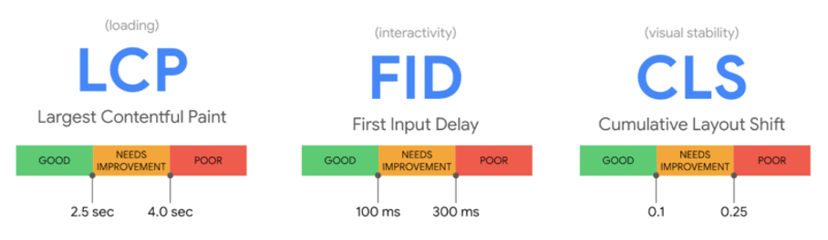
LCP < 2.5 s,CLS < 0.1,FID/INP < 200 ms.
Finish with Lighthouse or PageSpeed Insights; fix anything flagged red before moving to back-end development in Step 6.
Step 6: Build the Back-End Logic and Database
Front-end code makes things look slick; back-end code makes things work. If your site needs user accounts, gated content, real-time inventory, or any form submission beyond a basic email, you’ll need a server-side brain and a place to store data. Even if you’re leaning Jamstack, an API in the background will still handle business logic. The goal here is to choose technology that’s future-proof, easy to maintain, and secure from day one.
Choose a back-end language and framework
Pick tools your team can actually support rather than the trendiest logo. A quick comparison:
| Stack | Core Strengths | Typical NZ Hosting | Learning Curve |
|---|---|---|---|
| PHP + WordPress/Laravel | Huge plugin ecosystem, budget hosting | Abundant shared/VPS | Low–Medium |
| Node.js + Express/Nest | Same language front & back, real-time apps | Cloud/VPS | Medium |
| Python + Django/Flask | Batteries-included admin, data science tie-ins | VPS/Cloud | Medium |
| Ruby on Rails | Convention over config, rapid CRUD | Cloud | Medium |
| .NET Core | Enterprise integrations, Windows or Linux | Azure/NZCloud | High |
Factor in community size, documentation quality, and available developers when costing the project.
Design and create the database schema
Map out the entities your goals demand—users, products, orders, blog posts—then draw an ER-diagram to visualise relationships. Relational options (MySQL, PostgreSQL) excel at structured data and ACID compliance; NoSQL stores (MongoDB, DynamoDB) suit flexible or high-velocity datasets like IoT logs. Stick to naming conventions (snake_case for tables, singular nouns) and use foreign keys to enforce integrity. Early planning avoids “add column” emergencies months after launch.
Implement APIs and third-party integrations
Expose your data through REST (/api/v1/products) or GraphQL ({ product(id:1){name price} }) so the front end, mobile apps, or partner systems can consume it cleanly. Common add-ons include:
- Payment gateways (Stripe, Windcave)
- CRM sync (HubSpot, Zoho)
- Marketing automation (Mailchimp tags, Meta Conversions API)
- Shipping calculators (NZ Post API)
Abstract external calls into service layers so swapping providers later doesn’t torch the codebase.
Bake in security fundamentals
Security can’t be retrofitted. Tick off this baseline checklist before you push to staging:
- Force HTTPS with free Let’s Encrypt SSL and HSTS headers.
- Use environment variables for secrets—never commit API keys.
- Sanitize and validate all input; parameterise SQL queries to stop
DROP TABLEattacks. - Apply principle of least privilege: web user only needs
SELECT, INSERT, UPDATE, notDROP. - Schedule automatic dependency updates and weekly vulnerability scans.
Locking down early spares you midnight incident calls and protects customer trust—arguably the most valuable asset your website will ever store.
Step 7: Add Content and Optimise for SEO
Design and code alone won’t bring visitors or revenue; useful, discoverable content does. At this point in the website development guide you switch from pixels and pull-requests to words, images, and data that answer real questions, rank in Google, and persuade people to act. Treat content as an asset you’ll keep refining, not a one-off launch task.
Develop a content strategy and editorial calendar
Start by matching topics to each stage of the customer journey:
- Awareness – “What is custom joinery?” blog posts
- Consideration – comparison tables, cost calculators
- Decision – testimonials, case studies, FAQs
Group ideas in a spreadsheet with columns for target keyword, persona, funnel stage, format, author, and publish date. Batch-produce articles, video, and social snippets to maintain momentum, then schedule releases with project-management tools like Trello or Asana. A documented calendar keeps writers, designers, and subject-matter experts aligned and prevents “content drought”.
On-page SEO essentials
Search engines parse structure first, flair second:
- Perform lightweight keyword research using Google Keyword Planner or the free version of Ahrefs. Note intent as informational, transactional, or navigational.
- Place the primary keyword in the
<title>, one<h1>, first 100 words, meta description, image alt text, and URL slug (use hyphens, no stop words). - Nest subheadings (
h2–h3) semantically and sprinkle secondary phrases naturally. - Add internal links to related pages and include
schema.orgmarkup where relevant (FAQPage,Product).
These practices signal relevance without slipping into keyword stuffing—Google’s Helpful Content System is watching.
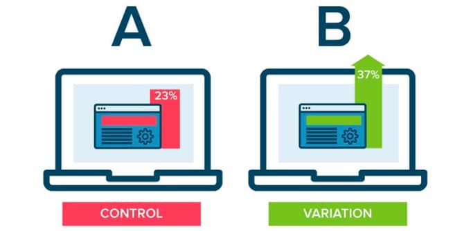
Conversion rate optimisation techniques
Ranking is pointless without conversions. Boost performance with:
- Clear, above-the-fold CTA buttons (one colour, one message per page)
- Short forms (ask only for what sales needs)
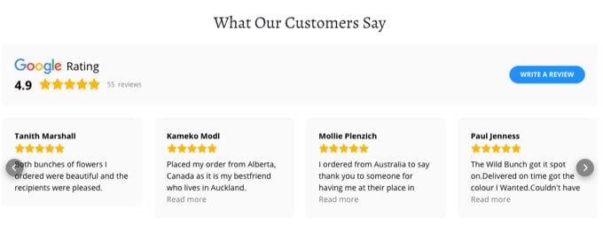
- Social proof – star ratings, media logos, user-generated photos
- Risk reducers – money-back guarantees, “no credit-card required” copy
Run A/B tests on headlines, imagery, or button colour using free tools like Google Optimize. Measure uplift against the SMART goals set in Step 1; kill anything that doesn’t move the needle.
Manage images, video, and downloadable assets
Media can lift engagement or tank load time. Follow this mini-checklist:
- Rename files with descriptive words:
custom-kitchen-joinery-nz.webp - Export images at 1× and 2×, compress to <100 KB where possible, and serve modern formats (WebP/AVIF).
- Add captions and transcripts to videos; host large files on YouTube or Cloudflare Stream to offload bandwidth.
- For PDFs or CAD drawings, indicate file size and open in a new tab (
target="_blank").
Optimised assets improve Core Web Vitals, especially Largest Contentful Paint, and keep accessibility boxes ticked.
Solid content paired with technical SEO transforms your site from brochure to growth engine—fuel that feeds every other step in this website development guide.
Step 8: Integrate Tools, Security, and Compliance
Your shiny new site now looks great, reads well, and functions smoothly. Before you lift the velvet rope and let real users in, you need the invisible layer that keeps everything measurable, lawful, and resilient. This step of the website development guide weaves in must-have tools, rigorous security, and regulatory box-ticks so you sleep at night and stakeholders trust the numbers on their dashboards.
Install essential plugins or extensions
Less is more; every extra plugin is another update and potential exploit. Curate a lean stack:
- Performance – server-level caching or a lightweight plugin such as WP Rocket or Swift Performance
- SEO – Yoast, Rank Math, or native module if you’re on Shopify/Webflow
- Security – Wordfence, Sucuri, or built-in WAF rules on Cloudflare
- Forms – Gravity Forms, Typeform embed, or platform form block
- Backups – UpdraftPlus, BlogVault, or a scheduled server snapshot
Deactivate and delete anything unused. Keep a changelog so future developers know why each extension exists.
Configure analytics and tracking
Data validates the SMART goals set in Step 1. A quick checklist:
- Create a Google Analytics 4 property and add the site tag (either
gtag.jsor via GTM). - Link GA4 to Google Search Console for query data.
- Define custom events: form submission, add-to-cart, phone click, PDF download.
- Enable Enhanced Conversions or Meta CAPI if you’re running ads.
- Add a privacy-friendly heat-mapping tool (Hotjar, Microsoft Clarity) to surface UX issues.
Verify events in real-time reports before launch; nothing is worse than discovering blank dashboards weeks later.
Meet legal and regulatory requirements
Compliance isn’t just for corporates. For New Zealand sites:
- Draft a plain-English Privacy Policy referencing the NZ Privacy Act 2020 and, if you trade overseas, relevant GDPR sections.
- Implement a cookie consent banner that allows opt-in for non-essential cookies.
- Include Terms of Service and refund policies; link them in the footer.
- Check WCAG 2.2 AA checkpoints—contrast ratios, focus indicators, captioned media—to head off accessibility complaints.
Document decisions so future audits are painless.
Establish backup, recovery, and SSL
Bad stuff happens—hardware fails, plugins clash, staff click phishing links. Mitigate:
- Set automated daily backups to an off-site location (AWS S3, Google Cloud Storage).
- Test a full restore on staging quarterly; screenshots aren’t proof.
- Enable free Let’s Encrypt SSL or a paid wildcard certificate; enforce HTTPS with 301 redirects and
Strict-Transport-Securityheaders. - Monitor uptime with Pingdom or Uptime Robot and receive instant SMS/email alerts.
With tooling, security, and compliance locked in, you’ve fortified your site for real-world chaos and set up reliable measurement for iterative growth. Next stop: shake the bugs out with a disciplined QA phase.
Step 9: Test, Debug, and Iterate for Quality Assurance
Launching without rigorous QA is like handing customers a wobbly ladder. A structured test cycle flushes out bugs, protects brand credibility, and confirms that every KPI you set back in Step 1 can be met. Run these passes on a staging server that mirrors production so fixes don’t break live traffic.
Functional testing: unit, integration, and user acceptance
Start at code level, then work up:
- Unit tests check individual functions (e.g., price calculator).
- Integration tests verify components talk to each other—database writes, API calls, payment hand-off.
- User acceptance testing (UAT) lets real stakeholders click through key journeys.
Feature checklist: navigation links, forms, checkout flow, log-ins, search, 404 page, email notifications. Log issues in Trello or Jira and retest after each patch.
Cross-browser and device compatibility
Render quirks still lurk in 2025. Use BrowserStack or the responsive mode in Chrome DevTools to cover:
- Desktop: latest Chrome, Safari, Firefox, Edge
- Mobile: iOS Safari, Android Chrome, Samsung Internet
Pay special attention to sticky headers, flex/grid layouts, and custom inputs—often the first to misbehave on smaller screens.
Performance and load testing
Speed is a ranking and revenue factor. Run Lighthouse, GTmetrix, or WebPageTest and aim for:
- Largest Contentful Paint < 2.5 s
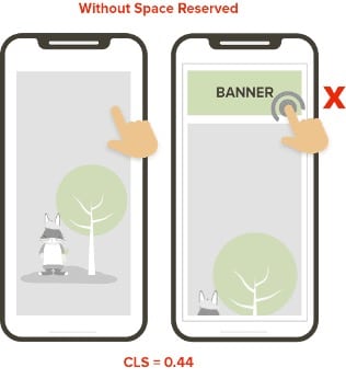
- Cumulative Layout Shift < 0.1
- Interaction to Next Paint < 200 ms
For traffic surges, script a k6 or JMeter test to simulate peak concurrent users; scale hosting or optimise queries where bottlenecks appear.
Final pre-launch checklist and stakeholder sign-off
Create a one-page, printable checklist covering SEO tags, analytics firing, backups, SSL, and legal pages. Circulate a staging link to decision-makers for last-minute approval, then freeze new feature requests—only critical bug fixes make the cut. A signed-off checklist is your green light to push the big red “Launch” button in Step 10.
Step 10: Launch, Measure, and Maintain for Continuous Growth
All the planning, design, and testing has led to this moment—pushing the site live without a hitch and then treating it as a living product that improves every month. A “launch-and-leave” mindset wastes the hard work you’ve invested so far; continuous measurement and maintenance are what convert a shiny new build into a lasting growth asset.
Deploy to production server
Aim for zero downtime. Use a blue–green or rolling deployment so visitors are automatically routed to the new version once health checks pass. Before the switch:
- Clone the latest staging database and media to production.
- Run final
composer install/npm ciand database migrations. - Update DNS A or CNAME records; lower TTL 24 hours beforehand to speed propagation.
- Verify SSL renewal and force HTTPS with 301 redirects.
Keep the old environment warm for a week as an instant rollback plan.
Post-launch monitoring and analytics review
First 72 hours are crucial. Set up:
- Uptime alerts via Pingdom or StatusCake (SMS/email on 5 min outages).
- Real-time GA4 dashboard tracking 404s, bounce spikes, and conversion events.
- Server metrics (CPU, RAM, disk I/O) inside your cloud console or New Relic.
Inspect logs for unexpected errors or bot attacks, and fix anomalies fast—early users are your most vocal promoters.
Routine maintenance and security updates
Schedule a monthly 30-minute “website WOF”:
- Apply CMS, plugin, and package updates on staging first.
- Back up files and databases; automate off-site copies.
- Run broken-link and security scans; patch vulnerabilities immediately.
Quarterly, optimise the database, clear media bloat, and retest Core Web Vitals. Document each task in a shared runbook so nothing slips through cracks when staff change.
Measure, learn, and optimise for growth
Data, not hunches, drives iteration. Adopt a simple loop:
- Hypothesise – “Shorter enquiry form will lift conversion by 10 %.”
- Test – Deploy an A/B variant with Google Optimize or Convert.
- Analyse – Review results against SMART goals; accept or reject.
- Iterate – Roll out winners, queue new experiments.
Pair quantitative insights with qualitative feedback from Hotjar recordings or customer emails. Over time you’ll refine UX, content, and marketing campaigns in lock-step, ensuring the website development guide you’ve followed continues to pay dividends long after launch.
Next Steps on Your Web Build Journey
You now have a battle-tested, ten-step playbook: set goals, lock down domains and hosting, map information, design the interface, code the front end, power it with a secure back end, craft optimised content, integrate tooling and compliance, test the living daylights out of it, then launch and iterate. Each stage builds on the last, so planning hard, staying glued to user needs, and committing to ongoing tweaks will separate a site that merely exists from one that drives measurable growth.
Pick your next action while the ideas are fresh. Maybe it’s sketching personas on a whiteboard, booking a host, or lining up a Lighthouse audit on your staging URL. Whether you DIY the whole build or bring in specialists for the heavy lifting, momentum is everything.
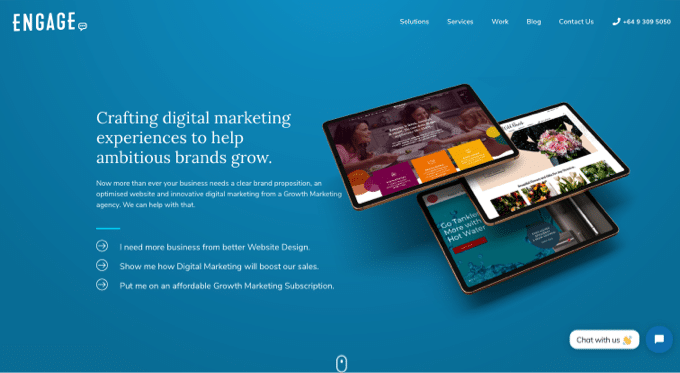
If you’d like seasoned pros to accelerate the journey—strategy, design, code, and marketing under one roof—explore how Engage Digital can help at Engage Digital. Bring your vision; we’ll supply the horsepower.