
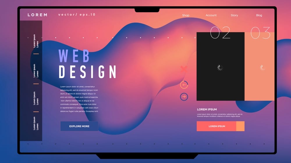
If you’re running a small business in New Zealand, you’ll know the frustration of a website that simply isn’t pulling its weight. Maybe you’re seeing a trickle of visitors, but hardly any enquiries land in your inbox. Or perhaps you sense your website looks a bit tired compared to your competitors, and you’re left wondering how many potential customers lose trust before they even pick up the phone.
The truth is, your website is often the first – and sometimes only – impression your business gets to make. Smart design is no longer just about looking good; it’s about building trust, guiding people effortlessly towards making contact, and turning browsers into buyers. Local data shows over 80% of Kiwis are browsing on their phones – and if a site loads slowly or is awkward to use, most will bounce within seconds, taking their business elsewhere.
The good news? With a handful of practical tweaks, you can transform your site into a genuine lead generator. In this guide, you’ll discover ten proven small business website design tips tailored for the New Zealand market. Whether your goal is more enquiries, online sales, or a steady pipeline of qualified leads, you’ll find actionable steps to lift conversion rates and grow your business.
Let’s get straight into the ten essential website design tips that can turn your site into a conversion powerhouse.
1. Optimise for Mobile Devices
More than 80% of New Zealanders now browse on smartphones, so planning for mobile first is no longer optional. According to Aotearoa Internet Insights 2024, a clunky mobile experience can see visitors abandon your site in seconds. By designing with smaller screens, touch interfaces and varying network speeds in mind, you’ll capture and keep the attention of on-the-go customers.
Start by adopting a responsive layout that fluidly adapts to any screen size. Simplify your navigation and position call-to-action buttons within easy thumb reach. Optimising performance—through faster load times and thumb-friendly tap targets—will reduce frustration and boost conversions on mobile devices.
Responsive Design Principles
Responsive design relies on three core concepts:
- Fluid grids: Layouts that use relative units (%, em, rem) instead of fixed pixels to scale content.
- Flexible images: Media that resizes within its container—often controlled via CSS rules like
max-width: 100%; height: auto;. - Media queries: CSS conditions (
@media) that apply different styles based on viewport width, orientation or resolution.
You don’t need to code from scratch. Popular CSS frameworks (e.g. Bootstrap, Tailwind) and page builders (like WordPress’s Block Editor or Shopify’s Dawn theme) offer responsive settings out of the box. As you design, think about stacking order: present your most important content first and collapse less critical sections below the fold on smaller screens.
Mobile Navigation Best Practices
A cluttered menu is a quick way to lose mobile visitors. Consider these approaches:
- Simplified menus: Limit top-level items to 4–6 labels, using clear, jargon-free titles.
- Icon-only nav bars: Pair recognisable icons with text labels or tooltips to save space.
- Expandable accordions: Hide submenus behind tap-to-expand panels instead of multi-layer dropdowns.
- Sticky header or hamburger icon: Keep navigation within thumb reach by pinning a collapsible menu at the top.
Avoid deep dropdowns and long menus that force excessive scrolling or multiple taps. Aim for a single, intuitive path to each page.
Real-Device Testing
Emulators only take you so far. Test on actual devices to spot quirks that might slip through:
- Test across major mobile platforms (Android, iOS) and popular screen sizes (phones, phablets, smaller tablets).
- Use tools like BrowserStack, Sauce Labs or a local device lab for remote debugging.
- Run a quick checklist:
- Touch targets: Ensure interactive elements are at least 44×44px.
- Viewport scaling: Confirm your pages include
<meta name="viewport" content="width=device-width, initial-scale=1">. - Font legibility: Check body text remains readable at arm’s length without pinch-zooming.
By validating on real hardware, you’ll catch performance or layout issues that could undermine the user experience and, ultimately, your conversion rate.
2. Improve Website Speed
Slow-loading pages frustrate visitors and hurt both conversions and search rankings. Research shows that even a one-second delay can shave off around 7% of conversions, while a 0.1-second improvement drove an 8.4% uplift for retail sites in a Deloitte study. To keep Kiwis engaged (and keep Google happy), you’ll want to audit and optimise every millisecond. Tools like Google PageSpeed Insights or GTmetrix will flag bottlenecks, while guides such as Kiwi Website Design Best Practices steer you through local optimisation tips.
Optimise Images and Media
Images often account for the bulk of a page’s weight. To trim file sizes without sacrificing quality:
- Use modern formats like WebP or AVIF, which can be 30–60% smaller than JPEGs.
- Compress assets via tools such as TinyPNG, Squoosh or ImageOptim.
- Implement lazy loading (
loading="lazy") so off-screen images only download when the user scrolls.
Example markup for a hero image:
<img
  src="hero-image.webp"
  alt="Your product highlight"
  width="1200"
  height="600"
  loading="lazy"
/>
By converting a 2 MB JPEG to a 200 KB WebP and deferring its load, you can shave nearly a second off your initial render.
Minimise Scripts and Plugins
Excess JavaScript and third-party plugins can block rendering and inflate load times. To streamline:
- Audit scripts via your speed-test waterfall (look for long “scripting” or “blocking” times).
- Defer or asynchronously load non-critical JS:
<script src="chat-widget.js" defer></script> - Cull unused WordPress plugins or consolidate multiple tracking tags into a single manager (e.g. Google Tag Manager).
- Replace heavy widgets (social feeds, pop-ups) with lightweight alternatives or embed them only when needed.
- Use server-side caching (e.g. Varnish or a WordPress caching plugin) to serve pre-built pages rather than generating them on each request.
Leverage Caching and CDNs
Caching and a content delivery network (CDN) ensure visitors fetch assets from the nearest edge, reducing latency:
- Enable browser caching via
Cache-Controlheaders so repeat visitors load static files from their local cache. - Use server-side caching (e.g. Varnish or a WordPress caching plugin) to serve pre-built pages rather than generating them on each request.
- Employ an edge CDN—Cloudflare’s free plan or networks like BunnyCDN (with a PoP in Auckland)—to distribute images, scripts and styles across global servers.
By pairing aggressive caching rules with a localised CDN, you’ll deliver resources in a blink, irrespective of where your customer is sitting with their device.
Together, these tactics will dramatically cut your page-load times, lift your ranking, and keep New Zealand users glued to your content rather than hunting for faster alternatives.
3. Use Clear Calls-to-Action
Your calls-to-action (CTAs) are the sign-posts that guide visitors towards taking action—whether that’s booking a consultation, downloading a guide or requesting a quote. A well-crafted CTA can turn casual browsers into engaged leads by making the next step obvious, irresistible and easy to complete. To get the best results, focus on three pillars: compelling copy, striking design and smart placement. Real-world examples include “Book a Free Consult”, “Get Your Quote Today” and “Start Your 14-Day Trial”.
Action-Oriented Language
Strong CTAs begin with an active verb followed by a clear benefit. Instead of generic text like “Submit” or “Learn More”, opt for phrases that describe exactly what the user will gain:
- Ineffective: “Click Here”
- Effective: “Download Your Free Guide”
Split-test examples can highlight the difference. A/B tests often show that swapping “Download the Report” for “Get My Free Report” boosts click-through by up to 20%—the personal pronoun and word “free” make the offer more enticing. Similarly, “Reserve Your Spot” usually outperforms “Sign Up Now” because it conveys limited availability.
Design and Colour Contrast
Your CTA needs to stand out at a glance. Use bold button shapes, generous padding and a colour that contrasts sharply with your background. Check that your text meets WCAG AA contrast ratios (at least 4.5:1 for body text). Key design tips:
- Button size: minimum 44×44px tap area for comfortable clicking.
- Hover states: add a subtle shade or outline to signal interactivity.
- Whitespace: surround buttons with plenty of breathing room so they don’t get lost in nearby text or images.
Tools like the WebAIM Contrast Checker can help you verify accessible colour combinations. Once your design is polished, test hover and disabled states to ensure they’re clear and consistent across devices.
Strategic CTA Placement
Placement is just as crucial as copy and design. Position your primary CTA where users expect it and where they have the strongest intent:
- Hero section: anchor a prominent button immediately under your headline.
- Content breaks: add inline CTAs after key service or product descriptions.
- Sticky or floating bars: keep contact options visible on long pages or blog posts.
For example, a “Get Your Quote Today” button in the hero banner captures new visitors, while a secondary “Chat with Us” floating button ensures support is always within reach. On sidebars, highlight a “Download Case Study” CTA next to related content. By mapping CTAs to high-intent zones, you’ll guide visitors smoothly towards conversion without overwhelming them.
4. Build Trust and Credibility
Trust signals on your website help ease visitors’ minds, reduce friction and boost the likelihood they’ll pick up the phone or submit an enquiry. When people feel confident you’ll deliver on your promises, they’re far more likely to become customers. By weaving in genuine testimonials, authentic imagery, clear team information and recognised security marks, you’ll turn sceptical browsers into engaged leads.
Showcase Client Testimonials
Nothing speaks more loudly than a satisfied customer. Full-length quotes, complete with the client’s name, job title and photo, add authenticity and help potential customers visualise working with you. If you have video testimonials, embed them in your case-study or service pages for maximum impact.
Consider layouts that encourage engagement:
- A rotating testimonial slider on your homepage for quick social proof.
- A static grid or masonry gallery on a dedicated testimonials page so visitors can browse multiple success stories.
- A “Read the full story” link that takes users to in-depth case studies, complete with before-and-after metrics.
Always attribute each quote clearly. If you can, include a link or logo of the client’s business (with permission) to reinforce authenticity.
Real Photography and Team Bios
Generic stock images are easy to spot—and they rarely convey your unique brand personality. Invest in a local photographer to capture:
- Your workspace or showroom, so visitors feel familiar with your environment.
- Behind-the-scenes moments that humanise your process.
- Portraits of your team in natural settings, reflecting your company culture.
On your “About Us” or “Team” page, structure each profile with:
- A professional photo.
- Name and role.
- A brief bio outlining expertise and a personal detail or fun fact.
These bios make you relatable and show there are real people ready to solve real problems, not faceless entities hiding behind a website.
Prominent Security Badges
Security badges reassure users their data is protected, especially on contact forms or e-commerce checkouts. Prominently display:
- An SSL padlock icon or “Secure” badge near form fields.
- Logos for your payment gateways (e.g. Visa, Mastercard, PayPal).
- Membership or accreditation badges (for example, your local Chamber of Commerce or industry awards).
Position these trust marks:
- Beside or just below your primary CTA buttons.
- In the footer of every page.
- On your checkout or payment page where transaction confidence is critical.
By thoughtfully integrating client testimonials, genuine visuals, team bios and recognised security marks, you’ll create an environment of reliability and authority—essential ingredients for higher conversions and lasting customer relationships.
5. Simplify Website Navigation
When visitors arrive on your site, they should instinctively know where to go next. A clear, intuitive navigation structure reduces bounce rates, encourages deeper exploration and ultimately leads to more enquiries or sales. According to Coast Design Studio, a streamlined menu and straightforward pathways are essential in guiding users to high-value pages—whether that’s your services, pricing, or contact form.
Start with a flat menu structure that surfaces your most important pages in a single click or tap. Combine that with helpful in-page cues—like breadcrumbs—and a visible search bar to catch anyone who still prefers typing over clicking. Finally, mirror your primary navigation in the footer with key links and legal pages so users never feel lost, even after scrolling to the very bottom.
Clear Menu Hierarchy
- Limit top-level items to five or six clear, descriptive labels
- Avoid industry jargon—use terms your customers actually search for (e.g. “Our Services” rather than “Solutions”)
- Group related pages under logical headings, but resist deep dropdowns—two levels max keeps things simple
By flattening your menu, you reduce decision fatigue and help visitors find what they need in an instant.
Breadcrumbs and Site Search
Breadcrumb trails show users their exact path through your site, helping them back-track without confusion. Place them just below the main header or page title, in a format like:
Home > Services > Digital Marketing
Alongside breadcrumbs, a prominent search box—ideally in the header or hero area—caters to those who know exactly what they want. Many CMS platforms offer built-in search widgets, or you can integrate a third-party solution for more advanced filtering and auto-complete functionality.
Footer Navigation
Your footer is the safety net for visitors who scroll to the end. Include:
- A mini-sitemap with links to About, Services, Blog and Contact pages
- Legal essentials like Privacy Policy and Terms of Service
- Social media icons and a newsletter signup field
Organise these elements into two or three columns for clarity. Even if someone misses your main menu, the footer provides a last chance to guide them back to your core content.
With a simplified navigation system—clear menus, helpful breadcrumbs and a comprehensive footer—you’ll keep users engaged and reduce the risk of them bouncing off to a competitor’s site.
6. Use High-Quality, Brand-Aligned Visuals
People form an opinion about your business within seconds of landing on your site—and much of that judgement comes from what they see. Crisp, on-brand imagery and graphics convey professionalism, build trust and hold attention far longer than text alone. When your visuals reflect your unique style and values, visitors immediately recognise that you care about every detail of their experience.
Resist the temptation to fill key pages with generic stock photos that anyone could find online. Instead, invest in visuals that reinforce your brand story—whether that’s a behind-the-scenes shot of your team at work or a short video walkthrough of your flagship product. By tailoring every image, graphic or animation to your identity, you’ll connect more deeply with Kiwi customers who appreciate authenticity.
Alongside careful creative choices, you’ll want to optimise these assets so they never slow down your site. Dimension, file size and display quality all matter: oversized images will frustrate visitors, while poorly scaled graphics can look fuzzy on high-resolution screens. In the sections below, we outline how to plan, produce and deliver standout visuals that elevate both your brand and your site’s performance.
Custom Photography and Videography
Hiring a local photographer or videographer ensures your visuals feel genuine rather than off-the-shelf. Consider these ideas:
- Team and culture portraits: Capture candid moments in your office or workshop to humanise your business.
- Product demos: Short clips showing your offering in action help prospects understand features and benefits instantly.
- Location shots: If you have a physical store or unique workspace, showcase it to strengthen local ties.
These real-world visuals can feature on service pages, your “About Us” section or social feeds embedded in your site. A quick office-tour video or time-lapse of a project adds dynamism and gives visitors a peek behind the curtain.
Branded Graphics and Icons
Custom graphics and icons reinforce your colour palette, typography and tone of voice at a glance. To get the best results:
- Create infographics that explain processes (e.g. “How Our Lead-Gen System Works”) using your brand fonts and hues.
- Source or design SVG icons so they render sharply on any device and scale without pixelation.
- Build simple charts or data visuals that match your style—even basic bar graphs or percentage circles can feel uniquely yours when styled correctly.
By weaving these elements into your layout—whether as section headers, bullet-point highlights or service overviews—you’ll achieve a cohesive look that keeps users orientated and engaged.
Visual Asset Optimisation
Even the most stunning image needs careful preparation before it hits your site:
- Compression tools: Use TinyPNG, Squoosh or ImageOptim to reduce file sizes without noticeable quality loss.
- Correct dimensions: Export separate versions for thumbnails, banners and hero images. Avoid relying on CSS to downscale huge files.
- Retina-ready assets: Provide 2× resolution images (e.g. 2048×1024 instead of 1024×512) and set
srcsetattributes so high-PPI screens load sharper versions.
Combine these practices with lazy loading for off-screen images (loading="lazy") and you’ll preserve page speed even as you showcase rich media. Delivering polished, brand-aligned visuals that load swiftly will leave a lasting impression—and boost your conversion rate in the process.
7. Leverage Social Proof and Testimonials
Social proof is a powerful nudge—when visitors see that other customers have had positive experiences, they’re far more likely to trust your service or product. By showcasing genuine reviews, star ratings, case studies and even live social feeds, you’ll tap into the persuasive effect of peer validation. In a market where reputation matters at least as much as price, these trust anchors can be the deciding factor between a casual browse and a firm enquiry.
Display Customer Reviews and Ratings
Customer reviews and average star ratings act as instant credibility signals. Integrate review widgets from platforms you use most—whether it’s Google My Business, Facebook or third-party sites like Trustpilot. A few ways to make them work harder:
- Place an overall star rating in your header or beside key call-to-action buttons.
- Feature a recent five-star quote on your homepage or service pages.
- Link each review to the original source to maintain transparency.
Encourage happy customers to leave feedback by including a review link in your follow-up emails, invoices or even on printed receipts. Fresh testimonials remind prospective buyers that you consistently deliver great results.
Feature Case Studies
While snippets and stars serve as quick wins, in-depth case studies tell your story in full. Structure each case study around three parts:
- The challenge your client faced (e.g. lagging sales, clunky website)
- The solution you provided (redesign, targeted campaigns, new feature)
- The result, backed by data points (conversion uplift, time saved, revenue growth)
Use before-and-after visuals, pull-out quotes and clear statistics to bring these success stories to life. A “Read the full case study” link can drive visitors into a dedicated page where they can explore the details and download a PDF if they want a takeaway.
Embed Social Media Feeds
Live social media feeds let visitors see real-time engagement and posts that reflect your brand personality. Whether it’s an Instagram grid of finished projects or a LinkedIn feed of client success announcements, embedding these streams adds dynamic social proof:
- Choose feeds that regularly update with customer-focused content.
- Moderate posts to ensure any off-brand or low-quality content is filtered out.
- Position feeds in a sidebar, on your homepage, or in a dedicated “Social Wall” section.
By blending curated reviews with ongoing social activity, you’ll present a rounded picture of satisfied clients and an active, engaged community—two key ingredients in steadily boosting conversions.
8. Test and Refine with A/B Experiments
Even the best design is based on assumptions—A/B testing lets you replace guesswork with data-driven decisions. By running controlled experiments, you uncover which headlines, images or button colours truly resonate with your audience. Over time, this iterative process turns small wins into significant uplifts in conversions, revenue and user satisfaction.
Start with a clear hypothesis—“Changing the hero headline from generic to benefit-driven will increase click-through rates.” Then create a variant (B) and split your traffic, measuring performance against your original (A). Once you’ve collected enough data for statistical significance, roll out the winner and document your learning. Rinse and repeat on the next element.
Popular testing tools include Google Optimize (free and easy to integrate), VWO and Optimizely for more advanced heatmaps and personalisation. Many CMS platforms—such as WordPress and Shopify—also offer built-in split-testing plugins. However you choose to test, link experiments to your analytics (e.g. Google Analytics or a tag manager) for consistent tracking.
Identifying Elements to Test
To get the highest lift, focus on high-impact areas of your site:
- Headlines: Swap benefit-driven versus feature-focused copy to see which grabs attention.
- Calls-to-Action: Experiment with different verbs, colours or button shapes.
- Hero Images: Test lifestyle photography against product-focused visuals.
Begin with simple, single-variable tests—such as changing button text from “Get Started” to “Claim Your Free Quote”—before attempting multi-element redesigns. This isolates which factor influences user behaviour.
Analysing and Iterating
Clear metrics guide effective iteration. Depending on your experiment, track:
- Click-through rate (CTR): For buttons or banners.
- Form completions: Number of enquiries or downloads.
- Revenue per visitor: Especially relevant for e-commerce.
Review results in your testing dashboard or via Google Analytics goals. Look for statistically significant differences—ideally ≥95% confidence—before declaring a winner. If neither variant outperforms, dig into qualitative feedback (session recordings or on-page surveys) to unearth roadblocks and refine your next hypothesis.
Documenting Learnings
A test without documentation is a missed opportunity. Keep a central log of:
- Test name & date: So you can trace past experiments.
- Variants: Description of A and B changes.
- Results: Key metrics, uplift percentages and confidence levels.
- Action taken: Which version won, and your next steps.
Over time, this repository becomes a playbook for future designs and campaigns. You’ll spot patterns—like certain colour palettes underperforming or headline styles that consistently drive clicks—and use those insights to fast-track optimisation.
By treating your website as an ongoing experiment rather than a finished product, you’ll steadily refine user journeys, boost conversions and stay ahead of changing customer preferences.
9. Provide Clear Contact Information
Even if your site nails every other tip, visitors will hit a dead end if they can’t find a way to reach you. Clear, prominent contact details reduce friction and stop enquiries slipping through the cracks. By making phone numbers, email addresses and forms instantly accessible, you’ll capture more leads and keep potential customers engaged.
Whether someone wants a quick chat, a detailed quote or simply directions to your office, they should never be more than a scroll or two away from the right contact method. Below are three key areas to lock down for maximum accessibility.
Header and Footer Placement
Your contact options should live in the two places every visitor sees: the header and the footer.
-
Header:
- Display your phone number in a clickable “tel:” link so mobile users can tap to call.
- Include a mailto link for email enquiries.
- If you have a physical address, a small map-pin icon next to your address can open Google Maps for easy directions.
-
Footer:
- Repeat your phone, email and address here in a concise block.
- Group social icons and newsletter signup under “Stay in Touch”.
- Add any legal links (Privacy Policy, Terms of Service) close by, so everything is tidy yet complete.
By sandwiching your contact details between header and footer, you make it effortless for site visitors to get in touch at every stage of their journey.
Contact Page Essentials
A dedicated contact page is the natural destination for anyone wanting more information. Keep it focused, clear and as frictionless as possible:
-
Short Form:
- Ask only for essential fields: Name, Email, Phone and a free-text Message box.
- Use anti-spam tools like a simple CAPTCHA or honeypot field—keep it unobtrusive.
-
Multiple Options:
- Offer direct links for phone (
tel:) and email (mailto:). - Embed a live Google Map or link to Apple Maps for on-site visits.
- If you handle urgent enquiries, mention typical response times (e.g. “We’ll get back to you within 2 business hours”).
- Offer direct links for phone (
-
Visual Clarity:
- Break your page into clear sections: “Send Us a Message”, “Call Us”, “Visit Us”.
- Use icons or contrasting backgrounds to distinguish each method.
This approach ensures every visitor finds their preferred contact method quickly—whether they’re ready to write, call or drop in.
Live Chat and Chatbots
For many businesses, live chat is the digital equivalent of having a receptionist at the door. It’s perfect for answering simple questions instantly, and it captures leads who might otherwise bounce.
-
Choosing a Tool:
- Evaluate solutions like Intercom, Drift or the free Tawk.to.
- Consider ease of setup, pricing and how well it integrates with your CRM or email system.
-
Coverage and Tone:
- Decide whether you’ll staff chat during business hours only or offer 24/7 automated responses.
- Use friendly, concise canned replies for common queries (“Our office hours are 9am–5pm; we’ll reply by 5pm today.”).
-
Escalation Paths:
- Route detailed or technical questions to email or phone follow-up.
- Capture lead details (name, email) before opening the chat window so you can re-engage if they close the window.
By layering live chat on top of your header, footer and contact page, you cover every enquiry style—from quick questions to full proposals—and make it as easy as possible for visitors to become leads.
10. Ensure Web Accessibility Compliance
Making your website accessible isn’t just a nice-to-have—it’s a legal requirement for many organisations and a moral imperative if you want to reach every potential customer. By aligning your site with the New Zealand Government Web Accessibility Standard and WCAG 2.2 Level AA, you’ll eliminate barriers for people with disabilities, boost usability for all, and reduce the risk of complaints or litigation. Plus, accessible sites often benefit from better SEO and cleaner code, so it’s a win–win.
Start by carrying out a simple self-assessment: use automated tools like WAVE or axe and manual checks (keyboard-only navigation, screen-reader trials) to spot glaring issues. Public sector sites must report their conformance under the NZ Government Web Standards on accessibility, but every business can adopt these best practices to ensure no one is left out.
Colour Contrast and Text Scaling
Good contrast and flexible text sizes are the first line of defence for visually impaired users. Aim for at least a 4.5:1 contrast ratio on body text and 3:1 for large text (24px or 19px bold). Colour-contrast checkers (for example, the WebAIM Contrast Checker) let you test combinations in seconds.
Beyond contrast, let your users control font sizes:
- Define base font sizes in
remoremunits rather than pixels. - Avoid fixed heights on containers so text can reflow naturally.
- Test at 200% zoom in your browser to ensure layouts don’t break and text remains legible.
Keyboard and Screen-Reader Support
Not everyone uses a mouse—ensure every interactive element (links, buttons, form fields) can be reached and activated with the Tab key. Visual focus indicators (clear outlines or underlines) should make it obvious where the user is on the page.
For screen-reader users:
- Add ARIA roles and landmarks (
<nav>,<main>,<header>,<footer>) to define regions. - Provide meaningful
altattributes on images andaria-labeloraria-labelledbyfor form controls. - Group navigation links in logical lists (
<ul>/<li>) so screen-readers announce them correctly.
Captioning and Audio Descriptions
If your site features videos, transcripts and captions are non-negotiable. Quality captions not only help Deaf or hard-of-hearing users but also keep all visitors engaged when sound isn’t an option (e.g. in open-plan offices).
For richer media:
- Include captions on all prerecorded content.
- Offer live captions for webinars or high-priority streams.
- Provide audio descriptions for video segments where essential information is conveyed visually (e.g. charts, diagrams or on-screen text).
Accessibility Statement
Transparency is key—publish a concise accessibility statement in your footer or on a dedicated page. It should:
- Declare your current level of WCAG conformance (for instance, “This site aims to meet WCAG 2.2 Level AA”).
- Outline any known gaps and your plan to address them.
- Provide a contact (email or web form) where users can report barriers or request assistance.
By inviting feedback, you demonstrate genuine commitment and can continually refine your site. An accessible website isn’t a one-and-done project; it’s an ongoing promise to include everyone in your digital experience.
Ready to Convert More Visitors?
You’ve now covered ten practical website design tips tailored for New Zealand small businesses—from mobile-first layouts and lightning-fast loading times, to clear calls-to-action, social proof and inclusive accessibility standards. Each tweak you make improves the chances that a casual browser turns into a genuine lead, whether that’s via an enquiry form, a phone call or an online purchase.
Take a moment to audit your own site against these best-practice pointers. Check how your pages perform on a phone, test your CTA copy and placement, review your navigation hierarchy and run a quick accessibility scan. Even small changes can deliver outsized gains in visitor engagement, enquiry numbers and sales.
If you’d like a hand turning these strategies into results, our team at Engage Digital can help. We specialise in high-impact website design, growth marketing and lead-generation systems that lift traffic, boost conversions and accelerate real-world business growth—so you can spend less time tweaking your site and more time enjoying the enquiries rolling in. Get in touch to see how we can transform your website into your most powerful sales tool.
