Picture this: you’ve invested time and money into attracting visitors to your website, only to watch most of them slip away without ever making contact, enquiring, or buying. For New Zealand’s small and medium-sized businesses, that’s not just a missed opportunity—it’s lost revenue. Yet even a modest lift in your website’s conversion rate can transform results; for many, moving the needle by just 1% means dozens more leads each month and a tangible jump in sales.

But what exactly is a “conversion”? Whether it’s a completed sale, a contact form submission, or a newsletter sign-up, every meaningful action a visitor takes on your site helps move your business forward. The challenge: most sites convert less than 3% of visitors into leads or customers, and many perform well below that benchmark. The good news? Conversion rates aren’t set in stone—they’re the outcome of strategic choices, clear measurement, and ongoing refinement.

If you’re ready to make your website work harder (and smarter) for your business, this article distils the 10 most effective, actionable tips for improving website conversion. You’ll discover how to attract quality traffic, create seamless user journeys, build trust, and turn more visitors into genuine leads—without guesswork or jargon. Let’s get started.

1. Set Clear Goals and Track Conversions Accurately

Any optimisation effort starts with knowing exactly what “success” looks like. Without specific goals and reliable tracking in place, you’ll be shooting in the dark—and you can’t improve what you can’t measure. Clear objectives help you focus on the actions that matter most, and accurate data shows you whether your changes are paying off.

Identify Macro and Micro Conversions

Before you dive into analytics, map out the key actions visitors can take:

  • Macro conversions
    These are primary business outcomes, such as:
    • Completed sale or quote request
    • Enquiry or contact-form submission

  • Micro conversions
    These smaller interactions signal interest and pave the way to a macro conversion, for example:
    • Newsletter or blog subscription
    • Downloading a whitepaper or guide
    • Clicking a “Request a demo” button

Tracking both types of conversions gives you a fuller picture of your funnel. Micro conversions highlight where your audience is warming up, while macro conversions show the bottom-line impact.

Implement Conversion Tracking in Analytics and Ads

Once you’ve defined your conversions, it’s time to configure your tools:

  1. Google Analytics 4 (GA4)

    • Sign in to GA4 and go to Events. Identify or create the event you want to track (e.g. form_submit).
    • Mark the event as a conversion so GA4 reports on it automatically.
    • For page-view goals (e.g. thank-you pages), use the “Create conversion” option and set the page URL match.
  2. Google Ads Conversion Tracking

    • In Google Ads, navigate to Tools & Settings → Conversions and click “+ New conversion action”.
    • Choose “Website” and follow the wizard to install the global site tag and event snippet.
    • For detailed instructions, see Google’s guide on Google Ads conversion tracking.
  3. Best practices

    • Adopt consistent naming conventions (e.g. ContactForm_Submit) to avoid confusion.
    • Assign values to conversions where possible—this helps calculate ROI automatically.
    • Enable cross-device tracking in both GA4 and Google Ads so you can attribute conversions to the right touchpoints, even if users switch devices.

Monitor and Report on Performance

Tracking is only useful if you review it regularly and act on the insights:

  • Reporting cadence
    • Weekly snapshots for quick course corrections
    • Monthly deep dives to spot trends

  • Key metrics to watch
    Conversion rate (macro and micro)
    • Cost per conversion (in Google Ads and social campaigns)
    • Assisted conversions (other channels that contributed)
    • Conversion value and overall ROI

Set up automated dashboards or reports in GA4, Google Ads and your preferred BI tool to keep these numbers front of mind. With clear goals and robust tracking in place, you’ll know exactly which changes drive more leads—and which don’t.

2. Optimise Site Usability and Accessibility for All Users

A site that’s intuitive to navigate and accessible to everyone not only keeps visitors engaged longer but also signals credibility and care—two qualities that drive conversions. By streamlining how people find information and ensuring your content meets Web Content Accessibility Guidelines (WCAG), you’ll open your digital doors to more potential leads and demonstrate that you value every user’s experience.

Simplify Navigation and Page Layout

• Use clear, descriptive menu labels (“Services” instead of “What We Do”) and arrange items in a logical hierarchy.
• Minimise on‐page distractions by limiting navigation links on landing and product pages—strip out sidebars or irrelevant links so your primary call-to-action stands out.
• Break long pages into scannable sections with concise headings and bullet points, then highlight the next step (contact form, quote request or demo) with contrasting buttons and directional cues.

Comply with New Zealand Web Accessibility Standard 1.2

Meeting NZ Government Web Accessibility Standard 1.2 (aligned with WCAG 2.2 Level AA) does more than tick a legal box—it broadens your audience and builds trust. Key essentials include:

• Alt text for meaningful images, so screen-reader users understand visual content.
• Keyboard-only navigation and visible focus states to help people who can’t use a mouse.
• Sufficient colour contrast for text and interactive elements, ensuring readability for low-vision visitors.
• Descriptive link text (“Read our privacy policy” rather than “Click here”) and properly labelled form fields for clarity.

Conduct Regular Usability Testing

Even minor friction points—an unresponsive button or a confusing form label—can kill a conversion. Schedule periodic usability reviews to catch and fix these issues early:

• Analyse session recordings to see where users hesitate, repeatedly click or abandon tasks.
• Run first-click tests (using remote tools or simple user interviews) to confirm that people instinctively know where to go next.
• Hold short remote interviews or surveys with real customers to surface pain points you might not have spotted.
• Prioritise fixes based on impact: start with UX blockers on key pages (home, product, contact) before polishing secondary content.

By combining a clear, streamlined layout with full accessibility compliance and ongoing usability feedback, you’ll create a site that naturally guides every visitor towards the actions you care most about.

3. Improve Page Speed and Ensure Mobile Responsiveness

A slow or clumsy site can derail your best conversion efforts, no matter how compelling your messaging or design. Every extra second your pages take to load increases the chances of a visitor bouncing—and on mobile, impatient users expect almost-instant answers. By focusing on performance and a true mobile-first approach, you’ll keep more visitors engaged and ready to act.

Techniques to Reduce Load Times

Optimise images – Compress files and use next-generation formats (WebP, AVIF) to cut download size without sacrificing clarity.
Minify and defer code – Remove unused CSS and JavaScript, and defer non-critical scripts so they don’t block the initial render.
Leverage caching and a CDN – Set sensible browser-cache headers and serve static assets (images, fonts, scripts) from a Content Delivery Network close to your users.

These measures can shave precious seconds off page load, lowering bounce rates and boosting conversions.

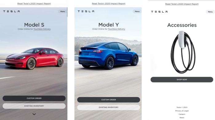
Adopt a Mobile-First Design Mindset

With over half of web traffic now coming from smartphones, crafting experiences around small screens is essential:

Design for thumb zones – Place primary calls to action within easy reach of a thumb or natural scrolling area.
Simplify the layout – Use a single-column structure, concise headings, and minimal form fields to reduce cognitive load.
Prioritise essential content – Hide or collapse less important elements behind accordions or progressive disclosure to keep screens uncluttered.

By thinking mobile first, you’ll also improve desktop usability, as the same principles of clarity and simplicity apply across devices.

Test Across Devices and Networks

Performance can vary wildly by device, browser and connection speed. Make testing part of your routine:

Automated tools – Run Google PageSpeed Insights or GTmetrix to get lab-based performance scores and actionable recommendations.
On-device trials – Check real-world loading on smartphones and tablets over 3G/4G connections, noting how long key page elements take to appear.
Iterate and monitor – Track your Core Web Vitals (Largest Contentful Paint, First Input Delay, Cumulative Layout Shift) and set alerts so you catch regressions before they affect your conversion rates.

By combining optimisation with thorough, device-diverse testing, you’ll ensure fast-loading pages that convert—whether your visitors are on a desktop in Auckland or on a mobile network in rural New Zealand.

4. Craft a Compelling Value Proposition and Clear Messaging

Crafting the right message is the single most important factor in convincing prospects to stick around—and ultimately to convert. Your value proposition isn’t just a slogan; it’s the ‘why you’ that sets you apart. Clear, benefit-focused messaging eliminates doubt, builds trust, and guides visitors towards taking action.

Define and Differentiate Your Unique Selling Point

A Unique Selling Point (USP) speaks directly to your customer’s needs and highlights what only you can deliver. Begin by listing features (what your product or service is) and then translate each into a benefit (what your customer gets). For example, “24/7 support” becomes “peace of mind, day or night.”

Aim to distil your USP into a single, memorable sentence of no more than ten words. This forces you to be laser-focused on what truly matters. Ask yourself: “What is the one thing we do better than anyone else?” Workshop ideas with your team and refine them until you land on the most compelling version.

Communicate Benefits Clearly Above the Fold

Your headline is often the only line of copy many visitors read, so make it punchy, customer-centred and immediately clear. Follow it with a concise sub-headline that expands on the primary benefit, then reinforce with three supporting bullet points:

  • Headline: “Convert More Leads Without Blowing Your Budget”
  • Sub-headline: “Our growth marketing plans combine SEO, Google Ads and conversion optimisation for predictable ROI.”
  • Bullets:
    • Bespoke website design optimised for speed and mobile
    • Monthly reports with actionable insights and A/B test results
    • No lock-in contracts—scale up or down as you grow

Steer clear of jargon and marketing fluff. Write as if you’re explaining your service to a business owner over coffee—straightforward, friendly and benefit-driven.

Test and Refine Messaging with Visitors

Even the best-crafted copy is only as good as the response it elicits. Use A/B testing to compare headlines, sub-headlines or bullet-point arrangements and let real visitor behaviour determine the winner. Heatmaps help you identify which sections grab attention and which are being skipped—use that insight to sharpen or reposition your core proposition. Over time, this data-driven approach ensures your messaging consistently engages users and drives more conversions.

5. Streamline the Conversion Path and Reduce Friction

Even the most compelling offer can fall flat if the journey from interest to action is cluttered or confusing. Each extra click, form field or dead-end link adds friction—small frustrations that can cost you big in abandoned carts and half-finished enquiries. By simplifying every step in the conversion path, you make it easier for visitors to say “yes” and complete the action you want.

Reduce and Simplify Form Fields

Visitors are far more likely to abandon a form that feels like homework. Only ask for the information you truly need up front, then gather the rest later via progressive profiling or follow-up communications.

• Only collect essential data: name, email and one or two qualifying questions (e.g. “What’s your project budget?”).
• Use intelligent defaults and autofill (for addresses or company details) to speed up entry.
• Offer social sign-in (Google, LinkedIn) so returning prospects don’t have to remember another username or password.

A lean, well-structured form not only feels less intimidating but also demonstrates respect for your visitor’s time.

Enable Guest Checkout and One-Page Flows

Forcing visitors to create an account before they buy can kill conversions. By offering a guest checkout option and grouping all purchase steps onto a single page, you remove barriers that may cost millions in lost sales.

One famous example is the “$300 million button” case study, where a retailer increased sales by simply changing or removing a login requirement. Once they let customers check out without registering, revenue soared—and the lesson is clear: make buying as frictionless as possible.

• Allow guest checkout so new customers can complete their purchase in one go.
• Combine shipping, payment and order-review steps into a single, scrollable page.
• Clearly label each section (e.g. “1. Shipping details”, “2. Billing & payment”) to reassure users they’re nearing completion.

Provide Clear Navigation Cues and Next-Step Prompts

Clarity and guidance are vital at every stage of the conversion path. Visitors shouldn’t have to guess what to do next or hunt for the right button.

• Highlight your primary call to action with a contrasting colour and plenty of white space around it.
• Use directional cues—arrows, lines or even subtle animation—to draw the eye towards the next step.
• On multi-step processes, include progress indicators (e.g. “Step 2 of 3”) so users know how much remains.
• Add inline hints or short tooltips for any fields or options that might cause uncertainty.

By consistently signalling the right path forward, you keep users focused, confident and more likely to complete the journey you’ve designed.

6. Build Trust with Social Proof, Security Signals and Privacy Transparency

Before visitors hand over their details or click “Buy now”, they need to feel confident in your credibility and confident their information is safe. By layering authentic social proof, clear security indicators and straightforward privacy messaging throughout your site, you’ll break down doubts and inspire more leads.

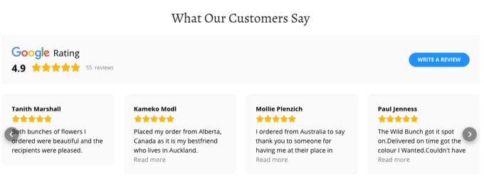
Showcase Testimonials, Reviews and Case Studies

Nothing speaks louder than the voice of a satisfied customer. Scatter well-placed endorsements around critical pages—especially alongside calls to action—and let prospects hear success stories in their own words.

  • Customer quotes near CTAs:
    Placing a short, punchy testimonial next to your form or button can tip the balance. For example, “We saw a 40% uplift in enquiries after working with Engage Digital—absolutely worth it!”
  • Star ratings and review widgets:
    Integrate real-time ratings or snippets from Google Reviews, Facebook or industry directories. Just seeing a “4.8/5” average can reinforce the decision to engage.
  • Before-and-after case studies:
    Showcase tangible outcomes—“From 200 visits to 1,500 leads per month” or “100% revenue growth in six months”—to paint a clear picture of what you deliver. A PDF download of a full case study offers depth for prospects who need more convincing.

Display Trust Badges and Secure Checkout Indicators

Security symbols aren’t just decoration—they’re visual cues that your site is legitimate and that transactions are safeguarded.

  • SSL and padlock icons:
    The familiar green padlock in the browser bar reassures users at a glance. If you accept card payments, make sure your SSL certificate is up to date and prominently displayed.
  • Payment partner logos:
    Show recognised badges for Visa, MasterCard, PayPal or Afterpay at the point of purchase. Seeing a trusted payment brand reduces anxiety around entering card details.
  • Industry certifications and affiliations:
    Whether it’s an ISO certification, NZ Marketing Association membership or an award from a local chamber of commerce, make your credentials visible—ideally with a small logo and a tooltip or link for more details.

Clearly Communicate Privacy Practices

In an era of data breaches and spam, people want to know exactly how their information will be used. Simple, transparent privacy messaging builds goodwill and reduces reluctance to share personal details.

  • Brief privacy statements:
    Under each form, include a line like “We respect your privacy. Your details are never shared.” Link the words “privacy” to a dedicated policy page.
  • Link to official guidance:
    Point users to the Office of the Privacy Commissioner’s advice on data collection so they can see you’re following best practice. For example:
    “We collect only essential information in line with Privacy Commissioner guidelines.”
  • Opt-in clarity:
    If you invite subscribers to newsletters or marketing emails, use explicit checkboxes rather than pre-ticked boxes. Let users choose, and be clear about what they’re signing up for.

By weaving genuine testimonials, unmissable security cues and concise privacy assurances into your site, you’ll transform scepticism into confidence—and more visitors into qualified leads.

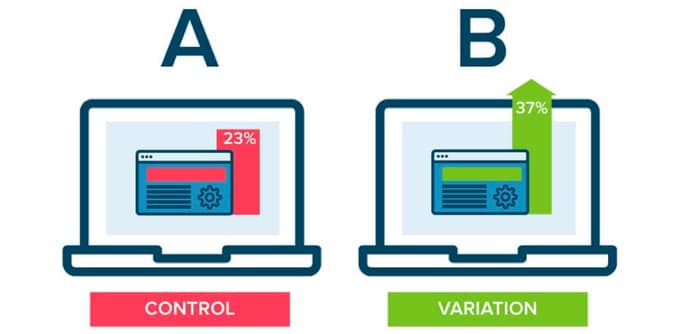
7. Conduct Continuous A/B Testing and Experimentation

Continuous testing is the engine behind ongoing conversion improvements. Without experimentation, you’re relying on hunches rather than visitor behaviour—and small tweaks can yield surprisingly large gains. By embedding A/B testing into your optimisation routine, you’ll validate what really works for your audience, from button colours and headlines to layout changes and form lengths.

Every experiment brings new insights. Over time, those incremental uplifts compound, and your site becomes finely tuned to your ideal customer. You don’t need massive traffic to get started; even modest sites can generate clear learnings by testing one change at a time and measuring the impact.

Build Hypotheses from Data and User Feedback

A good test begins with a specific, measurable hypothesis rooted in actual behaviour. Mine your analytics, session recordings and on-site surveys to uncover friction points—perhaps users hesitate on a pricing table, or repeatedly abandon a form field. Then translate these observations into testable statements, for example:

  • “Changing our primary CTA from ‘Get in touch’ to ‘Request a free quote’ will increase clicks by 15%.”
  • “Reducing the hero image size on mobile will improve scroll depth and form submissions.”

Defining clear success metrics—click-through rate, submission rate or scroll completion—keeps your test focused and outcomes unambiguous.

Prioritise Tests with a Structured Framework

As your list of test ideas grows, apply a simple impact vs effort matrix to decide which experiments to run first. Score each variation on:

  • Potential impact (high/medium/low uplift expected)
  • Implementation effort (design, development and QA hours)

Target high-impact, low-effort tests for quick wins, then sequence more complex experiments. Always test one variable per page at a time—if both your headline and button change, you won’t know which drove the result.

Measure, Document and Iterate

When a test reaches statistical significance, analyse the results. Did your variant outperform the control? If so, roll out the winner site-wide; if not, review the data—sometimes a near-miss points to a refined hypothesis. Record every experiment—objective, setup, duration, results and learnings—in a central repository. This “conversion playbook” prevents duplicated efforts and informs future tests.

Finally, revisit past tests under new conditions: a headline that lost last year might win today, thanks to shifting audience preferences or updated site context. By measuring rigorously, documenting consistently and iterating continuously, your website will evolve in step with your customers—driving ever-higher conversion rates.

Ready to sharpen your A/B testing process and uncover what really moves the needle? Check out our guide on top tips for creating a successful conversion-based site and start experimenting.

8. Leverage Data-Driven Insights: Funnel Analysis, Heatmaps and Surveys

Every visitor interaction on your site tells a story. By blending hard numbers from your analytics with the human perspective from on-site feedback, you’ll pinpoint the exact tweaks that unlock better performance. In this section, we’ll look at how to chart your funnel, watch real user behaviour with heatmaps, and surface hidden obstacles through targeted surveys.

Map and Analyse Your Conversion Funnel

Begin by sketching out the key stages your prospects travel through—for instance:
• Homepage → Product page → Cart → Form submission

With your funnel laid out, dive into Google Analytics (or your preferred analytics tool) to track how visitors flow from one step to the next. Identify where the largest drop-offs occur and ask: is the value proposition unclear on the product page? Does the cart page load slowly or introduce confusing charges? Armed with these insights, you can address the weakest links first and engineer a smoother journey to conversion.

Use Heatmaps and Session Recordings to Uncover Behaviour Patterns

Numbers alone won’t always tell the full story, so complement your funnel analysis with heatmaps and session recordings:

• Heatmaps reveal where people click, tap or scroll—and where they don’t.
• Session recordings let you watch real visitors navigate your site: note any rage clicks, hesitations or sudden exits.

Pinpoint pages that receive high engagement but low conversions—perhaps your hero image is drawing attention away from the call to action, or a button colour blends in with the background. By focusing fixes on the spots where users spend the most time (and where they struggle), you’ll make confident, data-driven improvements rather than educated guesses.

Deploy Targeted On-Site Surveys to Gather Visitor Feedback

Sometimes the best way to learn what’s blocking conversions is simply to ask. On-site surveys, triggered at key moments—like when a visitor is about to abandon the cart—can uncover objections or unanswered questions:

• Use short, contextual surveys (one or two questions) so you don’t overwhelm users.
• Trigger them on exit-intent, after a set time on page, or when someone scrolls to a critical section.
• Ask open-ended questions such as “What nearly stopped you from completing your order?” or “What information were you looking for today?”

These candid responses will reveal issues you may never spot in analytics alone—whether it’s missing details, confusing terminology or an unexpected shipping fee. Combine these qualitative insights with your quantitative data and you’ll have a clear roadmap of practical changes that drive higher conversion rates.

9. Address Objections and Reduce Perceived Risk

Even when your value proposition is crystal clear, prospective customers will hesitate if they harbour doubts—concerns about suitability, cost or the reliability of your offering. By anticipating and answering these objections up front, you minimise friction and make it easier for visitors to say “yes.” Think of this as customer support at scale: pre-emptive reassurance can be the difference between an abandoned cart and a confirmed sale.

Identify Common Purchase Hesitations

Start by gathering feedback from every corner of your business. Review customer support tickets, on-site survey responses and session recordings to compile a list of the most common roadblocks. Typical objections include:

  • “Will this solution integrate with our existing systems?”
  • “Is the price justified for the benefits we’ll get?”
  • “How long will delivery or implementation take?”
  • “What if it doesn’t perform as advertised?”

Once you’ve listed these concerns, score each by frequency and potential impact. Focus on the top two or three objections that drive the most drop-off—removing these “deal-breakers” often yields a tangible lift in conversions.

Highlight Strong Guarantees and Return Policies

A robust guarantee can sway even the most cautious buyer. Whether you offer a 30-day money-back promise, a performance warranty or a “pain compensation” policy, present it clearly and prominently:

  • State the guarantee plainly, e.g. “Try it risk-free for 30 days—full refund if you’re not satisfied.”
  • Outline any simple conditions (no hidden fees, no paperwork).
  • Include real examples or brief testimonials from customers who’ve taken up the offer—this demonstrates that you stand firmly behind your promise.

Industry-leading return policies show confidence in your product and reassure hesitant visitors that their risk is minimal.

Develop a Clear, User-Friendly FAQ Section

An FAQ page lets you address granular concerns in a structured, scannable way. Focus on the questions that surface most often in support channels and on-site feedback:

  • Shipping and delivery (“How long until my order arrives?”)
  • Pricing and billing (“Are there any setup fees?”)
  • Compatibility or integration (“Does this work with X platform?”)
  • Support and training (“Is onboarding included?”)

Write succinct answers in plain English, group related items under clear headings and add jump-links for easy navigation. A well-crafted FAQ not only dispels doubts but also helps with SEO by covering the exact queries prospects are searching for.

By systematically identifying objections, showcasing iron-clad guarantees and providing a concise FAQ, you’ll lower the barriers for new customers—and watch your conversion rate climb as a result.

10. Encourage Action with Authentic Urgency, Scarcity and Incentives

When visitors feel a genuine push to act now, they’re more likely to convert. Well-crafted urgency and scarcity tap into that motivation—without coming across as gimmicky. Pair those tactics with thoughtfully chosen incentives, and you’ll give prospects both the reason and the reward for committing on the spot.

Use Genuine Scarcity and Time-Limited Offers

FOMO (the “fear of missing out”) only works if the constraint is real. Display actual stock levels or countdown timers to show visitors exactly how much time or inventory they have left to decide.
• Show “Only 3 items left at this price” on product pages, so shoppers know you’re not bluffing.
• Add a simple timer for limited-time promotions—just make sure you reset it honestly, or you risk losing trust.

By relying on actual deadlines and quantities, you preserve credibility while nudging prospects towards action.

Offer Valuable Incentives for Immediate Action

An irresistible incentive sweetens the deal and rewards visitors for converting now rather than later. Think beyond a generic “Save 10%”—tailor your offers to your business and audience:
• Free shipping on orders over a set threshold (“Free NZ-wide delivery on orders over $150”).
• Bonus add-ons for first-time customers, such as an extra service hour or downloadable resource.
• Tiered discounts that increase with basket size (“Get 5% off orders above $200, 10% off above $500”).

Pairing scarcity with a timely incentive—“Only today: free setup on every new subscription”—creates a powerful one-two punch that drives conversions without feeling pushy.

Craft Compelling Calls to Action with Clear Value

Your calls to action should highlight exactly what the user gains and why they need to click now:
• Use a contrasting button colour and concise text (“Claim my free audit”, “Unlock 20% off today”).
• Position CTAs at decision points—beneath your headline, alongside pricing tables or at the end of a benefits section.
• Reinforce the incentive in nearby copy: “Add to cart and enjoy free shipping—offer ends midnight.”

By coupling authenticity, timely rewards and crystal-clear CTAs, you’ll create a sense of momentum that turns hesitant visitors into confident customers.

Ready to Boost Your Conversions?

Conversion optimisation is an ongoing journey, not a one-time fix. Begin by rolling out your highest-priority tweaks—streamline that form, sharpen your headline, or introduce a compelling social proof element—and track the results closely. With every test you run and metric you review, you’ll learn what truly resonates with your audience and can adjust your site’s design and messaging accordingly.

Keep the momentum going by staying user-centric and data-driven. Regularly consult your funnel analytics, heatmaps and on-site surveys to discover fresh insights. Address any newfound friction points swiftly and embrace new opportunities to enhance clarity, trust and ease of use. Over time, these incremental improvements snowball into a markedly higher conversion rate and a stronger bottom line.

For hands-on expertise in website design, development and growth marketing—backed by proven conversion-rate-optimisation strategies—partner with Engage Digital. Our Auckland-based team builds marketing systems that attract quality traffic, convert more leads and deliver measurable ROI, so you can focus on what you do best: running and growing your business.

If you’re running a small business in New Zealand, you’ll know the frustration of a website that simply isn’t pulling its weight. Maybe you’re seeing a trickle of visitors, but hardly any enquiries land in your inbox. Or perhaps you sense your website looks a bit tired compared to your competitors, and you’re left wondering how many potential customers lose trust before they even pick up the phone.

The truth is, your website is often the first – and sometimes only – impression your business gets to make. Smart design is no longer just about looking good; it’s about building trust, guiding people effortlessly towards making contact, and turning browsers into buyers. Local data shows over 80% of Kiwis are browsing on their phones – and if a site loads slowly or is awkward to use, most will bounce within seconds, taking their business elsewhere.

The good news? With a handful of practical tweaks, you can transform your site into a genuine lead generator. In this guide, you’ll discover ten proven small business website design tips tailored for the New Zealand market. Whether your goal is more enquiries, online sales, or a steady pipeline of qualified leads, you’ll find actionable steps to lift conversion rates and grow your business.

Let’s get straight into the ten essential website design tips that can turn your site into a conversion powerhouse.

1. Optimise for Mobile Devices

More than 80% of New Zealanders now browse on smartphones, so planning for mobile first is no longer optional. According to Aotearoa Internet Insights 2024, a clunky mobile experience can see visitors abandon your site in seconds. By designing with smaller screens, touch interfaces and varying network speeds in mind, you’ll capture and keep the attention of on-the-go customers.

Start by adopting a responsive layout that fluidly adapts to any screen size. Simplify your navigation and position call-to-action buttons within easy thumb reach. Optimising performance—through faster load times and thumb-friendly tap targets—will reduce frustration and boost conversions on mobile devices.

Responsive Design Principles

Responsive design relies on three core concepts:

  • Fluid grids: Layouts that use relative units (%, em, rem) instead of fixed pixels to scale content.
  • Flexible images: Media that resizes within its container—often controlled via CSS rules like max-width: 100%; height: auto;.
  • Media queries: CSS conditions (@media) that apply different styles based on viewport width, orientation or resolution.

You don’t need to code from scratch. Popular CSS frameworks (e.g. Bootstrap, Tailwind) and page builders (like WordPress’s Block Editor or Shopify’s Dawn theme) offer responsive settings out of the box. As you design, think about stacking order: present your most important content first and collapse less critical sections below the fold on smaller screens.

Mobile Navigation Best Practices

A cluttered menu is a quick way to lose mobile visitors. Consider these approaches:

  • Simplified menus: Limit top-level items to 4–6 labels, using clear, jargon-free titles.
  • Icon-only nav bars: Pair recognisable icons with text labels or tooltips to save space.
  • Expandable accordions: Hide submenus behind tap-to-expand panels instead of multi-layer dropdowns.
  • Sticky header or hamburger icon: Keep navigation within thumb reach by pinning a collapsible menu at the top.

Avoid deep dropdowns and long menus that force excessive scrolling or multiple taps. Aim for a single, intuitive path to each page.

Real-Device Testing

Emulators only take you so far. Test on actual devices to spot quirks that might slip through:

  • Test across major mobile platforms (Android, iOS) and popular screen sizes (phones, phablets, smaller tablets).
  • Use tools like BrowserStack, Sauce Labs or a local device lab for remote debugging.
  • Run a quick checklist:
    • Touch targets: Ensure interactive elements are at least 44×44px.
    • Viewport scaling: Confirm your pages include <meta name="viewport" content="width=device-width, initial-scale=1">.
    • Font legibility: Check body text remains readable at arm’s length without pinch-zooming.

By validating on real hardware, you’ll catch performance or layout issues that could undermine the user experience and, ultimately, your conversion rate.

2. Improve Website Speed

Slow-loading pages frustrate visitors and hurt both conversions and search rankings. Research shows that even a one-second delay can shave off around 7% of conversions, while a 0.1-second improvement drove an 8.4% uplift for retail sites in a Deloitte study. To keep Kiwis engaged (and keep Google happy), you’ll want to audit and optimise every millisecond. Tools like Google PageSpeed Insights or GTmetrix will flag bottlenecks, while guides such as Kiwi Website Design Best Practices steer you through local optimisation tips.

Optimise Images and Media

Images often account for the bulk of a page’s weight. To trim file sizes without sacrificing quality:

  • Use modern formats like WebP or AVIF, which can be 30–60% smaller than JPEGs.
  • Compress assets via tools such as TinyPNG, Squoosh or ImageOptim.
  • Implement lazy loading (loading="lazy") so off-screen images only download when the user scrolls.

Example markup for a hero image:

<img 
  src="hero-image.webp" 
  alt="Your product highlight" 
  width="1200" 
  height="600" 
  loading="lazy" 
/>

By converting a 2 MB JPEG to a 200 KB WebP and deferring its load, you can shave nearly a second off your initial render.

Minimise Scripts and Plugins

Excess JavaScript and third-party plugins can block rendering and inflate load times. To streamline:

  • Audit scripts via your speed-test waterfall (look for long “scripting” or “blocking” times).
  • Defer or asynchronously load non-critical JS:
    <script src="chat-widget.js" defer></script>
    
  • Cull unused WordPress plugins or consolidate multiple tracking tags into a single manager (e.g. Google Tag Manager).
  • Replace heavy widgets (social feeds, pop-ups) with lightweight alternatives or embed them only when needed.
  • Use server-side caching (e.g. Varnish or a WordPress caching plugin) to serve pre-built pages rather than generating them on each request.

Leverage Caching and CDNs

Caching and a content delivery network (CDN) ensure visitors fetch assets from the nearest edge, reducing latency:

  • Enable browser caching via Cache-Control headers so repeat visitors load static files from their local cache.
  • Use server-side caching (e.g. Varnish or a WordPress caching plugin) to serve pre-built pages rather than generating them on each request.
  • Employ an edge CDN—Cloudflare’s free plan or networks like BunnyCDN (with a PoP in Auckland)—to distribute images, scripts and styles across global servers.

By pairing aggressive caching rules with a localised CDN, you’ll deliver resources in a blink, irrespective of where your customer is sitting with their device.

Together, these tactics will dramatically cut your page-load times, lift your ranking, and keep New Zealand users glued to your content rather than hunting for faster alternatives.

3. Use Clear Calls-to-Action

Your calls-to-action (CTAs) are the sign-posts that guide visitors towards taking action—whether that’s booking a consultation, downloading a guide or requesting a quote. A well-crafted CTA can turn casual browsers into engaged leads by making the next step obvious, irresistible and easy to complete. To get the best results, focus on three pillars: compelling copy, striking design and smart placement. Real-world examples include “Book a Free Consult”, “Get Your Quote Today” and “Start Your 14-Day Trial”.

Action-Oriented Language

Strong CTAs begin with an active verb followed by a clear benefit. Instead of generic text like “Submit” or “Learn More”, opt for phrases that describe exactly what the user will gain:

Split-test examples can highlight the difference. A/B tests often show that swapping “Download the Report” for “Get My Free Report” boosts click-through by up to 20%—the personal pronoun and word “free” make the offer more enticing. Similarly, “Reserve Your Spot” usually outperforms “Sign Up Now” because it conveys limited availability.

Design and Colour Contrast

Your CTA needs to stand out at a glance. Use bold button shapes, generous padding and a colour that contrasts sharply with your background. Check that your text meets WCAG AA contrast ratios (at least 4.5:1 for body text). Key design tips:

  • Button size: minimum 44×44px tap area for comfortable clicking.
  • Hover states: add a subtle shade or outline to signal interactivity.
  • Whitespace: surround buttons with plenty of breathing room so they don’t get lost in nearby text or images.

Tools like the WebAIM Contrast Checker can help you verify accessible colour combinations. Once your design is polished, test hover and disabled states to ensure they’re clear and consistent across devices.

Strategic CTA Placement

Placement is just as crucial as copy and design. Position your primary CTA where users expect it and where they have the strongest intent:

  • Hero section: anchor a prominent button immediately under your headline.
  • Content breaks: add inline CTAs after key service or product descriptions.
  • Sticky or floating bars: keep contact options visible on long pages or blog posts.

For example, a “Get Your Quote Today” button in the hero banner captures new visitors, while a secondary “Chat with Us” floating button ensures support is always within reach. On sidebars, highlight a “Download Case Study” CTA next to related content. By mapping CTAs to high-intent zones, you’ll guide visitors smoothly towards conversion without overwhelming them.

4. Build Trust and Credibility

Trust signals on your website help ease visitors’ minds, reduce friction and boost the likelihood they’ll pick up the phone or submit an enquiry. When people feel confident you’ll deliver on your promises, they’re far more likely to become customers. By weaving in genuine testimonials, authentic imagery, clear team information and recognised security marks, you’ll turn sceptical browsers into engaged leads.

Showcase Client Testimonials

Nothing speaks more loudly than a satisfied customer. Full-length quotes, complete with the client’s name, job title and photo, add authenticity and help potential customers visualise working with you. If you have video testimonials, embed them in your case-study or service pages for maximum impact.

Consider layouts that encourage engagement:

  • A rotating testimonial slider on your homepage for quick social proof.
  • A static grid or masonry gallery on a dedicated testimonials page so visitors can browse multiple success stories.
  • A “Read the full story” link that takes users to in-depth case studies, complete with before-and-after metrics.

Always attribute each quote clearly. If you can, include a link or logo of the client’s business (with permission) to reinforce authenticity.

Real Photography and Team Bios

Generic stock images are easy to spot—and they rarely convey your unique brand personality. Invest in a local photographer to capture:

  • Your workspace or showroom, so visitors feel familiar with your environment.
  • Behind-the-scenes moments that humanise your process.
  • Portraits of your team in natural settings, reflecting your company culture.

On your “About Us” or “Team” page, structure each profile with:

  1. A professional photo.
  2. Name and role.
  3. A brief bio outlining expertise and a personal detail or fun fact.

These bios make you relatable and show there are real people ready to solve real problems, not faceless entities hiding behind a website.

Prominent Security Badges

Security badges reassure users their data is protected, especially on contact forms or e-commerce checkouts. Prominently display:

  • An SSL padlock icon or “Secure” badge near form fields.
  • Logos for your payment gateways (e.g. Visa, Mastercard, PayPal).
  • Membership or accreditation badges (for example, your local Chamber of Commerce or industry awards).

Position these trust marks:

  • Beside or just below your primary CTA buttons.
  • In the footer of every page.
  • On your checkout or payment page where transaction confidence is critical.

By thoughtfully integrating client testimonials, genuine visuals, team bios and recognised security marks, you’ll create an environment of reliability and authority—essential ingredients for higher conversions and lasting customer relationships.

5. Simplify Website Navigation

When visitors arrive on your site, they should instinctively know where to go next. A clear, intuitive navigation structure reduces bounce rates, encourages deeper exploration and ultimately leads to more enquiries or sales. According to Coast Design Studio, a streamlined menu and straightforward pathways are essential in guiding users to high-value pages—whether that’s your services, pricing, or contact form.

Start with a flat menu structure that surfaces your most important pages in a single click or tap. Combine that with helpful in-page cues—like breadcrumbs—and a visible search bar to catch anyone who still prefers typing over clicking. Finally, mirror your primary navigation in the footer with key links and legal pages so users never feel lost, even after scrolling to the very bottom.

Clear Menu Hierarchy

  • Limit top-level items to five or six clear, descriptive labels
  • Avoid industry jargon—use terms your customers actually search for (e.g. “Our Services” rather than “Solutions”)
  • Group related pages under logical headings, but resist deep dropdowns—two levels max keeps things simple

By flattening your menu, you reduce decision fatigue and help visitors find what they need in an instant.

Breadcrumbs and Site Search

Breadcrumb trails show users their exact path through your site, helping them back-track without confusion. Place them just below the main header or page title, in a format like:

Home > Services > Digital Marketing

Alongside breadcrumbs, a prominent search box—ideally in the header or hero area—caters to those who know exactly what they want. Many CMS platforms offer built-in search widgets, or you can integrate a third-party solution for more advanced filtering and auto-complete functionality.

Footer Navigation

Your footer is the safety net for visitors who scroll to the end. Include:

  • A mini-sitemap with links to About, Services, Blog and Contact pages
  • Legal essentials like Privacy Policy and Terms of Service
  • Social media icons and a newsletter signup field

Organise these elements into two or three columns for clarity. Even if someone misses your main menu, the footer provides a last chance to guide them back to your core content.

With a simplified navigation system—clear menus, helpful breadcrumbs and a comprehensive footer—you’ll keep users engaged and reduce the risk of them bouncing off to a competitor’s site.

6. Use High-Quality, Brand-Aligned Visuals

People form an opinion about your business within seconds of landing on your site—and much of that judgement comes from what they see. Crisp, on-brand imagery and graphics convey professionalism, build trust and hold attention far longer than text alone. When your visuals reflect your unique style and values, visitors immediately recognise that you care about every detail of their experience.

Resist the temptation to fill key pages with generic stock photos that anyone could find online. Instead, invest in visuals that reinforce your brand story—whether that’s a behind-the-scenes shot of your team at work or a short video walkthrough of your flagship product. By tailoring every image, graphic or animation to your identity, you’ll connect more deeply with Kiwi customers who appreciate authenticity.

Alongside careful creative choices, you’ll want to optimise these assets so they never slow down your site. Dimension, file size and display quality all matter: oversized images will frustrate visitors, while poorly scaled graphics can look fuzzy on high-resolution screens. In the sections below, we outline how to plan, produce and deliver standout visuals that elevate both your brand and your site’s performance.

Custom Photography and Videography

Hiring a local photographer or videographer ensures your visuals feel genuine rather than off-the-shelf. Consider these ideas:

  • Team and culture portraits: Capture candid moments in your office or workshop to humanise your business.
  • Product demos: Short clips showing your offering in action help prospects understand features and benefits instantly.
  • Location shots: If you have a physical store or unique workspace, showcase it to strengthen local ties.

These real-world visuals can feature on service pages, your “About Us” section or social feeds embedded in your site. A quick office-tour video or time-lapse of a project adds dynamism and gives visitors a peek behind the curtain.

Branded Graphics and Icons

Custom graphics and icons reinforce your colour palette, typography and tone of voice at a glance. To get the best results:

  • Create infographics that explain processes (e.g. “How Our Lead-Gen System Works”) using your brand fonts and hues.
  • Source or design SVG icons so they render sharply on any device and scale without pixelation.
  • Build simple charts or data visuals that match your style—even basic bar graphs or percentage circles can feel uniquely yours when styled correctly.

By weaving these elements into your layout—whether as section headers, bullet-point highlights or service overviews—you’ll achieve a cohesive look that keeps users orientated and engaged.

Visual Asset Optimisation

Even the most stunning image needs careful preparation before it hits your site:

  • Compression tools: Use TinyPNG, Squoosh or ImageOptim to reduce file sizes without noticeable quality loss.
  • Correct dimensions: Export separate versions for thumbnails, banners and hero images. Avoid relying on CSS to downscale huge files.
  • Retina-ready assets: Provide 2× resolution images (e.g. 2048×1024 instead of 1024×512) and set srcset attributes so high-PPI screens load sharper versions.

Combine these practices with lazy loading for off-screen images (loading="lazy") and you’ll preserve page speed even as you showcase rich media. Delivering polished, brand-aligned visuals that load swiftly will leave a lasting impression—and boost your conversion rate in the process.

7. Leverage Social Proof and Testimonials

Social proof is a powerful nudge—when visitors see that other customers have had positive experiences, they’re far more likely to trust your service or product. By showcasing genuine reviews, star ratings, case studies and even live social feeds, you’ll tap into the persuasive effect of peer validation. In a market where reputation matters at least as much as price, these trust anchors can be the deciding factor between a casual browse and a firm enquiry.

Display Customer Reviews and Ratings

Customer reviews and average star ratings act as instant credibility signals. Integrate review widgets from platforms you use most—whether it’s Google My Business, Facebook or third-party sites like Trustpilot. A few ways to make them work harder:

  • Place an overall star rating in your header or beside key call-to-action buttons.
  • Feature a recent five-star quote on your homepage or service pages.
  • Link each review to the original source to maintain transparency.

Encourage happy customers to leave feedback by including a review link in your follow-up emails, invoices or even on printed receipts. Fresh testimonials remind prospective buyers that you consistently deliver great results.

Feature Case Studies

While snippets and stars serve as quick wins, in-depth case studies tell your story in full. Structure each case study around three parts:

  1. The challenge your client faced (e.g. lagging sales, clunky website)
  2. The solution you provided (redesign, targeted campaigns, new feature)
  3. The result, backed by data points (conversion uplift, time saved, revenue growth)

Use before-and-after visuals, pull-out quotes and clear statistics to bring these success stories to life. A “Read the full case study” link can drive visitors into a dedicated page where they can explore the details and download a PDF if they want a takeaway.

Embed Social Media Feeds

Live social media feeds let visitors see real-time engagement and posts that reflect your brand personality. Whether it’s an Instagram grid of finished projects or a LinkedIn feed of client success announcements, embedding these streams adds dynamic social proof:

  • Choose feeds that regularly update with customer-focused content.
  • Moderate posts to ensure any off-brand or low-quality content is filtered out.
  • Position feeds in a sidebar, on your homepage, or in a dedicated “Social Wall” section.

By blending curated reviews with ongoing social activity, you’ll present a rounded picture of satisfied clients and an active, engaged community—two key ingredients in steadily boosting conversions.

8. Test and Refine with A/B Experiments

Even the best design is based on assumptions—A/B testing lets you replace guesswork with data-driven decisions. By running controlled experiments, you uncover which headlines, images or button colours truly resonate with your audience. Over time, this iterative process turns small wins into significant uplifts in conversions, revenue and user satisfaction.

Start with a clear hypothesis—“Changing the hero headline from generic to benefit-driven will increase click-through rates.” Then create a variant (B) and split your traffic, measuring performance against your original (A). Once you’ve collected enough data for statistical significance, roll out the winner and document your learning. Rinse and repeat on the next element.

Popular testing tools include Google Optimize (free and easy to integrate), VWO and Optimizely for more advanced heatmaps and personalisation. Many CMS platforms—such as WordPress and Shopify—also offer built-in split-testing plugins. However you choose to test, link experiments to your analytics (e.g. Google Analytics or a tag manager) for consistent tracking.

Identifying Elements to Test

To get the highest lift, focus on high-impact areas of your site:

  • Headlines: Swap benefit-driven versus feature-focused copy to see which grabs attention.
  • Calls-to-Action: Experiment with different verbs, colours or button shapes.
  • Hero Images: Test lifestyle photography against product-focused visuals.

Begin with simple, single-variable tests—such as changing button text from “Get Started” to “Claim Your Free Quote”—before attempting multi-element redesigns. This isolates which factor influences user behaviour.

Analysing and Iterating

Clear metrics guide effective iteration. Depending on your experiment, track:

  • Click-through rate (CTR): For buttons or banners.
  • Form completions: Number of enquiries or downloads.
  • Revenue per visitor: Especially relevant for e-commerce.

Review results in your testing dashboard or via Google Analytics goals. Look for statistically significant differences—ideally ≥95% confidence—before declaring a winner. If neither variant outperforms, dig into qualitative feedback (session recordings or on-page surveys) to unearth roadblocks and refine your next hypothesis.

Documenting Learnings

A test without documentation is a missed opportunity. Keep a central log of:

  • Test name & date: So you can trace past experiments.
  • Variants: Description of A and B changes.
  • Results: Key metrics, uplift percentages and confidence levels.
  • Action taken: Which version won, and your next steps.

Over time, this repository becomes a playbook for future designs and campaigns. You’ll spot patterns—like certain colour palettes underperforming or headline styles that consistently drive clicks—and use those insights to fast-track optimisation.

By treating your website as an ongoing experiment rather than a finished product, you’ll steadily refine user journeys, boost conversions and stay ahead of changing customer preferences.

9. Provide Clear Contact Information

Even if your site nails every other tip, visitors will hit a dead end if they can’t find a way to reach you. Clear, prominent contact details reduce friction and stop enquiries slipping through the cracks. By making phone numbers, email addresses and forms instantly accessible, you’ll capture more leads and keep potential customers engaged.

Whether someone wants a quick chat, a detailed quote or simply directions to your office, they should never be more than a scroll or two away from the right contact method. Below are three key areas to lock down for maximum accessibility.

Header and Footer Placement

Your contact options should live in the two places every visitor sees: the header and the footer.

  • Header:

    • Display your phone number in a clickable “tel:” link so mobile users can tap to call.
    • Include a mailto link for email enquiries.
    • If you have a physical address, a small map-pin icon next to your address can open Google Maps for easy directions.
  • Footer:

    • Repeat your phone, email and address here in a concise block.
    • Group social icons and newsletter signup under “Stay in Touch”.
    • Add any legal links (Privacy Policy, Terms of Service) close by, so everything is tidy yet complete.

By sandwiching your contact details between header and footer, you make it effortless for site visitors to get in touch at every stage of their journey.

Contact Page Essentials

A dedicated contact page is the natural destination for anyone wanting more information. Keep it focused, clear and as frictionless as possible:

  • Short Form:

    • Ask only for essential fields: Name, Email, Phone and a free-text Message box.
    • Use anti-spam tools like a simple CAPTCHA or honeypot field—keep it unobtrusive.
  • Multiple Options:

    • Offer direct links for phone (tel:) and email (mailto:).
    • Embed a live Google Map or link to Apple Maps for on-site visits.
    • If you handle urgent enquiries, mention typical response times (e.g. “We’ll get back to you within 2 business hours”).
  • Visual Clarity:

    • Break your page into clear sections: “Send Us a Message”, “Call Us”, “Visit Us”.
    • Use icons or contrasting backgrounds to distinguish each method.

This approach ensures every visitor finds their preferred contact method quickly—whether they’re ready to write, call or drop in.

Live Chat and Chatbots

For many businesses, live chat is the digital equivalent of having a receptionist at the door. It’s perfect for answering simple questions instantly, and it captures leads who might otherwise bounce.

  • Choosing a Tool:

    • Evaluate solutions like Intercom, Drift or the free Tawk.to.
    • Consider ease of setup, pricing and how well it integrates with your CRM or email system.
  • Coverage and Tone:

    • Decide whether you’ll staff chat during business hours only or offer 24/7 automated responses.
    • Use friendly, concise canned replies for common queries (“Our office hours are 9am–5pm; we’ll reply by 5pm today.”).
  • Escalation Paths:

    • Route detailed or technical questions to email or phone follow-up.
    • Capture lead details (name, email) before opening the chat window so you can re-engage if they close the window.

By layering live chat on top of your header, footer and contact page, you cover every enquiry style—from quick questions to full proposals—and make it as easy as possible for visitors to become leads.

10. Ensure Web Accessibility Compliance

Making your website accessible isn’t just a nice-to-have—it’s a legal requirement for many organisations and a moral imperative if you want to reach every potential customer. By aligning your site with the New Zealand Government Web Accessibility Standard and WCAG 2.2 Level AA, you’ll eliminate barriers for people with disabilities, boost usability for all, and reduce the risk of complaints or litigation. Plus, accessible sites often benefit from better SEO and cleaner code, so it’s a win–win.

Start by carrying out a simple self-assessment: use automated tools like WAVE or axe and manual checks (keyboard-only navigation, screen-reader trials) to spot glaring issues. Public sector sites must report their conformance under the NZ Government Web Standards on accessibility, but every business can adopt these best practices to ensure no one is left out.

Colour Contrast and Text Scaling

Good contrast and flexible text sizes are the first line of defence for visually impaired users. Aim for at least a 4.5:1 contrast ratio on body text and 3:1 for large text (24px or 19px bold). Colour-contrast checkers (for example, the WebAIM Contrast Checker) let you test combinations in seconds.

Beyond contrast, let your users control font sizes:

  • Define base font sizes in rem or em units rather than pixels.
  • Avoid fixed heights on containers so text can reflow naturally.
  • Test at 200% zoom in your browser to ensure layouts don’t break and text remains legible.

Keyboard and Screen-Reader Support

Not everyone uses a mouse—ensure every interactive element (links, buttons, form fields) can be reached and activated with the Tab key. Visual focus indicators (clear outlines or underlines) should make it obvious where the user is on the page.

For screen-reader users:

  • Add ARIA roles and landmarks (<nav>, <main>, <header>, <footer>) to define regions.
  • Provide meaningful alt attributes on images and aria-label or aria-labelledby for form controls.
  • Group navigation links in logical lists (<ul>/<li>) so screen-readers announce them correctly.

Captioning and Audio Descriptions

If your site features videos, transcripts and captions are non-negotiable. Quality captions not only help Deaf or hard-of-hearing users but also keep all visitors engaged when sound isn’t an option (e.g. in open-plan offices).

For richer media:

  • Include captions on all prerecorded content.
  • Offer live captions for webinars or high-priority streams.
  • Provide audio descriptions for video segments where essential information is conveyed visually (e.g. charts, diagrams or on-screen text).

Accessibility Statement

Transparency is key—publish a concise accessibility statement in your footer or on a dedicated page. It should:

  • Declare your current level of WCAG conformance (for instance, “This site aims to meet WCAG 2.2 Level AA”).
  • Outline any known gaps and your plan to address them.
  • Provide a contact (email or web form) where users can report barriers or request assistance.

By inviting feedback, you demonstrate genuine commitment and can continually refine your site. An accessible website isn’t a one-and-done project; it’s an ongoing promise to include everyone in your digital experience.

Ready to Convert More Visitors?

You’ve now covered ten practical website design tips tailored for New Zealand small businesses—from mobile-first layouts and lightning-fast loading times, to clear calls-to-action, social proof and inclusive accessibility standards. Each tweak you make improves the chances that a casual browser turns into a genuine lead, whether that’s via an enquiry form, a phone call or an online purchase.

Take a moment to audit your own site against these best-practice pointers. Check how your pages perform on a phone, test your CTA copy and placement, review your navigation hierarchy and run a quick accessibility scan. Even small changes can deliver outsized gains in visitor engagement, enquiry numbers and sales.

If you’d like a hand turning these strategies into results, our team at Engage Digital can help. We specialise in high-impact website design, growth marketing and lead-generation systems that lift traffic, boost conversions and accelerate real-world business growth—so you can spend less time tweaking your site and more time enjoying the enquiries rolling in. Get in touch to see how we can transform your website into your most powerful sales tool.

The world has become digital, and your business is no exception. With the growth of digital marketing, businesses have been turning to conversion-based sites as a way to drive leads and sales. A conversion site helps you identify what actions your visitors take on your site so you can focus on driving those actions instead of selling visitors on things like products or services.

A conversion-based site is useful for many reasons beyond just driving conversions. For example, it also gives you an option when designing a layout that doesn’t require you to rely on plugins or third-party services. It lets you target your ads more effectively and create a design that will look great across devices, too.

Create a site for conversions

Creating a conversion-based site is great for driving conversions, but it isn’t always easy. You have many options to choose from when designing your site, and the amount of time and effort you put into your site will depend on what you want to achieve. It’s also important to think about how visitors will interact with your site.

It’s best if you consider a few things before starting your conversion-based site:

  1. How will visitors interact with the website?
  2. What are the goals of your business?
  3. What will convert better?

Be clear about your goals

The first step to creating a conversion site is getting clear about your goals. Identify the actions you want your visitors to take and what you hope they will do once on your site. Make sure you have a clear idea of how you want people to engage with your content so that you can create the layout for your site that allows for those interactions. 

Next, think about the most important features of your website and plan out what content should be displayed where. For example, if you’re selling products, think about where they should be placed and what order they should be in. If you’re selling services, then plan out which pieces of content are essential to the visitor’s experience and where they should appear on the page.

Use analytics to inform your decision-making

The top resource for finding success on a conversion-based site is analytics. Using the analytics, you can make informed decisions about what your visitors are doing and what actions to focus on.

Start by setting up goals in your analytics software so you know where you want to take your traffic. After that, set up conversion pixels on your website so you can track specific actions. When it comes to clicking ads or visiting certain pages, this will help you understand what’s working and what isn’t. It also gives you a chance to fine tune your site before investing in any other methods of driving leads or conversions.

Make sure you understand your visitors’ journeys

Understanding your visitors’ journeys is vital for a successful conversion-based site. From their first encounter with your website to their final purchase, you need to know what steps they take and how long it takes them to complete each step. This helps you target your ads so that your message will reach the people most likely to convert into customers.

There are several ways you can use analytics on your site to understand these journeys. For example, Google Analytics lets you see where visitors go on your site, when they come in contact with a certain page, and where they enter and exit the site. You can also use Google Search Console to see how many people have viewed different pages of your website over time and what keywords they searched for while visiting. If you have a blog or news section on your website, consider using Google Trends to find out which topics are trending right now.

AdWords is the key to success with PPC ads

One of the most important things to understand is that Google AdWords is a huge key in driving conversions. With AdWords, you can target your audience and set up your ads to have a specific call-to-action at the end. You’ll also see better conversion rates when you’re using PPC ads.

Some other tips for success with PPC: Embrace long-term goals and make sure you are willing to stay focused on them. Track your performance so you can make continuous adjustments.

#1: Use a conversion-based site

Making sure that your website has been designed with conversions in mind is an essential step toward creating a successful conversion site. In order to create this design, you need to know how visitors interact with the site and what actions they take throughout their journey through your website. This will help you identify what actions are most valuable for driving conversions on your site and focus more on those actions instead of selling visitors on things like products or services.

#2: Embrace long-term goals

When designing a conversion site, it’s important not to get too distracted by short-term goals. Instead, make sure that you understand where you want to be in the future and use that information as a way to guide your design efforts today. Don’t worry about getting everything done right away; rather, think long term so that once you reach those goals, all of your work will be worth it overall.

Test, test, test

Of course, to create a successful conversion site, you need to first test your idea. To find out what’s working and what isn’t on your site, use Google Analytics or another analytics tool to review where visitors go on your site. This will also help you identify any problems that might need to be fixed.

Another way to determine if your site is converting well is through data tracking. You can use a tool like Google Tag Manager to track specific actions visitors take on your site and how many people are taking those actions. If you see that people are not converting at the rate you want them too, you should re-evaluate why they aren’t converting and make adjustments accordingly.

Conclusion

Everything about your website – from the copy to the design – should focus on one thing: conversions.

Your conversion-based site should have a clear goal in mind and a site that targets a specific type of visitor. With the help of an analytics tool, like Google Analytics, you’ll be able to track what visitors are doing on your site and use that information to make decisions about where to invest your time and money.

Once you’ve created a conversion-based website, it’s time to get it in front of people. AdWords is the key to success with PPC ads.

The success of your website depends on the quality of traffic it receives. Therefore, mixing and matching the right digital strategies can generate substantial website traffic. While you might deliver the best message, product, and service, it would mean little until you attract your target crowd regularly and reliably. Learning how to increase your website traffic is one of the best ways to achieve these goals.

1. Prioritise Content Marketing

Content remains king. This concept applies to all types of online content, including visual, video, and written articles, because engaging content keeps site visitors coming back for more. While SEO strategies can improve your site’s searchability and align with the crawlers to raise SERP rankings (search engine results page), you should also tailor your content to your readers’ interests. 

2. Leverage Paid Ads

Paid ads are some of the most effective ways of getting your site across to your target audience. First, you should thoroughly research your target demographic before deciding on a paid ad platform. Identifying your audience’s interests, locations, and ages can help you pinpoint their most frequented platforms and increase your chances of engagement. 

Also, consider the type of ads applied in your campaigns. While video ads may seem highly popular, market research shows that 49% of people click on text ads, 31% on shopping ads, and only 16% on video ads. 

Similarly, you should have a systematic tracking method for paid ad metrics to ensure that the money you spend goes to good use. Regularly checking your paid ad campaigns helps you evaluate their effectiveness and re-strategise if necessary to optimise their impact. 

3. Constantly Refine On-Page SEO

SEO provides a proven formula to connect your site content with your audience, and it usually has three components: on-page SEO, off-page SEO, and technical SEO

On-page SEO refers to your website’s attributes, including meta descriptions, tags, well-positioned headers populated with keywords, and short paragraphs. The effectiveness of your SEO campaigns largely depends on the on-page SEO components. Therefore, managing on-page SEO as a set of living documents that require constant tweaking for the best results is essential. 

For instance, combining evergreen and seasonal keywords can help you reach a broader audience, especially during peak seasons like the summer holidays. Also, search engines like Google tend to revise their SEO practices, so keeping up with the latest updates helps drive more traffic to your website. 

4. Develop Effective Link-Building Strategies

Links make up a considerable part of off-page SEO. Internal and external links are the two main types, and both can help you improve site traffic in different ways. Therefore, applying each kind to your website might be advantageous. 

Internal links facilitate the site navigation process for your audience. For example, clicking on an internal link on your blog may take your reader to a deep service page (i.e., pages that take four or more clicks for access from a home page) and generate website traffic for that part of your site. 

External links bridge your site content with other websites and work well with search engine crawlers as part of technical SEO. Google rates the equity or value of an external link differently from an internal one, prioritising them for ranking purposes. The search engine also determines the usefulness and credibility of your website by assessing the quality of your external links. 

You might consider external links similar to a peer-review article’s citations, supporting its content’s authority and authenticity.  

5. Optimise Email Marketing 

Email marketing is one of the most cost-effective marketing strategies for generating business revenue, with an estimated $36 for every $1 spent. This marketing type can be a real game-changer if you wish to generate website traffic from your target demographic, with a mailing list engaging and attracting constant traffic. 

Periodic email newsletters can also help keep your audience interested in your offerings by providing exclusive tips, discounts, content, and tutorials that redirect your readers to your site. 

An advanced mailer allows you to manage your mailing list easily and offers customisation features to give each email a personal touch, further driving engagement. 

6. Keep Your Google Business Profile in Top Form

Your Google Business Profile represents your company’s online public image, and optimising it will help generate website traffic. For example, organic user searches on Google will turn up your Google Business profile, where potential site visitors will form their first impressions of your business. 

While conventionally, site visitors and customers would navigate to your business home page to acquire more information, they will now turn to your Google Business Profile for the same purpose. 

Consider including information that optimises your business reputation, such as high-resolution photos of your company and products, customer reviews, and valuable contact information such as operating hours and a link to your website, which directly generates website traffic. 

Videos are also highly effective ways of introducing your business to potential customers, where studies show that 53% of customers want to see more video content from companies they support. 

Closing Thoughts on How to Increase Your Website Traffic

Having an easily navigatable site is only half of the battle won. You will need to provide the guiding lamps that lead your most valuable audience to your winning content. Engage Digital can help you discover the most effective methods and tools to connect with your target audience without the guesswork. 

Book a call with us to say hello to the Engage Digital team! Together, we will discover the full potential of your business’s marketing growth. 

Whether you’re a brick-and-mortar business looking to expand online or a digital-first company that needs to re-do its brand, you can consider your website the welcome mat to your business.

If your website is outdated, difficult to navigate, or fails to get across your brand’s values, it can easily leave potential customers feeling disconnected. Meanwhile, if it feels cookie-cutter or forgettable, you’ll have nothing to leverage when it comes to building a lasting reputation and fostering customer loyalty.

For all of these reasons, hiring a professional web design agency is a worthy investment. The question is, how can you choose the right one? No matter your budget, timeline, or desired look, here’s some advice to point you in the right direction and help you select a qualified team of professionals that can bring your brand’s website to life. 

1. Compare Web Design Companies’ Qualifications

When it comes time to select a web design agency, you have countless options. One of the quickest ways to narrow down your options to the best is to go through their websites. It’s a bad sign if a web design agency has a website that’s slow, outdated, inconsistent, or just doesn’t speak to you. In other words, this is a situation where you can judge a book by its cover. 

After finding your favourite websites, take some time to read through the agency’s list of qualifications. Has it won any awards? Who’s on the team? Are they certified in any design software? While there are plenty of highly talented design agencies that aren’t award-winning, these things can certainly help prove an agency’s reputation and reliability up-front.

Most web design agencies will have a list of their team members so that you can see how long each individual has been in the business. You should also see when the agency was established by checking the “About” section. While you shouldn’t necessarily avoid young talent, experience is valuable. 

Lastly, as you try to get a feel for what the agency does, make sure its team is familiar with search engine optimisation (SEO) and search engine marketing (SEM). With countless factors impacting SEO—including speed and clean code—it’s important that your agency doesn’t unknowingly work against your website’s future rankings or performance. 

2. Thumb Through the Web Design Company’s Portfolio

Every web design agency will have a website design portfolio where you can look through some examples of their past work. The best agencies may even have case studies where they’ve interviewed previous clients to have them talk about their experience working with the team.

Even just taking a few minutes to look through the screenshots or links that an agency shares can help you determine the quality of its work. Beyond noting whether or not the examples are up to your standards, you should also consider if any of them match your style.

If you’re going for something entirely different from an agency’s typical projects, the company may not be the right fit. With that said, don’t let a website portfolio on its own throw you off just because you have a different style in mind. If the website agency’s team do great work, it’s still worth reaching out to them to see what they’ll say.

3. Make Sure the Practical Details Line Up

Once you have a list of website agencies that have stayed in your favour after going through their website, team, and portfolio, it’s time to do your due diligence and make sure that working with them is a practical choice.

For example, if you’d prefer to work with an agency in person, you should limit your search to those with an office nearby. It’s up to you how far you’re willing to travel, but checking where the agency is located (or able to travel to) will help you quickly determine if an agency is still under consideration.

On the other hand, if you’re working with a web design agency remotely, location still matters. More specifically, you need to know which time zone the agency works in to make sure that scheduling meetings and progress checks won’t be an inconvenience. While many teams will try to work with your schedule, you shouldn’t have to jump through hoops every time you want to call in. 

Beyond location and time zone, you might also consider the size of the agency’s team (smaller teams may not be able to take on a major enterprise project), its general timeline for projects, and its target clientele (which will impact how much the agency charges). 

4. Find a Team That You Connect With

By far, one of the best things you can do when comparing the web design agencies you’re considering is schedule a time to actually talk with the team—either in person or over the phone. When you do, go ahead and give high marks to the team that you resonate with the best.

Aside from being friendly and clear in their communication, the best web design company will have a team who are happy to spend time explaining their services, getting to know your brand, and talking about how they would approach your project.

During this call, you should ask questions pertaining to:

  • The timeline and how long they would expect the project to take. In order to provide an accurate estimate, they’ll likely ask what information or pages you want to include, among other things. 
  • The process for handling requests and revisions. How will the agency handle it if you change your mind about something during the project or if you don’t like how they executed something? Understanding if revisions are included, and to what extent, is critical to staying within budget and getting the results you want. 
  • The estimated cost and what could change it. Additional customisations and more complex website features will certainly raise the original estimate. Consider if the web design company plans to charge a flat fee or hourly rate for the project, or some combination of the two. 

There will be a lot to remember, so even if you think you can keep track of it all, make sure to take notes. This will make it much easier to compare your options after you talk to your favourite website companies. 

5. Compare Estimates From Web Design Companies Side by Side

Following the consultation, you should request a written estimate from each web design company you speak to. Obviously, your budget will be a primary consideration, but you should also think back to which team you melded with the best. Working with people that are happy to listen to you and help build upon your ideas is crucial to a successful web design project that reflects the look you’re really going for.

In addition to great communication, consider the additional services any agency offered to you (for example, help with branding, logo design, or SEO) that you’re interested in. Also factor in the estimated timelines each agency gave you, as it might not be feasible to go with your first choice if the agency is going to take six months or more when the other options can get you a site within two or three.

Ultimately, the final decision is up to you, but by doing your due diligence, you can make sure that you don’t waste time and money with an agency that’s not able to execute your requests with the speed, quality, or reliability that you want. 

Get Started by Requesting a Website Quote

Are you working on choosing a web design company? Asking the right questions is a critical step to finding the best fit for your brand. Aside from being communicative and creative, the agency’s team should be quick on their feet and dedicated to your satisfaction. For all of those things, you can turn to the team at Engage Digital. When you’re ready to take the first step, request a free website proposal from us, so you can move forward with your website project.

49% of companies report that customer acquisition is their primary marketing objective. 58% of business leaders indicate that lead generation is one of their most toughest challenges.

Business growth is always challenging – few businesses build their sales revenue on luck – it takes dedicated effort and the right tactics to grow and retain your customer base.

If you’re like most business owners, you’ve tried almost every conceivable way to grow our business. Some of it works – most of it doesn’t.

But let’s start at the beginning – the key to accomplishing your ambitious sales goal, starts with attracting more of the right sales leads.

A sales lead is a person or a business that has the potential to purchase your company’s product or service.

A lead only becomes a prospect once you have identified their fit as a potential customer or they have shown a level of direct interest in what your company has to offer.

Without well-targeted leads we won’t have the chance to close deals. Our clever engagement tactics, sales offers, landing pages, proposals and closing scripts won’t see the light-of-day unless we feed the sales funnel with leads.

Calculate the sales leads required to reach your revenue target

Tune in to your buyers’ needs

Fundamental to engaging with leads is appreciating their situation – understanding the process a customer goes through to become aware of, consider alternatives and decide to purchase from you.

Our outreach communication or inbound content needs to resonate with them:

  • What problem do we solve for them?
  • What’s our ideal customers biggest frustration?
  • What motivates them to take action?
  • What’s the best way to communicate to them?
  • Why should they care about what we provide?

Once you have identified your most important personas, then you need to optimise your website for conversions. Your website will be your most important tool you have for tuning into your audiences needs and turning leads in to customers.

Implement an omni-channel approach

You can dramatically increase your chances of turning leads in to customers by increasing the number of times your leads see you or engage with you.

The adage that it takes 7 touchpoints or interactions to generate a prospect is so very true – indeed, depending on the commitment (dollar value, consideration of alternatives, trust) required to make a purchase decision, many industries report it takes 2 or 3 times this many interactions before a decision is made.

We need to use every channel to connect with leads – traditional, social media, website content, direct calls, live chat, email, SMS, retargeting and more.

The messages need to be tuned to the stage in their journey with you – discovering their problem, not aware of your solution, weighing up alternatives, developing trust in your promise, motivated by your offer.

Try outbound responses to inbound leads

If you’ve attracted an inbound lead through your promotion, advertising, or content, great.

Sure, you can nurture those leads with a series of automated emails and social and PPC retargeting efforts.

But why not take more direct charge of turning those respondents in to prospects and customers through outbound.

Send more personalised emails, live chat, and direct SMS messages to them and where relevant, call them.

Make your outbound as personalised and as tailored as possible.

If you can’t get to all of them, lead scoring can identify the most engaged leads or those most ready to make a purchase decision.

A direct call has been found to increase the chances of a close by 2-3 times.

Respond lightning fast to leads

According to HubSpot, the odds of a lead becoming qualified are 21 times greater when contacted within five minutes versus 30 minutes.

Just imagine how our odds drop, when we take a day or two to respond to a lead!

Get to your lead while they are in the moment.

A robust lead-to-close system addresses this by triggering a task and alerting an internal sales agent to respond within 5 minutes of acquiring a new inbound lead.

Revisit closed and lost opportunities

Often, “no” means “not right now”.

Revisit with your closed or lost opportunities. There is every chance that while you weren’t selected 6 months ago, you left a favourable impression that you might be reconsidered now that the time is right or other alternatives proved not so positive.

Companies that did not buy from you before are already qualified sales leads. Invest time and resources into marketing to these prospects. Stay in touch through email campaigns, local events, blog posts, and phone calls.

Today might be the very day that old lead asks “what was the name of that company that provided that amazing presentation 6 months ago?”

Find sales leads on social media networks

About 42% of us use some kind of social media.

Facebook and Instagram offer an abundant source of leads for B2C leads but that’s not to say they aren’t a viable source for B2B business either.

LinkedIn offers a more targeted source of business customers, with members more in the zone of finding business related information.

Use social media to get recommendations from your clients, post special offers, and tell more about your company. Any social media can be a fruitful channel to reach your audience and generate sales leads online.

Plus, once you have leads in the system, you can use social media to talk to them and find out more about what they need and want.

Get referrals from current customers

Your leads aren’t as likely to accept you singing about how great you are, as they will hearing from your current clients and customers.

Ratings, reviews and testimonials are powerful forms of endorsement.

Your leads are far more likely to trust you and hopefully purchase from you if they see that that they are working in good company or read positive messages from satisfied customers.

Get those messages front and centre on your website. Use those referrals in your pitch videos. Display your google ratings and reviews everywhere.

Don’t be afraid to ask your customers to refer friends and colleagues to you.

Run specific friend-get-friend promotions to encourage referral lead generation.

Create a better sales funnel

Once you have identified your ideal lead targets and what channels to use to reach them you should have a plan to collect contact information.

Usually, the first stage of an optimised sales funnel process is funnelling leads toa lead capture page or landing page that encourages visitors to share their contact information, usually in exchange for something of value to them; a coupon code, a free gift, a demo or valuable piece of content like an how-to ebook.

At this point, it’s vital that you have CRM or Marketing Automation software in place to keep track of sales leads and to further engage them through email, SMS and retargeting messages on social and websites platforms.

Marketing automation apps like Klaviyo or ActiveCampaign can be set to do all the hard-lifting of sending personalised messages and identifying just the right time to offer online sales incentives or prompt a sales representative to make a closing call.

Attract organic traffic from SEO

While paid online advertising can offer a short term fix for targeting leads, search engine optimisation can generate organic traffic to your website on an ongoing basis, literally for free.

By focusing on keyword researched quality content, posted to informative and engaging landing pages and blogs, you can rank high with search engines like Google and offset the massive investment of ad campaigns.

It’s unlikely that a business in a competitive industry can give up on paid placement, but ranking well with Google will ensure that this organic channel serves you well for a strong flow of leads at a lower cost of conversion.  

Takeaways

  • A healthy and productive sales funnel must start with a strong flow of leads.
  • Without leads your sales pipeline is dead in the water.  
  • Start by assessing your buyer personas and appeal to their pain points and frustrations with a strong value proposition.
  • Communicate your value proposition through an omnichannel lead generation approach that may include conventional media, PPC, social media, email, SMS, or cold calling.
  • Continue to experiment and optimise the sources for your sales leads – measuring not just quantity but conversion, costs and sales value of each lead source.
  • It’s vital that you use CRM and Marketing Automation to gather contact information of your hard-fought sales leads to engage and nurture them through your sales pipeline.
  • Assess if your current process responds to new leads quickly and provides them the personalised information that will make your business stand out from the competitors those leads are also considering.

Before the pandemic, ecommerce was important to some of us, an extra channel to support retail stores to many of us, and an ever-growing necessity to all of us.

Now everything has changed.

If the first lockdowns of 2020 got us thinking about growing our ecommerce channels, then the second and third waves of Covid-19 in 2021 have all businesses rethinking the importance of digital and the abundant opportunities of ecommerce.

Forrester research predicts that digital customer service interactions will increase by a whopping 40%.

This increased reliance on online shopping, digital finance services and even health consultancy being delivered virtually isn’t going away.

Sure, we’ll flock to the malls and stores when we get the chance but as consumers, we’ve also realised that we don’t have to travel halfway across a city to have a bargain or an essential purchase land at our door.

We’re becoming more aware that the clothing or electronics or homeware item we need can we hunted out online, often with more choice, better pricing, and amazingly speedy deliver from around the world, let alone from across town.

Competitive websites and particularly ecommerce websites can’t endure a cold face of function and form – to maintain their market position, or push beyond, they need to evolve and interact with users – here are four insights to help improve in this new reality of ecommerce prominence and the customer experience.

Your business needs to be always on – because your customers are.

No matter the time of day or night, no matter how busy you are or under resourced you are, your customers are always on.

So, your ecommerce site or online business needs to be always ready to engage and provide the right information for your customers.

Of course, the digital environment lends itself to provide the right technology to provide the support and answers your customer’s demand.

Searchable and categorised knowledge bases and wikis provide information and assurances to customers literally instantaneously. They can be updated and added to quickly and are inexpensive to install even for the most modest of ecommerce stores.

Live chat can also provide customers instant access to answers. And when not manned by real people, bots step in to provide timely information to the most regular questions.

Pop ups and artificial intelligence can provide answers to customers exploring special product features or pricing pages.

Browse abandonment and cart abandonment automated workflows can re-engage with us long after we would have left the physical stores carpark.

Start small and put ideas to the test

Digital allows us to experiment at a relatively low cost.

We can identify a single pain point within our shoppers’ funnel and address that with conversational intelligence or a reworked workflow.

If results show promise, we update and test some more.

We can then introduce the change and scale at will – keeping an improved customer experience at the centre of our objectives.

Map and improve the Customer Journey

The customer journey consists of four key parts. These are:

  1. Awareness
  2. Consideration
  3. Decision-making
  4. Evaluation

By exploring the CX at each one of these stages, you can improve the overall customer experience with you. This begins with helping them find you.

Map and evaluate the customer journey to determine where customer needs might not coordinate with what you have to offer. Then you can plan for an even better experience by making the sales journey as smooth as possible.

Becoming empathetic and real

In the past, we’ve felt we’re more in control of the customer experience, when that experience was face to face, or at least person to person.

With a mechanical ecommerce relationship that empathy with customers is often lost.  

But data from all touchpoints can provide extraordinary insights into the customers’ requirements and feeling.

We just need to spend the time to understand what the data is telling us.

High bounce rates on certain product pages might indicate that we haven’t clearly delivered the benefits of that product over another.

Abandonment during checkout might indicate that our shipping costs are too high.

Not receiving a message to confirm delivery might leave customers anxious that the parcel has gone astray.

Sending a thank you note in the mail is likely to leave a customer highly impressed and they are bound to pass the positive experience on to friends.

Takeaways

Despite the digital process of ecommerce transactions and touch points, or because of them, many online businesses can dramatically improve the customer experience.

Indeed, improving CX is the ultimate objective of our online marketing activity.

If we outgun our competitors with Customer Experience there’s an absolute probability our brand will flourish.

Data analysis, conversion optimisation, marketing automation, artificial intelligence and more, have big parts to play in ensuring we improve and tune the customers’ experience. Just think to when you were most delighted from an online experience – can you emulate that in your business and the way you deliver ecommerce or any sort of website engagement and transaction.

What happens if you’re trying to sell your car, but you’ve left it dirty – people may view it but you’re not going to get any offers. That’s exactly why you need a polished homepage design for your website.

You never get a second chance to make a first impression.

You need to present the best possible homepage design for your specific audience and ensure you’re presenting your products or services to their best by highlighting their unique qualities and benefits.

Undoubtedly, your website homepage is the most critical page on your website.

Sure, you might have special landing pages funnelling leads from your Google Ad campaigns, and lead capture pages pushing for conversions, or ecommerce product pages that garner a direct sale, but your homepage is most often where it all starts.

Your homepage is most likely to be the first page that your website visitors will see when they land on your website.

It’s the first impression prospects will have of your business – it’s the greeting at the door that welcomes visitors in or scares them away! 

 So, let’s explore some of the most important aspects of the perfect website homepage…

A compelling headline that talks directly to the customer

On the homepage the headline is a summation of your value proposition – it should distinctly express what this website and business can uniquely offer the visitor – that is, “what’s in it for me”.

Like a newspaper, we’ll certainly read the headlines – if something takes our interest we’ll read further.

If the article introduction resonates with us, we’ll keep reading – perhaps just skimming the sub-headings, images and bullet points, to the point that we’ve formed an opinion or have decided to take an action.

In short, presenting a compelling headline front and centre on your website homepage is the most important element you can create when designing your page. It’s the element we give the most attention in our website design and development process.

If you can’t describe your business to your visitors in that one sentence and if it doesn’t connect with their issues, then you’re not going to convert website traffic into sales.

Keep in mind these questions when creating your homepage headline:

  1. Who are you? (What is your company, product, or service about?)
  2. What do you do? (What does your company, product, or service actually do for its users?)
  3. How are you better than your competitors? (How does your company, product, or service uniquely solve a problem or fulfil a need in a way that’s better than the other options available?)
Same day flower delivery in Auckland – Wild Bunch couldn’t be clearer than that.

Blatant self-plug – here is what Engage does for their clients.

Help your audience understand exactly what you do

If you managed to get your visitors through your door with a compelling headline, now you can tell them a little more about how you can solve their problem.

Its great idea to be upfront with what you do at this point – prospects want confirmation they have come to the right place – so, tell them…

  • We offer same day delivery of flower bouquets in the Auckland area.
  • We supply and install European sourced tiles for commercial projects.
  • We provide retail display systems for multi-store retailers.
GoSweetSpot use a no-nonsense headline to explain what they do.

GDM explain what they do, who for and why on their homepage

Deliver concise and unique benefits

Our mantra at Engage is “Go beyond what you sell and focus on why it matters”(to your audience).

But so many brands use their website platform to talk about themselves.

No doubt your background and story is important to you – just make it relevant to the prospect.

The only reason you should mention that you’ve been in business since 1998, is if you back that up that your experience has developed a high quality product that will last for years.

Focus on what your research says is most important to your customer – they are most interested in what’s in it for THEM.

Prospects want to know about the benefits of buying from you, versus your competitors, because that’s what will compel them to make an enquiry or purchase.

So you need to explicitly state the factors that will compel them to buy from you rather than the other 4 websites they have up on their browser?

If they’re in research mode they want to see that your solution ticks all the boxes and more.

So place your key product or service benefits upfront on the home page and encourage prospects to read more.

Product benefits as laid out on Ratio Coffee’s homepage

Hello Fresh make it clear what their benefits are on their homepage design

On the home page, use support copy or emphasis copy to briefly explain how prospects will benefit from your product or service. If relevant, quantify the benefit with real numbers and state the timeframe that the benefit will be delivered in.

  • Using our Growthology Engine we’ll increase your leads by 20% within 3 months.
  • Buy with confidence – 30 day money-back guarantee

The difference between features and benefits

  1. Features are facts about products or services; they add credibility and substance to your sales pitch.
  2. Benefits give customers a reason to buy because they explain how your product or service improves their lives.
  3. To translate features into benefits, answer the question “So what?”

The benefits are the primary reason a prospect will buy your product. When it comes to purchasing, people are self-centred – they want things that solve their problems.

The Features-Benefits Matrix

Get your thoughts together by mapping out a Features Benefits Matrix – it will help crystallise how features of your product or service can match the benefits you can deliver your customers.

Map out your ideas with a Features-Benefits Matrix

Provide a prompt for visitors to engage with you

Most of the visitors to your website won’t be ready to buy from you, just yet.

Your goal is to get them to engage with you and then hopefully convert in the near future.

We don’t necessarily purchase the first shirt we see at the first store we visit, and we certainly don’t buy a new vehicle on the first visit to a car yard.

And so it is with a website visit – we’re not necessarily going to buy the first $100 headphones we find and we’re certainly going to research the hell out of $1000 tablet purchase.

We need to give visitors the necessary incentive, information, or time to make their commitment.

Providing an incentive is an obvious approach for an ecommerce store, where we’ll regularly see coupon offers delivered through homepage pop ups. Take 10% off your first purchase with this coupon code. Subscribe and get 15% off your first order.

Homepage popup offers are popular on ecommerce hompage designs

If you’re an app or software provider, a free trial or demo is a great way to reduce the barriers to purchasing – including a lack of experience with your solution or the trust that your app will deliver as promised.

Homepage free trial offer from ActiveCampaign to engage with their customers

If you’re a B2B business, and prospects simply need to get to know you better, then offer a high-value content offer (HVCO) that exchanges their email for your valuable content like a how-to guide, a clever cheat sheet or access to instructional videos.

High Value Content Offer – something of value in exchange for an email address

The objective for most of these offers is gaining an email address, whereby you’ll have permission to engage with that prospect on a regular basis until you’ve given them the confidence to buy from you, or they’re simply ready to make the leap and call you, book a meeting, visit your store, ask for a quote or make a purchase online.

Include prominent Calls-to-Action

The goal of your homepage is to compel visitors to dig deeper into your website and move them through your sales funnel – from awareness of your business, to interest and on to a purchase decision.

On your homepage, you’re not likely to know the visitors intention – are they just researching, have they just discovered you, or are they ready to make a purchase, call you or request a quote, right now?

Include two or three calls-to-action (CTA) above the fold of your homepage to encourage a deep dive into your website or to take action of some sort.

However, don’t confuse customers with too many opposing options.

Teamzy uses contrasting colour to make their CTA standout

Make sure you use a call-to-action title that makes sense and conveys value. A CTA like “Subscribe Now” is OK but how about “Subscribe Now & Get Free eBook” – now I’m interested.

Here’s a tip: Your CTA is where you want your visitors to focus their attention. It’s an invitation: Here’s what to do next. Create better CTA titles by completing the sentence, “I want to _______“. 

Help prospects engage with your business by figuring out where to take them on the next step. 

Make your website homepage work brilliantly on mobile

For most of our clients, even if they are B2B, their mobile traffic accounts for 60% of website traffic (and climbing). You’ll be surprised what consumers are getting done on their mobile phones even if they have an accessible desktop alternative.

So, no matter your business, your website homepage must work on mobile.

Tesla uses scroll navigation to perfection on their mobile website

We’re typically building with Responsive Design – that is, we’ll use a framework like bootstrap to quickly build fluid web pages with a set of common HTML and CSS components that adapt the same content for both a desktop and mobile screen.

In fact, many of our websites take a “Mobile First” philosophy where we design layout for mobile first and consider desktop second.

We’re usually laying mobile content to one or two columns wide, which means that any one time the user is viewing just one or two pieces of information.

We need to cleverly use the scrolling and horizontal flicking effects on mobile.

And we should consider the auto population of forms, address finders and clickable phone numbers – all to make the mobile experience of your homepage an effortless one.

We’ll declutter screens using hamburger menus – those 3 stacked lines. And design special flyout menus to help users navigate a website.

And adding sticky call-to-action buttons is a great way to make our important actions always present on a user’s screen.

Test alternative homepage designs

In an ideal world we should be continually testing and retesting ideas and content on our homepage.

An improved homepage has the ability to reduce bounce rate (the percentage of visitors who don’t go further) and more importantly, double your conversions. 

Even a 5% lift in conversions could mean a significant return on investment from A/B testing copy, images and call-to-action options.

A/B testing, sometimes also referred to as split testing, is a way to compare elements on a page against each other to determine which performs better in terms of page views, time on page, conversions, bounce rate, etc.

There are numerous free and paid tools that help us do this, like Google Optimize – so if you’re unsure which headline works best, test it.

Include Social Proof and Trustmarks on your homepage

Whether we’re purchasing a T-shirt, a dental exam, a furniture removal service, or a complex retail shelving system we want to know that we can trust the company that we’re go to purchase from or consult with.

Of course, the level of trust required will depend on the quantity of money we’re about to part with.

That trust might come from dealing with a well-known local retailers or a highly credible international brands – so showing the logos of current customers that you deal with, may instil confidence in potential customers.

GDM Retail Systems show their pedigree by the company they keep.

Memberships and accreditations are another way to demonstrate your expertise in certain fields

Digital Marketing agencies like Engage will display their expertise with accreditations.

Embedding your ratings and reviews with trusted aggregators like Google Reviews or Trustpilot is another way to display your creditability.

We’re more likely to purchase from a florist like The Wild Bunch with a 4.9 Google rating.

Takeaways

The homepage of your website is the window to your business.

It’s fundamental that the homepage communicates the right impression otherwise prospects will bounce and venture no further into your website.

The perfect homepage website design needs to include these key elements if it to perfectly present your brand and encourage visitors to find out more or buy from you:

  • A compelling headline that conveys your unique value proposition.
  • Copy that explains to your audience exactly what you do so that they get you.
  • An outline of your brand’s benefits – what’s in it for a customer.
  • Reasons for your prospects to engage with you.
  • Direct and prominent calls-to-action – to direct prospects to trial, view more or buy.
  • Your website homepage must work brilliantly on mobile – because 60% or more of your users will be using their mobile to browse your homepage.
  • An ability to test alternative homepage designs to optimise conversion with the best layout as proven by your website visitors.
  • Inclusion of social proof and trustmarks to provide more reason for prospects to buy from you.

Make a great start to redeveloping your homepage by downloading our website project planner.

Contact us today on 09 309 5050 or email phil@engagedigital.co.nz if you would like to discuss the redevelopment of your homepage into a conversion machine!

Meet the evolution of personalised email, sales nurturing campaigns, visitor analytics, lead scoring, content management and social media engagement and so much more – its called Marketing Automation.

Defining Marketing Automation

Marketing automation refers to software platforms and technologies designed for marketing departments and agencies to more effectively market on multiple channels online (such as email, social media, websites, etc.) and automate repetitive tasks.

We’re now working with one central marketing automation platform that has taken over from our old email marketing system. It most useful tools for us include:

  • Personalised nurturing workflows – it’s easy to build these workflows, send out nurturing emails, check prospect engagement with those emails, track website page visits, and so on
  • Score leads based on engagements whether physical or digital and set new actions based on score milestones
  • Assess what known contacts are doing on your website
  • bIntegration with Google Analytics and Adwords
  • Create deals or opportunities and track those new individual prospects along the sale funnel

A Combination of Platforms

While our core Marketing Automation platform does a great deal, it doesn’t have to do it all. Indeed, we’d rather have it that we can pick and integrate with the best-of-class or the system that fits ours and our client’s requirements. So we also work with single-purpose marketing automation platforms including the likes of:

  • Hootsuite for social media management
  • Asana for website project management
  • Wunderlist for our day-to-day to dos and reminders
  • Wordstream for managing and optimising client Adwords campaigns
  • Pipedrive combining a trusted CRM with the power of SharpSpring

Meet Grand Engage & SharpSpring

It’s no secret that we use SharpSpring as our central Marketing Automation platform but our label for it is Grand Engage. It’s the platform we use ourselves to progress new client opportunities and nurture prospects and it’s the platform that we use with clients to manage their email campaigns, capture leads, develop prospects through their sales funnel, track one-off emails with a known client, inform sales agents of hot leads and report on conversion from AdWords.


What we like best about SharpSpring

1. Tracking the life of a lead

SharpSpring starts tracking your website visitors even before you know their names. Its then up to you to integrate lead capture tactics and forms into your website and then build out powerful automation rules and display dynamic content or send targeted emails based on a specific prospects website habits or known interests.

2. All-in-one Marketing Automation

SharpSpring offers an all-in-one package: great lead generation tools, integrated CRM, lead scoring, email marketing, online behavioural tracking, campaign optimisation, measuring ROI.

Their powerful, easy-to-use visual workflow builder simplifies marketing automation.

  • Use logic branches to engage leads at critical points in their unique buying journeys.
  • Customisable buyer personas makes delivering targeted landing pages or emails easy.
  • Receive a list of each day’s hottest leads right to your inbox, and act at just the right time to convert them to sales.

3. Integrates with Best-Apps-in-Field

SharpSpring isn’t precious about doing everything. While it admirably performs CRM or Content Management (e.g. Landing Page or form building) tasks, it also plays nicely with the systems you are most comfortable with and easily integrates with say Salesforce, Zoho CRM, Shopify, Magento, WordPress or Gravity Forms (See all SharpSpring’s standard integrations).

4. Analytics at your finger tips

We love the reporting within SharpSpring – we get to see what’s working and what’s not and apply changes accordingly.

  • Follow email stats like open rates and clicks. Know what items are your emails are engaging best.
  • Automatically track your website visitors’ conversions; from the moment they first visit, all the way through the final sale.
  • Track your Adwords search campaigns and follow cost per acquisition to determine the true cost of a qualified lead.
  • SharpSpring Reports provide all the information you need to measure your current success and accurately forecast future performance.
  • Tag as many interactions as you wish to score leads or segment lists every-which-way.

Takeaways

  • Marketing automation allows us to nurture leads more effectively with a pre-set series of actions, messages and touch points.
  • Marketing automation is the glue that joins all our clever initiatives together: SEO, landing pages, email marketing, lead nurturing and scoring, website personalisation, segmenting audiences…
  • Great marketing teams use marketing automation to make their campaigns more effective and to empower their sales team with better leads, culminating with greater ROI.

The Growth Marketing options available to Marketers are endless, so in this post I’m distilling a long playbook list down to 23 practical tactics that any of our small to medium New Zealand clients can deploy today.

I’ve loosely arranged these example actions into one of three sections. The lines are a little blurred between each section, but you’ll get the picture…

  • Website SEO – preparing your most important digital asset.
  • Lead Generation – growing traffic and capturing leads.
  • Content Marketing – nurturing prospects and closing sales.

A key strength of a Growth Marketing strategy is not hinged on any one campaign, channel, or tactic in particular. The success pivots on each of the channels and actions combining to have an effect that is far greater than the sum of their performance alone.

A strong Growth Marketing plan will take care of short-term wins and develop medium- and long-term successes.

It’s likely to include a mix of our shortlisted tactics: Facebook advertising, Google Ads, display advertising, social media marketing, search engine optimisation, landing page design, conversion rate optimisation, email marketing, content marketing… pretty much anything that will help you achieve your goal.

What’s important with any growth marketing methods, is that you take a fluid approach to budget allocation – adjusting the allocation of your budget each month to the channels where you’re generating the best results. Experiment, test and improve constantly.

Website SEO

I can’t think of many situations where a strong website isn’t the catalyst for better results. So make your website great again.

Firstly, set it up so that it will rank well with Google and get found your prospects.

Then ensure it works hard to convert – changes opinions, captures lead, initiates calls or store visits, or it directly sells something.

Search Engine Optimisation – run a website audit and apply the technical changes for Google’s sake. Apply keyword-researched on-page SEO.

Offsite Link Building – ultimately Google ranks popular sites higher and one of their criteria is the amount of quality backlinks your site has. Here we start by auditing competitor sites to work out what strategies they are using to obtain their ranking for specific keywords and then we’ll look to build a better version of their backlinks.

Website Upgrade – perhaps it’s time for a total upgrade to a state-of-the-art mobile-friendly site that better reflects your brand and its position against your competitors.

Landing Pages – Don’t just send traffic to a general home page; direct it to specific landing pages optimised for certain keyword groups and designed to capture leads or for a specific conversion. Destination URLs from pay-per-click ads should be designed specifically in relation to the keyword or topic which was being advertised. The idea is to make it as easy as possible for the visitor to find the information that is relevant for them. Consider a product like Instapage that also reports on page performance

Conversion Optimisation – construct your landing pages so they encourage a signup or sale. Even subtle changes to button copy can have significant effects. Having the highest conversion rate possible allows you to spend more on marketing than your competitors. Actionable optimisation data could come from Google Analytics, heatmaps, visitor recordings and online surveys.

A/B Split Testing – a fundamental of Growth Marketing is experimentation and testing. Who’s not to say the old clunky page is worse than the new highly-crafted concept page – the only way to find out is to test them side by side at the same time using products like Google Optimise or Optimizely.

Website Trustmarks – An important factor in converting a visitor will always be how much trust they have in your brand or product. If you want a prospect to trust you more, include your clients’ logos, affiliations or employee photos on your website.

Lead Generation

Now that you have new traffic to your website, how can you turn that visitor in to a lead, capture an email address or contact details and then continue to engage and nurture them?

Lead generation is the process of attracting and converting strangers and prospects into someone who has indicated interest in your company’s product or service.

Search Engine Marketing – If you want to attract visitors today then start with paid search advertising (pay-per-click). Our tactics often start with Google Ads for immediate traffic and lead generation.

Facebook Advertising – Conversion focused ads using Remarketing, lookalike Audiences, client website fans and tailored interest groups.

Remarketing – You’ve put effort and money into getting people to your site; now retarget those specific groups of those visitors through Google and Facebook.

Gmail Sponsored Promotions – Here you can even target users receiving emails from your competitors!

YouTube Advertising – Test activity on the next largest search portal after Google search. Consider starting with Veeroll to produce high quality inexpensive video ads.

Pop-ups and Exit Intent – Tastefully styled and intelligently positioned popups can highlight an offer and drive conversion (usually email subscription focused). When all else fails, an Exit Intent popup can catch a visitor before they leave with a special offer or coupon.

Online Chat – Online chat works like text messaging and we all know how popular that is. It’s also inexpensive, so just add it to your site and test out the results.

Email Acquisition – Email can form a valuable core channel for any growth marketing plan but first you need to get those email contacts. Part of the email pool will come from general website lead capture – blog subscribers, quote requests, incomplete signups, purchases or applications and enquiries Valued Content Offers – visitors are only going to give up their email if you offer something valuable to them in return. One way to build your email list is to offer special eBook downloads promoted via Facebook or pay-per-click mediums. Another way could be through competitions; offering a prize to entrants.  

Content Marketing & Promotion

Content is the fuel that attracts prospects to your website. Great content engages prospects, warms them to your brand and ultimately helps you build a relationship with customers.

Unfortunately, it’s often an afterthought for businesses. If Google Ads works, why would we need to write a couple of blog articles a month? Why should we let our competitors in on our secret best practice guide? Because great content drives interest in our brand and positions us as a leader in our industry. It shows expertise and builds trust. And it weaponises our personalised emails, monthly newsletters and automated responses, and creates interest in social media, while our banner ads are being ignored.

Blog Articles – Much of our work here will be stimulated through valuable content sort out and searched for by your prospects. We’ll use social media and emails and SEO tactics to attract visitors to your blogs. Even for larger clients, blogging is often a hard tactic to commit to but by using affordable content writers anyone can have a strong blogging presence – which will become a strong foundation for much of our Growth Marketing. Mix your topics up a little; think case studies, reviews, in-depth articles, lists, aggregating other sites’ content.

Blog Optimisation – Your blog pages need to be optimised for lead capture – think popups and inline forms and download offers. Don’t forget to AB Test these as well.  

Reviews & Ratings – Use a system to gather reviews and ratings from customers; display them on your site and ensure they are added to Google My Business or aggregated by a 3rd party so that they appear in search and Google Ads results – that way prospects are more likely to click on you.

Email Marketing – Email remains one of the most effective means of delivering personalised messages to prospects and customers. We use it at all stages of the sales funnel, segmenting lists and delivering emails to welcome new subscribers, send requested content, to make special offers, send out periodic product news or bring back a lapsed customer.

Marketing Automation – not so much a strategy as a tool, but one that helps us do more, automating many processes through the funnel; from lead generation, segmenting and tagging users, personalising website pages, controlling email marketing and assisting with CRM. 

Loyalty Programme – it seems that Retention Marketing often gets left off the list. Marketing to current or previous customers can take a lot less effort and deliver better returns than finding new ones. A loyalty rewards programme could be just the edge your customers need to come back to you for more. Reviews and ratings – People trust reviews to inform them about their decisions, and reviews play a huge role in people’s purchasing decisions. So set up a system where you ask for them, display them schematically correctly on your website and have them pushed to Google My Business and beyond. 

Want 10, 20 or 50% more sales in 90 days?

Download a free copy of our 30-page Growth Marketing Playbook – a tactical guide to growing your sales.